Choosing the Perfect Green for your Home

Choosing the Perfect Green for your Home!

Today I’m sharing my favorite shades of green paint. Green has always been a color of balance and harmony, evoking a sense of calm while also representing renewal and growth. I see green as the bridge between the warmth of earth tones and the freshness of natural elements. I hope you enjoy and are able to use these colors in your home!
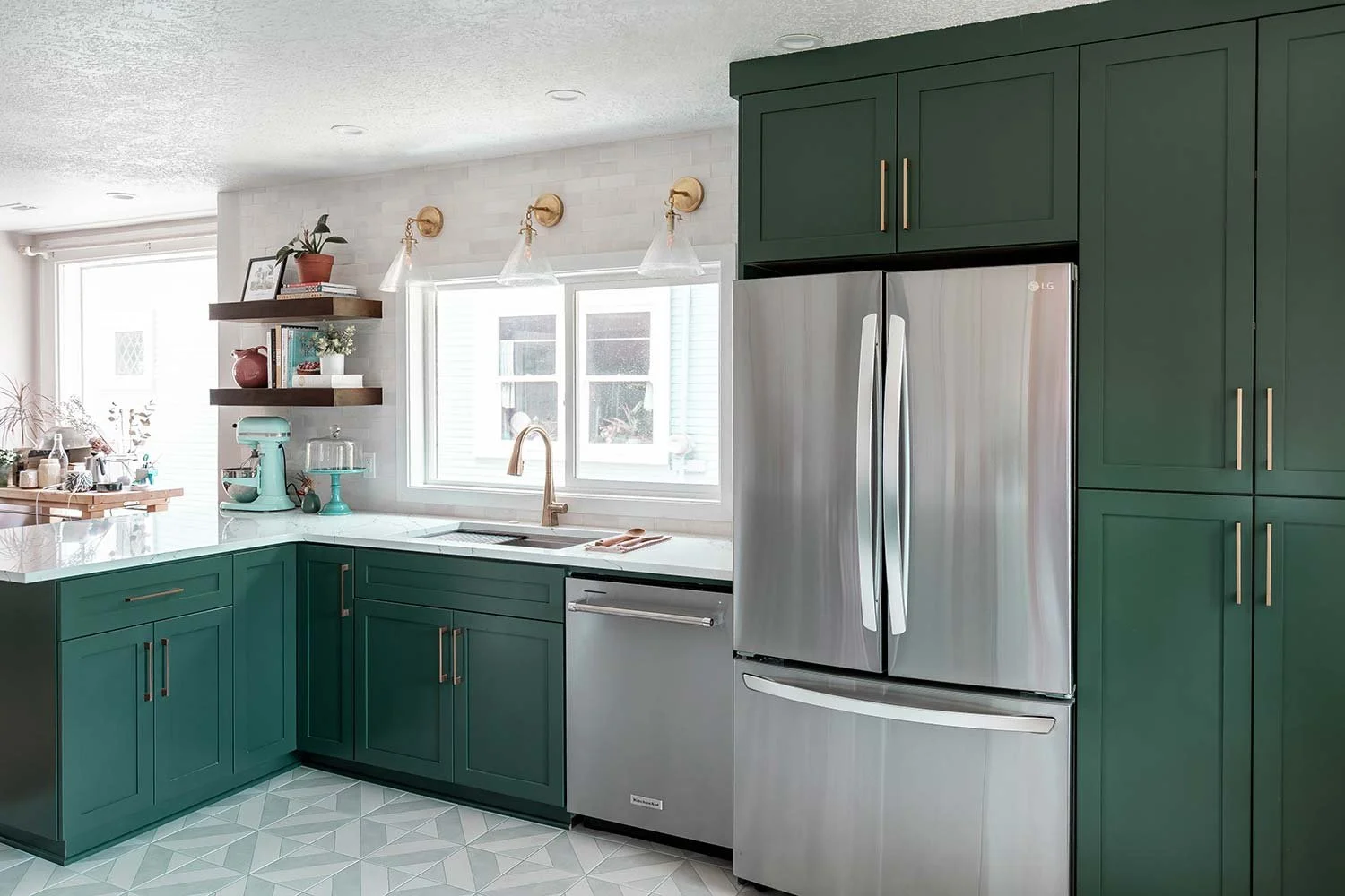

DARK Greens

Kitchen Design portland oregon Interior Design Trends 2025
green wall in home gym set up how to make a cool home gym

My favorite warm dark green paint colors are: Peale Green (Benjamin Moore HC-121), Jasper (Sherwin Williams 6216), Dark Hunter Green (Sherwin Williams 0041), and Secret Garden (Sherwin Williams 6181).

My favorite cool dark green paint colors are: Hunter Green (Benjamin Moore 2041-10), Black Forest Green (Benjamin Moore HC-187), Rookwood Shutter Green (Sherwin Williams 2809), and Green Onyx (Sherwin Williams 9128).
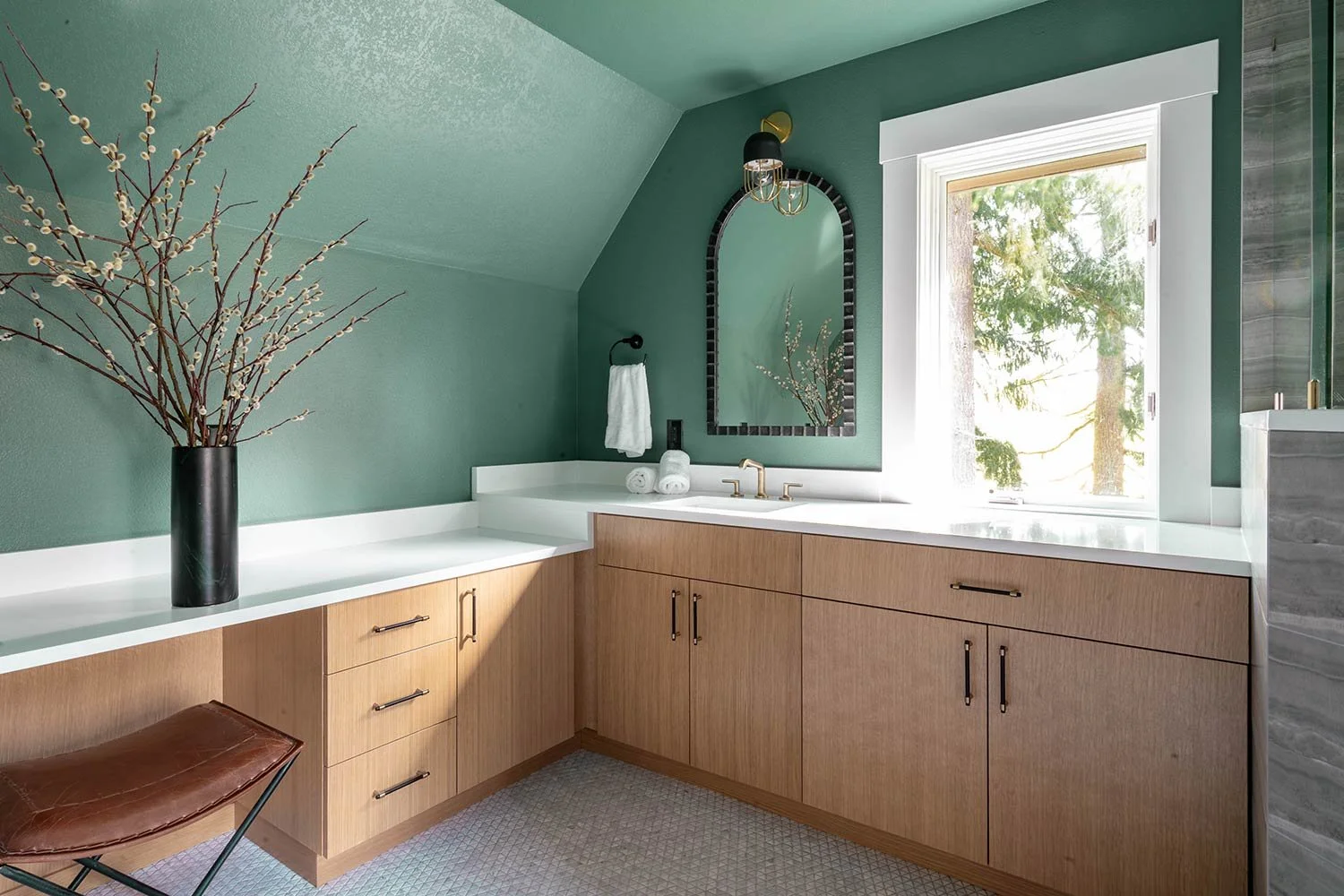

Medium Greens

Large bathroom with green walls
Green cabinet interior design how to style your home

My favorite warm medium green paint colors are: Backwoods (Benjamin Moore 469), Passion Vine (Benjamin Moore 1504), Vogue Green (Sherwin Williams 0065), and Shade Grown (Sherwin Williams 6188).

My favorite cool medium green paint colors are: Rolling Hills (Benjamin Moore 1497), Pewter Green (Sherwin Williams 6208), Retreat (Sherwin Williams 6207), and Cascade Green (Sherwin Williams 0066).


LIGHT Greens

bath inspiration door painted with matching shower tile
work space with wallpaper and green wall

My favorite warm light green paint colors are: Louisburg Green (Benjamin Moore HC-113), Filmy Green (Sherwin Williams 6190), White Mint (Sherwin Williams 6441), and Softened Green (Sherwin Williams 6177).

My favorite cool light green paint colors are: Saybrook Sage (Benjamin Moore HC-114) , Sagey (Sherwin Williams 6175), Green Trance (Sherwin Williams 6462), and Green Earth (Sherwin Williams 7748).

Best Beige's for your Neutral Paradise

Best Beige's for your Neutral Paradise

When it comes to creating a timeless and elegant home, few design choices are as powerful or as misunderstood as a neutral color palette. Often dismissed as “safe” or “boring,” neutrals actually offer a sophisticated foundation that can transform any space into a serene retreat. Today I’m going to be sharing my favorite neutral tones to use on your walls!


Dark Neutral Tones

traditional interior design how to style your home
office design how to style a office space

My favorite warm dark neutral paint colors are: Drift of Mist (Sherwin Williams 9166), Accessible Beige (Sherwin Williams 7036), Pale Oak (Benjamin Moore OC-20)

My favorite cool dark neutral paint colors are: Anew Gray (Sherwin Williams 7030), On the Rocks (Sherwin Williams 7671), Annapolis Gray (Benjamin Moore HC-176)


Medium Neutral Tones

interior desing portland oregon
Traditional home interior design portland oregon

My favorite warm medium neutral paint colors are: Shoji White (Sherwin Williams 7042), Alabaster (Sherwin Williams 7008), White Opulence (Benjamin Moore OC-69)

My favorite cool medium neutral paint colors are: Snowfall (Sherwin Williams 6000), Light French Gray (Sherwin Williams 0055), Cloud Cover (Benjamin Moore OC-25)


Light Neutral Tones

square tile white interior design how to style your home
gold and white and black interior design

My favorite warm light neutral paint colors are: White Dove (Benjamin Moore OC-17), Simply White (Benjamin Moore OC-117), Snowbound (Sherwin Williams 7004)

My favorite cool light neutral paint colors are: Chantilly Lace (Benjamin Moore OC-65), White Dove (Benjamin Moore OC-17), Extra White (Sherwin Williams 7006)

Lighting for Luxurious Living

Lighting for Luxurious Living


When it comes to designing a truly luxurious space, lighting should never be an afterthought! It can truly be one of the most powerful and crucial tools in your design arsenal. The right lighting doesn’t just illuminate a room, it enhances mood, elevates materials, and creates an immersive experience that feels both intentional and indulgent. In this blog post, we’re going to share some of our favorite lighting we have done in luxury spaces! Enjoy!

These bold brass pendants steal the show, adding just the right amount of sparkle to this sleek white kitchen. They balance out the big island beautifully, giving the space a warm, welcoming vibe that makes you want to pull up a chair and stay a while.

The bubble chandelier is like jewelry for this dining room! It’s playful, eye-catching, and full of personality. It catches the light by day, glows softly at night, and pairs perfectly with those amazing city views. Dinner under this beautiful light feels instantly elevated.

The amber glass pendants give this bar a cozy, laid-back glow that says “come hang out.” They highlight the rich wood cabinets and stone textures, while setting the mood for sipping wine or mixing cocktails. It’s lighting that makes the whole space feel like a hidden gem.

Clean lines and neutral tones set the stage for this modern dining room, but it’s the globe chandelier that brings the whole space to life. Its playful, geometric design spreads light evenly across the long table, while doubling as a statement piece of contemporary art. The mix of sophistication and fun makes everyday meals feel a little more like a celebration.

This mid-century modern powder room proves that even small spaces deserve big design moments. The sculptural pendant feels like a piece of art, floating above the sleek vanity while casting a soft, flattering glow on the rich teal walls. It’s the kind of lighting that turns a powder bathroom from average to extraordinary!

This laundry room embraces a clean, functional design, and the recessed lighting keeps the space feeling bright and fresh. A pair of subtle spotlights highlight the colorful art, adding a touch of personality to a room that’s usually all about utility. This type of accent lighting truly makes this a functional and beautiful laundry room.

We added these sculptural sconces to the primary bedroom to bring in both interest and sophistication. Choosing sconces instead of table lamps instantly upgrades the space by saving room on the bedside tables while creating a more elevated look. It’s a simple switch that makes the whole room feel more intentional, thoughtful, and beautifully designed.

The Bold and the Blue-tiful: Best Blues for you Home

The Bold and the Blue-tiful: Best Blues for you home

I’m so honored to be featured in Oregon Home Spring 2025 Magazine, where I had the chance to chat all about my love for the color Blue! From moody navies to airy sky tones, blue is one of the most versatile and soulful colors you can bring into your space. Today I’m sharing a few of my favorite blue shades, hope you enjoy!


Dark Blues

bright blues interior design portland oregon
Childrens bedroom design how to make a bedroom feel cool and beautiful
interior design blue colorful bathroom
Wine bar interior design for commercial spaces
how to set up a home gym and use color interior design

My favorite warm dark blue paint colors are: In the Navy (Sherwin Williams 9178), Charcoal Blue (Sherwin Williams 2739), Anchors Aweigh (Sherwin Williams 9179)

My favorite cool dark blue paint colors are: Sea Mariner (Sherwin Williams 9640), Salty Dog (Sherwin Williams 9177), Hale Navy (Benjamin Moore HC-154), Dark Pewter (Benjamin Moore 2122-10)


Medium Blues

accent wall interior design blue colors
How to make your powder bathroom pop
Nursery design color textures and decor

My favorite warm medium blue paint colors are: Portsmouth (Sherwin Williams 9644), Stargazer (Sherwin Williams 9635), Blue Danube (Benjamin Moore 2062-30)

My favorite cool dark green paint colors are: Providence Blue (Benjamin Moore 1636), Azure Tide (Sherwin Williams 9684), Palladian Blue (Benjamin Moore HC-144), Courtland Blue (Benjamin Moore HC-145)


Light Blues

light blue wet bar design
colorful accent wall design portland oregon

My favorite warm light blue paint colors are: Lakeside (Sherwin Williams 9683), Intuition (Benjamin Moore 806), Ocean Air (Benjamin Moore 2123-50)

My favorite cool light blue paint colors are: Dewdrop (Sherwin Williams 9641), Favorite Jeans (Sherwin Williams 9147), Lookout Point (Benjamin Moore 1646)

How to Pick the Right Tile for Your Bathroom

How to Pick the Right Tile for Your Bathroom


When it comes to bathroom design, tile is one of the most impactful decisions you’ll make. It sets the tone for the space, brings in texture and color, and can even influence how spacious your bathroom feels. Whether you're aiming for bold and expressive or timeless and serene, the right tile can transform your bathroom into a true retreat. Here’s how to find the perfect fit, plus a peek at a few of our favorite tile moments!

Interior design green tile in bathroom how to style a bathroom for outdoor living

If you’re not afraid to make a statement, lean into color and organic texture like we did in this vibrant green bathroom. The glossy zellige-style tile brings life to the space, reflecting light in beautiful, varied ways thanks to its handcrafted look. Paired with clean, modern fixtures, this tile adds just the right amount of personality without overwhelming the space.

interior design marble shower how to style a beautiful shower

For those who love a mix of traditional and modern, consider a soft marble tile paired with a patterned mosaic like this design. The subtle tones and golden grout detail create a look that’s sophisticated but still playful. This style works beautifully when you want a space that feels elevated and artful without straying from a neutral palette.

Interior Design how to style a old tile on a new home

This golden-toned shower embraces earthy elegance with large-format natural onyx stone tiles that bring warmth and richness to the space. The stone has beautiful veining and variation, adding organic character. The floor’s small square mosaic tile keeps the design cohesive and safe underfoot.

4 head shower how to have a luxury shower

Marble-inspired porcelain slabs, like in this shower, are perfect for creating a spa-like atmosphere with low maintenance. Here, large-format tiles with dramatic veining bring in the luxury feel, while the inset black mosaic adds just enough contrast and modern edge. Paired with brushed brass fixtures, the result is classic with a little bit of attitude.

choosing the right tile for your shower how to style your home

Looking for calm, clean, and classic? This shower is the definition of spa serenity. Soft grey vertical wall tiles are paired with a vertical inset of white hex tile for a gentle contrast and a touch of texture. The floor continues the hex pattern in a more subtle tone, tying everything together. The built-in bench and niche add functional luxury without interrupting the visual flow.

At the end of the day, the best bathroom tile is the one that speaks to your style, suits your lifestyle, and brings you joy every time you step into the room. Ready to design your dream bathroom? Let’s make it happen.