This custom new build is a 5,569 square foot single story ranch-style home. The home features four bedrooms, four bathrooms, expansive kitchen, open-concept living and dining, and numerous spaces for entertaining and utility. The house sits on lakefront property and the architectural layout is oriented to maximize unobstructed panoramic views of the surrounding environment. The views provided by the lake were a key factor in selecting the home’s location and subsequent design. All material specification, furnishings, and accessories were completed by Kevin Twitty Interiors.
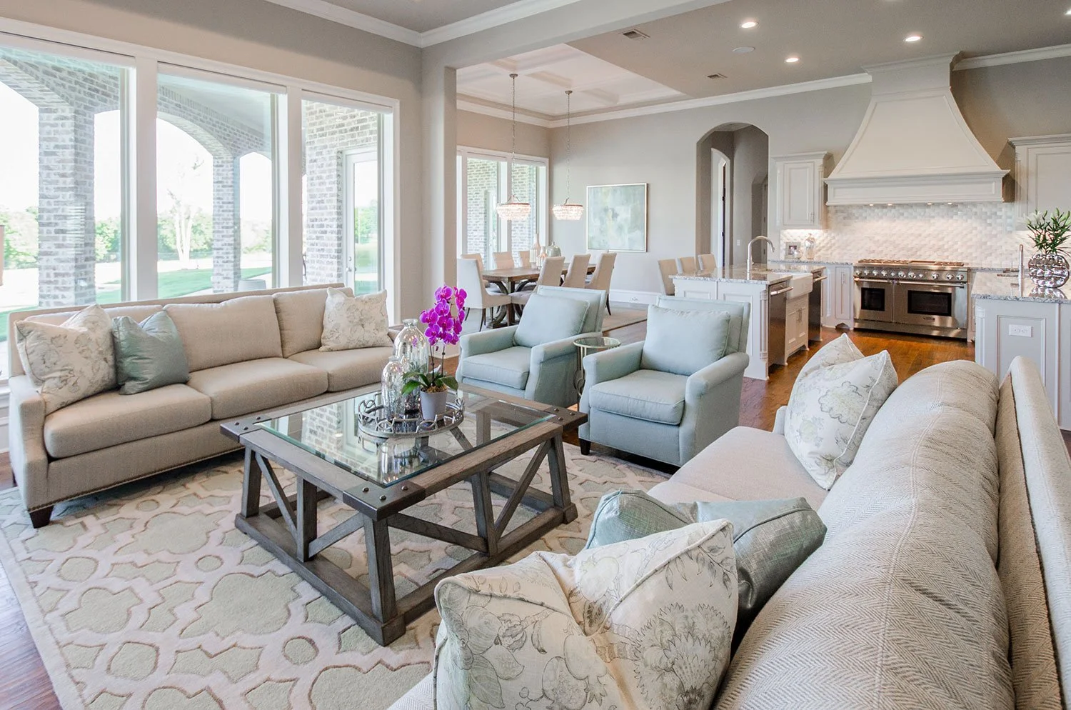
Natural light floods this living room featuring an outdoor inspired color palette with layered neutrals, blues, and greens.
Blending traditional Versailles pattern fireplace stone with a reclaimed wood mantle curates a classing and cozy sensibility for this family room.
Open concept living allows for unobstructed sightline throughout the entertaining space.
Fresh flowers and a touch a glam used as the accessories finish of the living room beautifully. By having an unexpected pop of color, it keeps everything visually interesting.
Double islands in this chef’s kitchen provide enough space for entertaining friends and hosting family events. By using a custom vent hood, we created a focal point with elevated style.
Natural curved arched Carrara marble backsplash provides a seamless design with no grout lines. The characteristic of marble offers organic movement pleasing to the eye.
Casual reclaimed wood dining table coupled with classic chairs and dramatic light fixtures create a unique blend of sophisticated style.
Double crystal chandeliers connect with the double islands in the kitchen and give rise to a special moment when moving through the dining room. A soft contemporary piece of art adorns the wall to bring the inspiration of nature into the house.
This design is all about taking in the views of the private lake from wherever someone may be in the home.
Every detail matters when selecting furnishings for a design project.
Custom iron front door designed to mimic vines seen in nature.
Entry featuring a unique and cohesive blend of design style pushing the box of personal style
Natural wood grain on the entry console bring an air of nature, comfort, and casual living to guests as they walk into the home.
A modern metal wall sculpture leading into the game room is an artistic interpretation of the coffered ceiling design.
The pool table in this game room was custom selected to have black felt which matches the carpeting in the media room. The game room takes advantage of the magnificent view and blends modern, classic, and industrial styles. This is the “man cave” of the home.
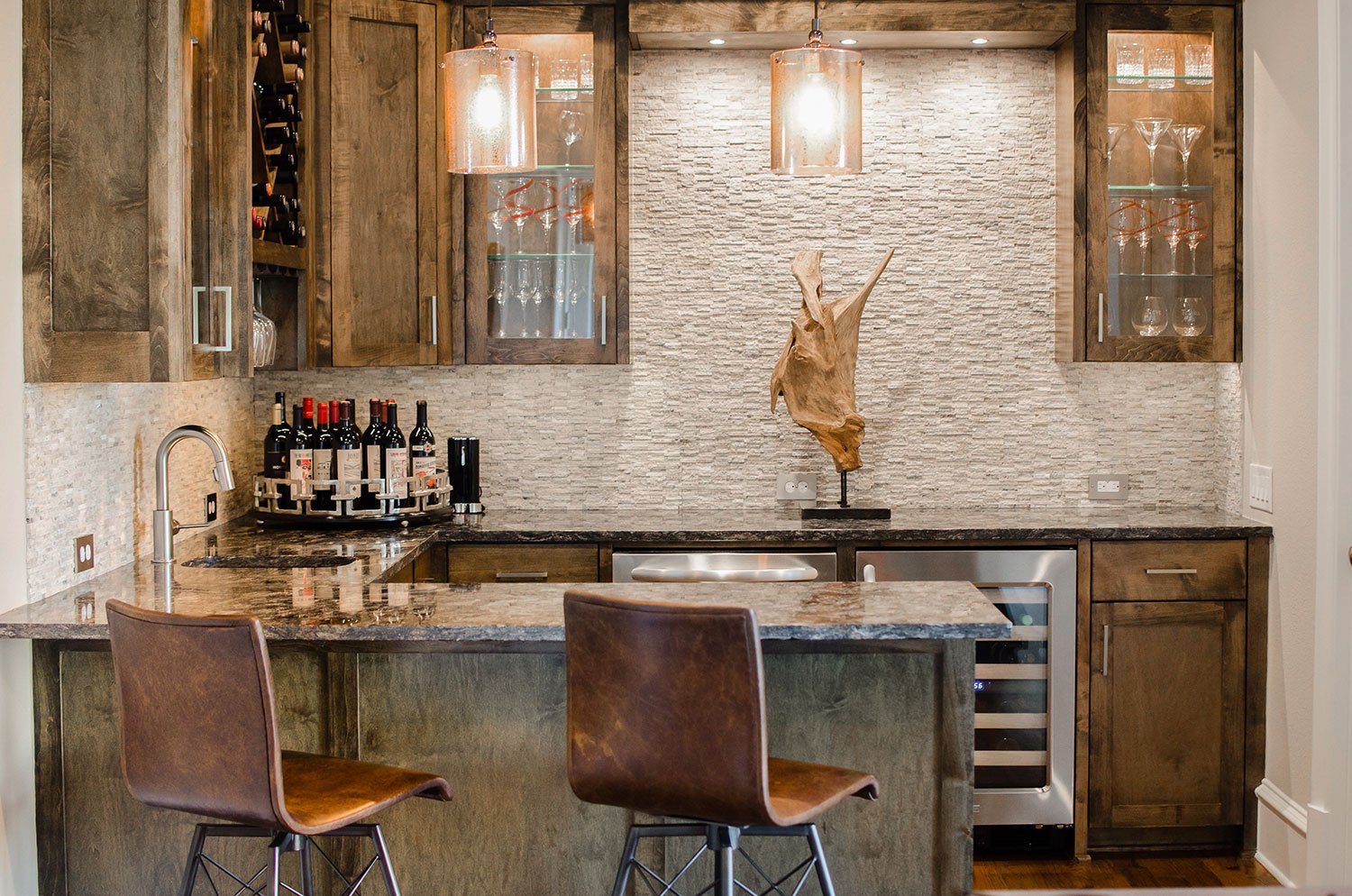
The wet bar was designed with a more masculine “man cave” style in mind. We wanted to use a lot of wood, leather, and naturally textured surfaces to make the homeowner feel like they were at a winery or nice whiskey bar.
A touch of industrial, a dash of rustic, and a whole l lot of style.
Wood beams on the ceiling add depth and dimension to this game room design.
The primary bedroom bed is a stylish four poster bed made out of reclaimed wood and metal accents. To tie in with the industrial undertone, the bed was flanked with hammered metal night stands that provide a lot of usable storage.
An inviting sitting area was placed at the foot of the bed to enjoy a cup of coffee or tea as the homeowners enjoyed the slower pace of lake-life mornings. It’s also a great place to wine down at the end of the day.
Farmhouse accessories are a refreshing juxtaposition with the reflective top of the small coffee table in the master bedroom.
This unique two-sided fireplace was designed specifically for this master bedroom retreat. I provides separation between the entertainment side of the bedroom and the relaxing retreat on the opposite side while providing warmth during the winter months to both areas.
The left side of the fireplace is used as a relaxing sitting area to disconnect from the world and get lost in the view provided by nature while the right side offers a comfortable seating area to watch television.
The seating area of the master bedroom has a pair of swivel chairs that allow the homeowners versatility. They can sit and enjoy the fire or swing around and have a stunning view.
All shutters in the house, including the floor to ceiling windows in this master bedroom’s reading nook, open to fully enjoy the lake view.
Area on opposite side of fireplace to read, relax, and enjoy the view without distractions.
Thank you for taking a tour though the main floor of this vacation home.


