Mid-Century Modern Dreamscape
This sweet family had an incredible mid-century modern home in Raleigh Hills, but only one of their three bathrooms was functional. With their first baby on the way, they wanted to reimagine all three spaces to be fully functional, beautiful, and true to the home’s original mid-century character. Plus we converted a guest room into their nursery for their newest family member! Our goal was to honor the architecture and spirit of the house while bringing in fresh, livable updates that would serve their growing family for years to come.
Primary Bathroom
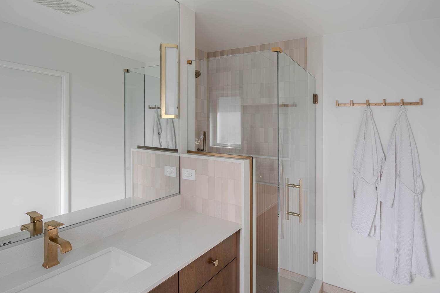
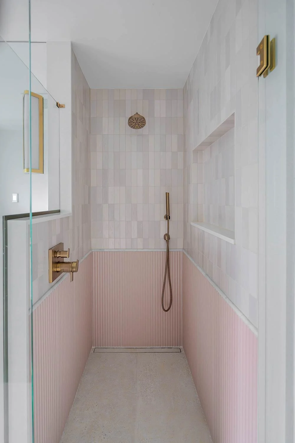
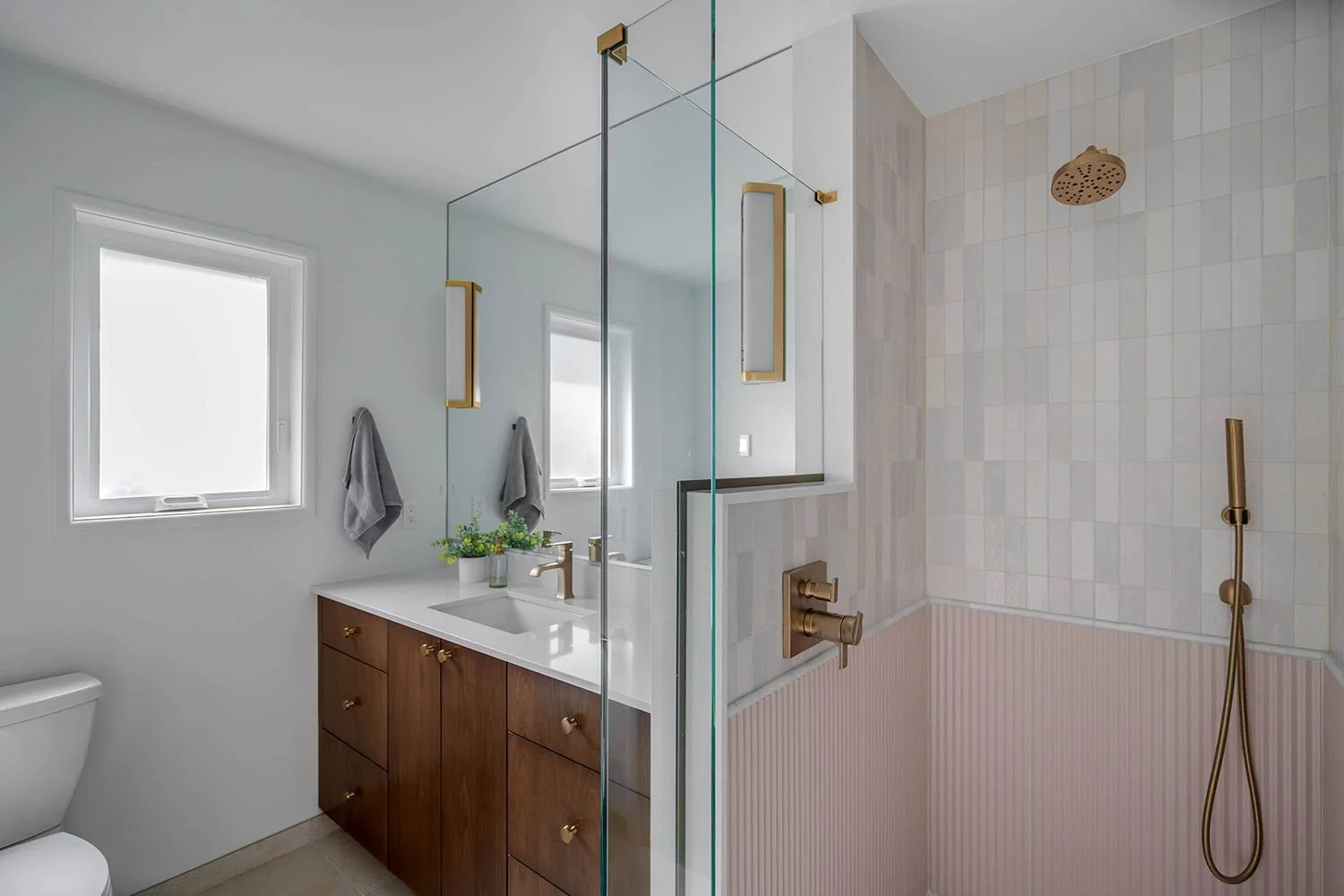
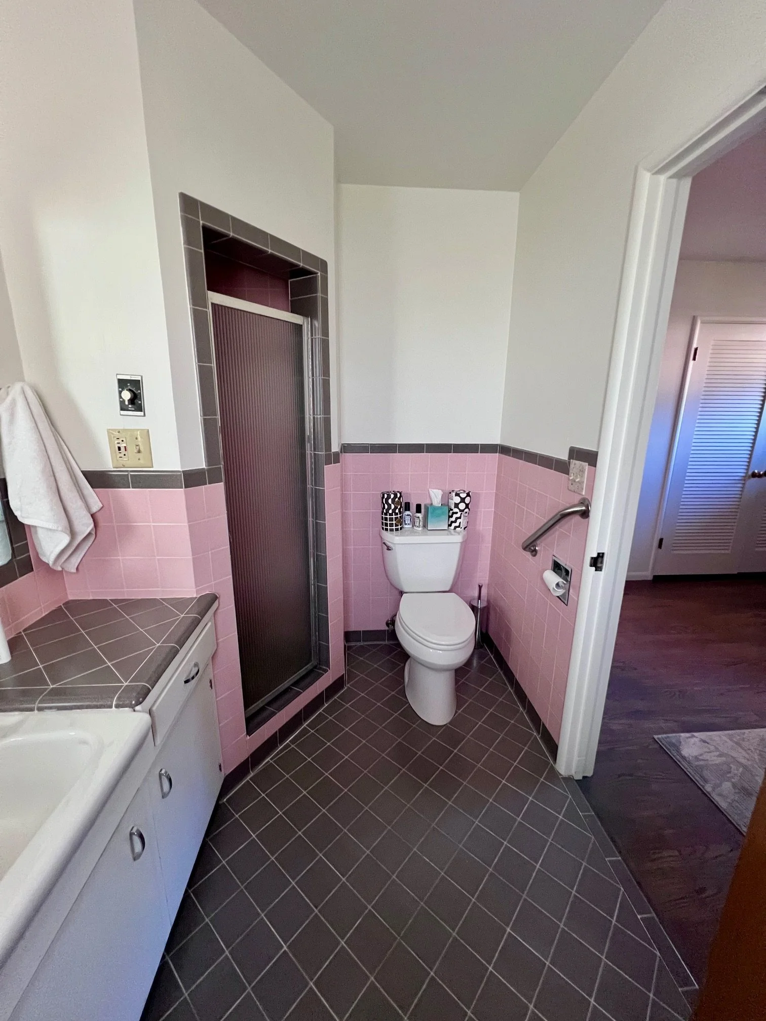
This primary bath originally had a pink theme that we chose to honor in the redesign! The shower was once cramped in the back corner and had outdated electrical, making it unsafe to use. We expanded the shower footprint and added a glass surround to open up the space and bring in more light.
For this walk-in shower, we wanted to create something that felt both elevated and serene. We integrated the drain for minimal visual disruption, allowing the gorgeous floor tile to flow continuously from the main bathroom into the shower. This small detail helps the space feel larger and more cohesive. The textured blush wainscoting brings such warmth and personality to the space! The soft tone adds a subtle pop of color without feeling overwhelming, giving the bathroom a bit of charm and softness against the cooler marble and white tones.
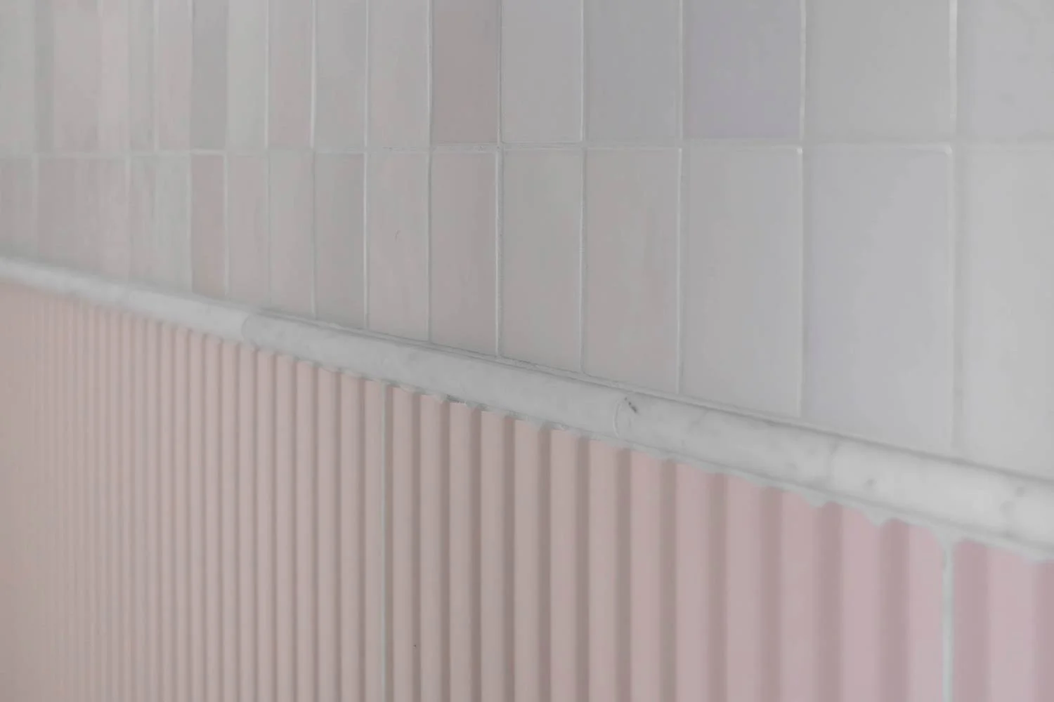
To tie everything together, we added a marble schluter detail that acts as a beautiful bridge between the pink wainscoting and the white zellige tile above. The zellige tiles each have their own slightly different finish and texture, which gives the walls movement and a handcrafted feel. Together, the combination of materials, textures, and tones creates a space that feels elegant without losing its sense of fun and individuality!
To enhance the sense of height and airiness, we carried the mirror wall to wall and all the way up to the ceiling. The vanity offers plenty of counter space for getting ready and features the same warm walnut tones carried throughout the home, creating a beautiful sense of cohesion. This space feels inviting, functional, and distinctly mid-century, honoring its charming original character while feeling fresh and timeless.
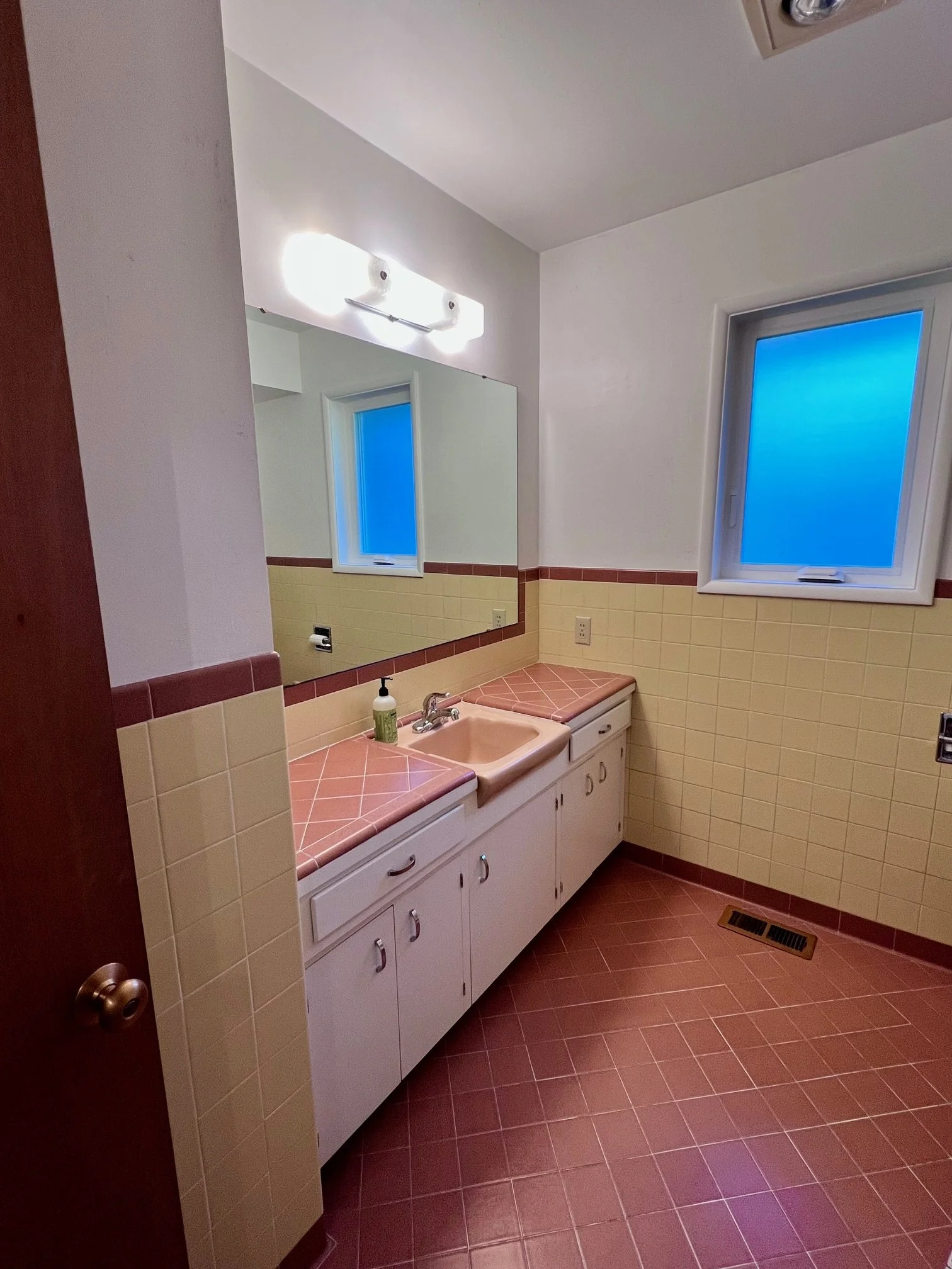
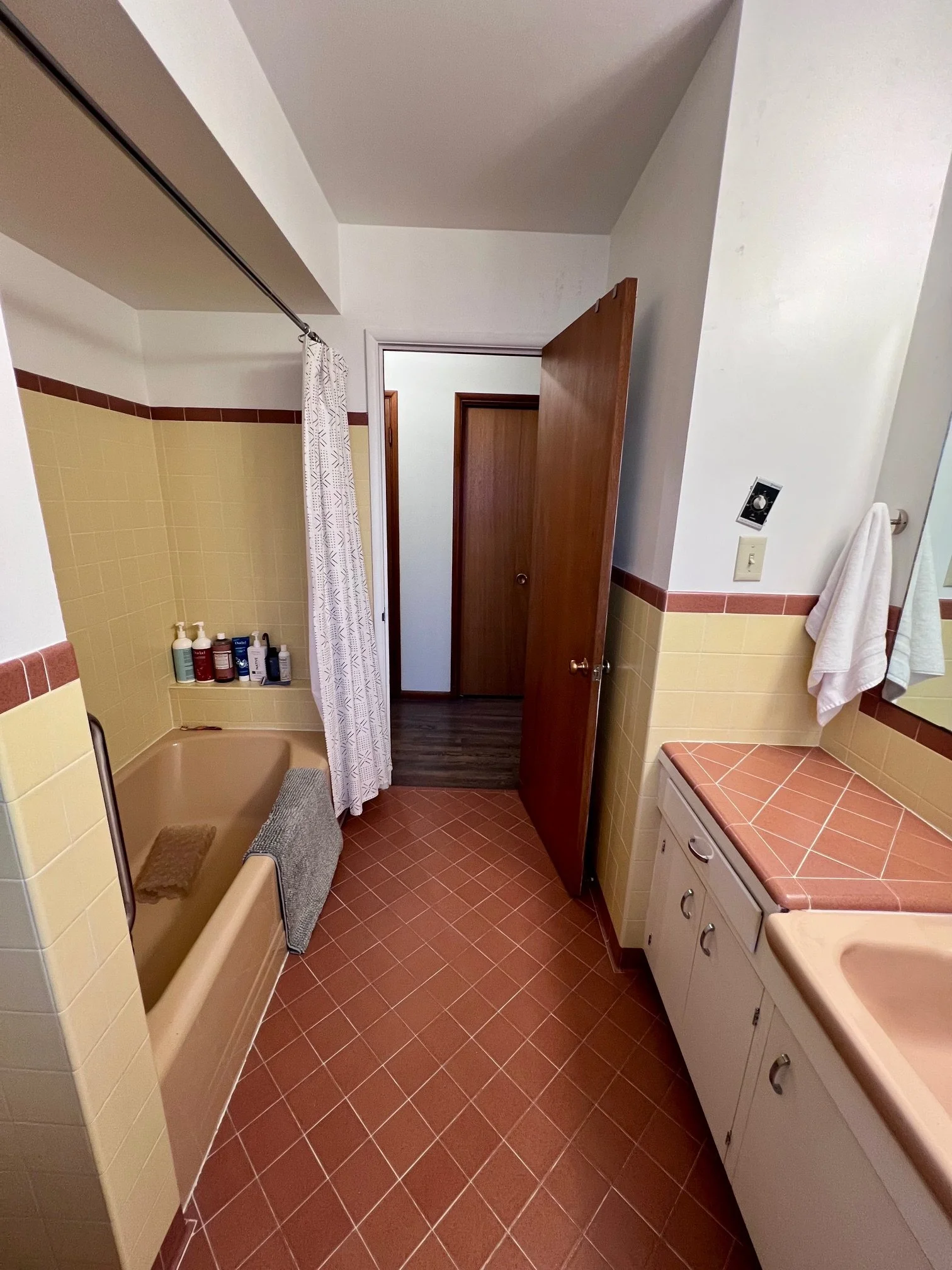
Before Photo: This primary bathroom featured an iconic color scheme rooted in classic mid-century modern style; however, the space was completely nonfunctional. The shower’s electrical work was not up to code, rendering it unusable, and the angled layout prevented the room from fully maximizing its footprint. With the shower drywalled in on all sides, the enclosure felt especially dark and cramped, further limiting the functionality and comfort of the space.
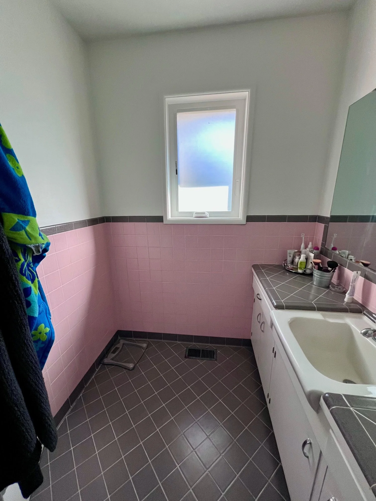
Before Photo: The vanity featured an oversized sink that unfortunately left very little usable counter space. Storage was also limited, and the mirror was mounted too low, making it difficult for the tall homeowner to comfortably see himself.
Powder Bathroom
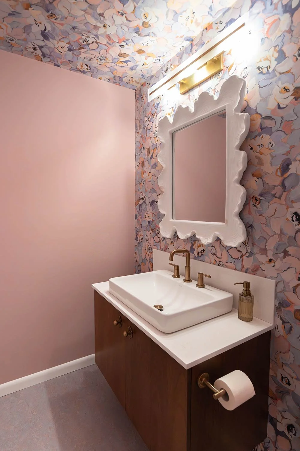
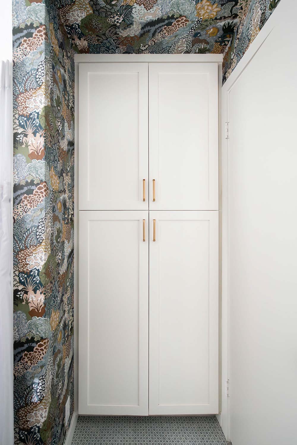
This powder bath was originally cramped, outdated, and neglected. The clients wanted a true pop of fun and funk, so we transformed it with a floral-inspired wallpaper that wraps up onto the ceiling and painted the remaining walls a soft pink to tie it all together. We installed a lilac Marmoleum floor that extends into the laundry room for durability and easy cleaning. The result is a one-of-a-kind, functional space that makes a bold mid-century modern statement that’s playful, practical, and full of personality.
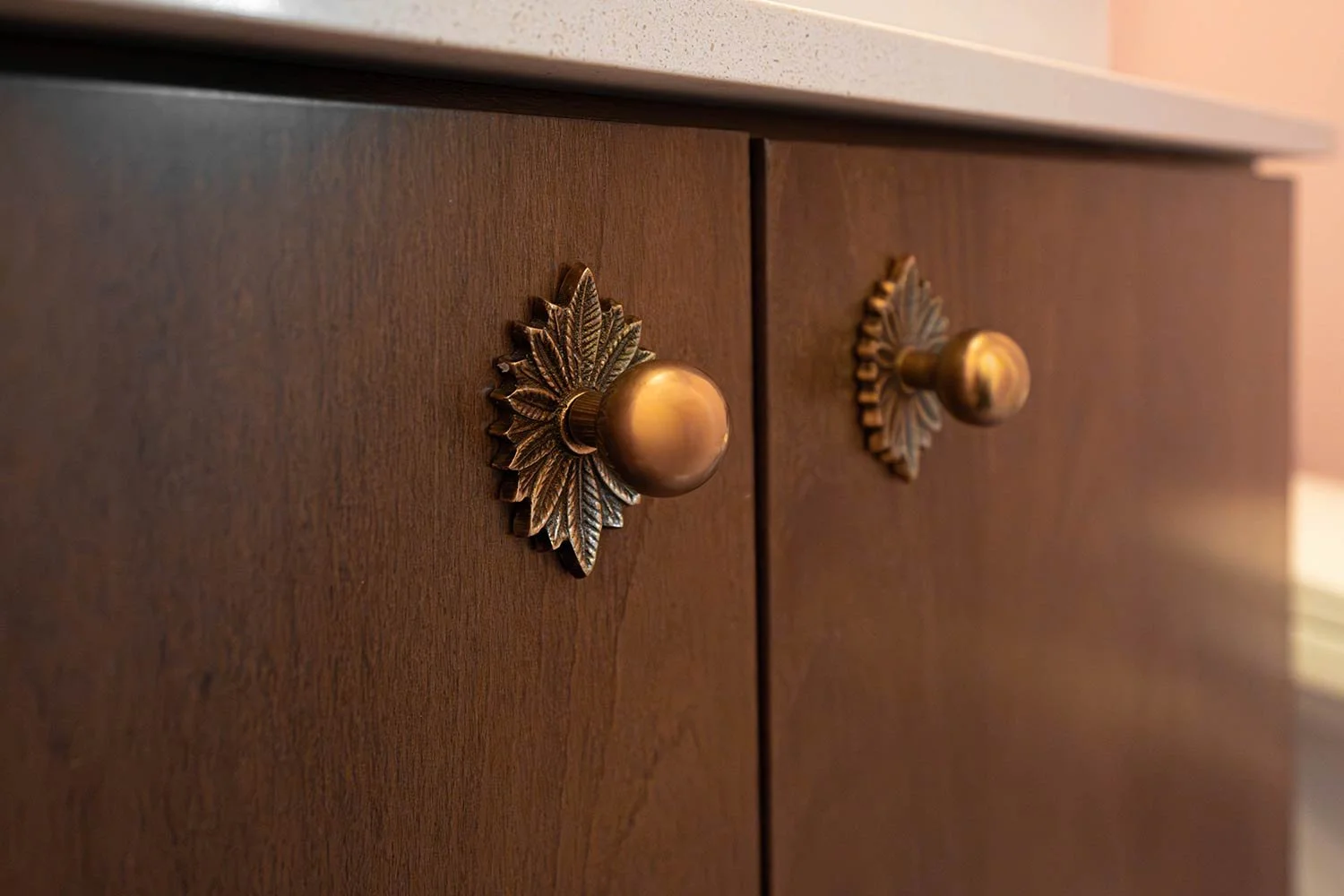
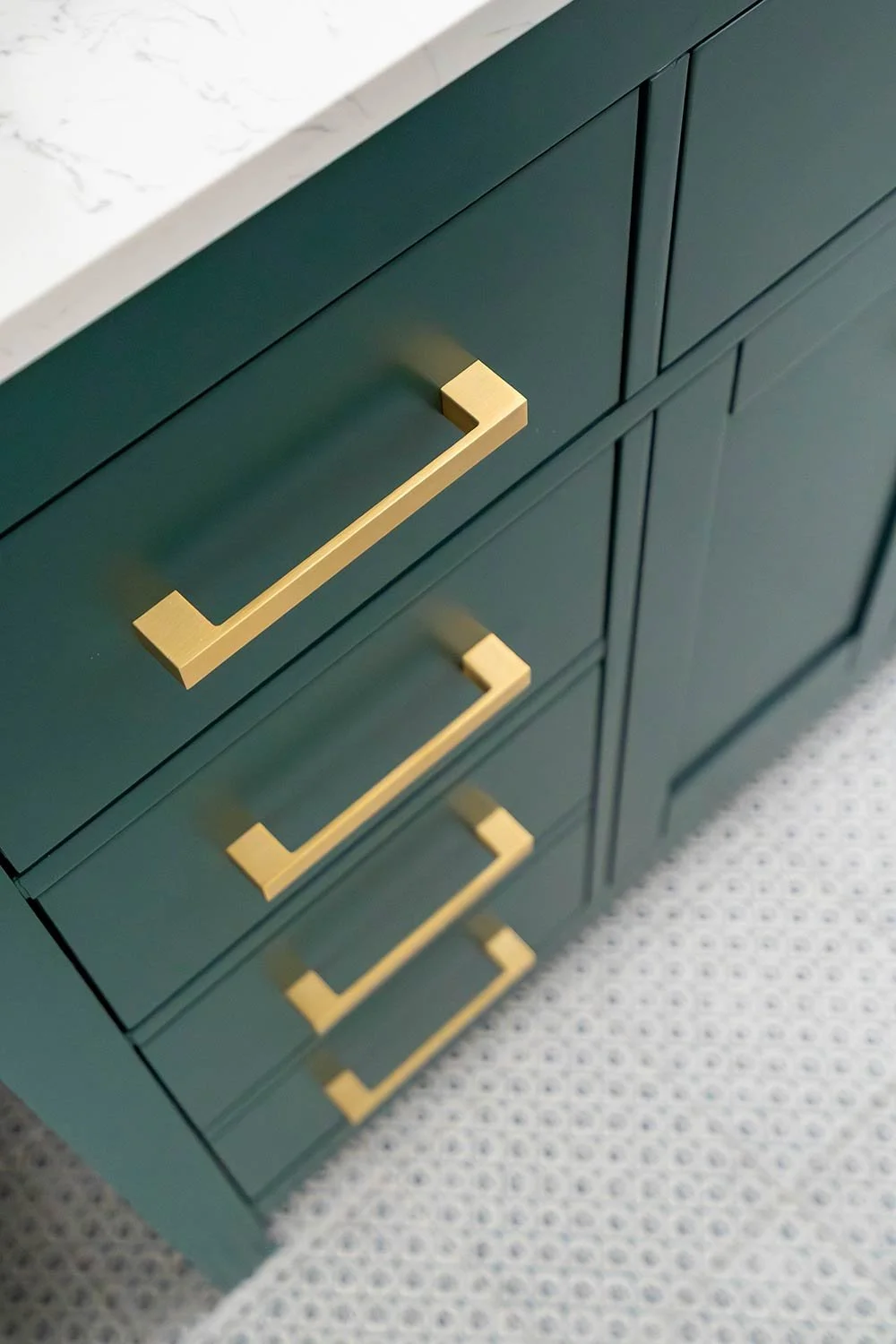
We sourced the knobs during some of our travels, and we love how they help to make this design truly one of a kind!
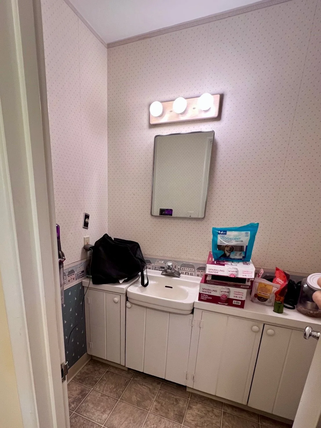
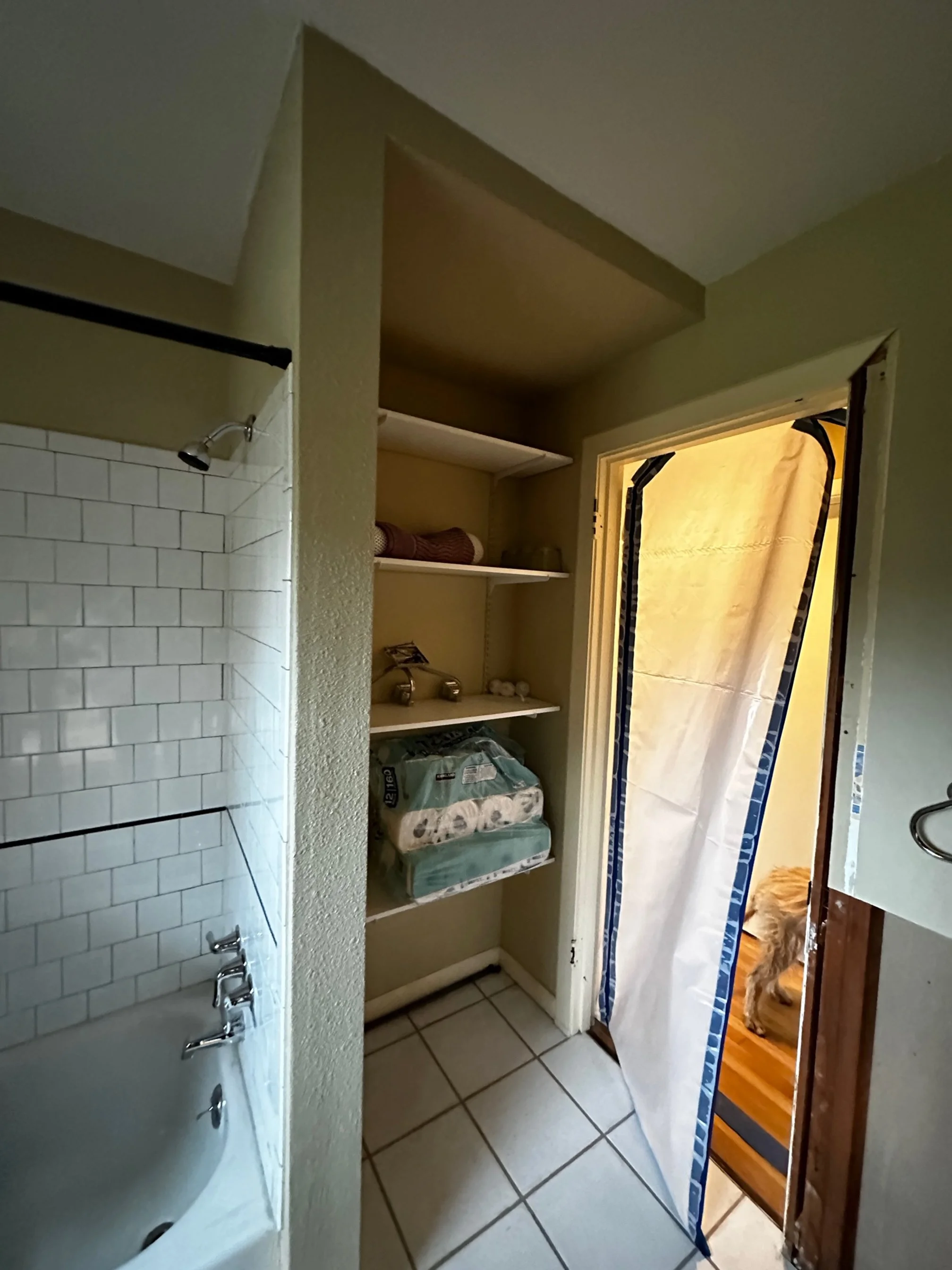
Before Photo: At first glance, this bathroom appeared to offer plenty of storage, but the layout told a different story. Because of the door placement and the tight spacing between the door and the cabinetry, the cabinets were difficult to open and awkward to access while moving in and out of the room. While the location could have been ideal for a guest water closet, the cramped configuration, dated appearance, and non-functional toilet ultimately made the space unusable.
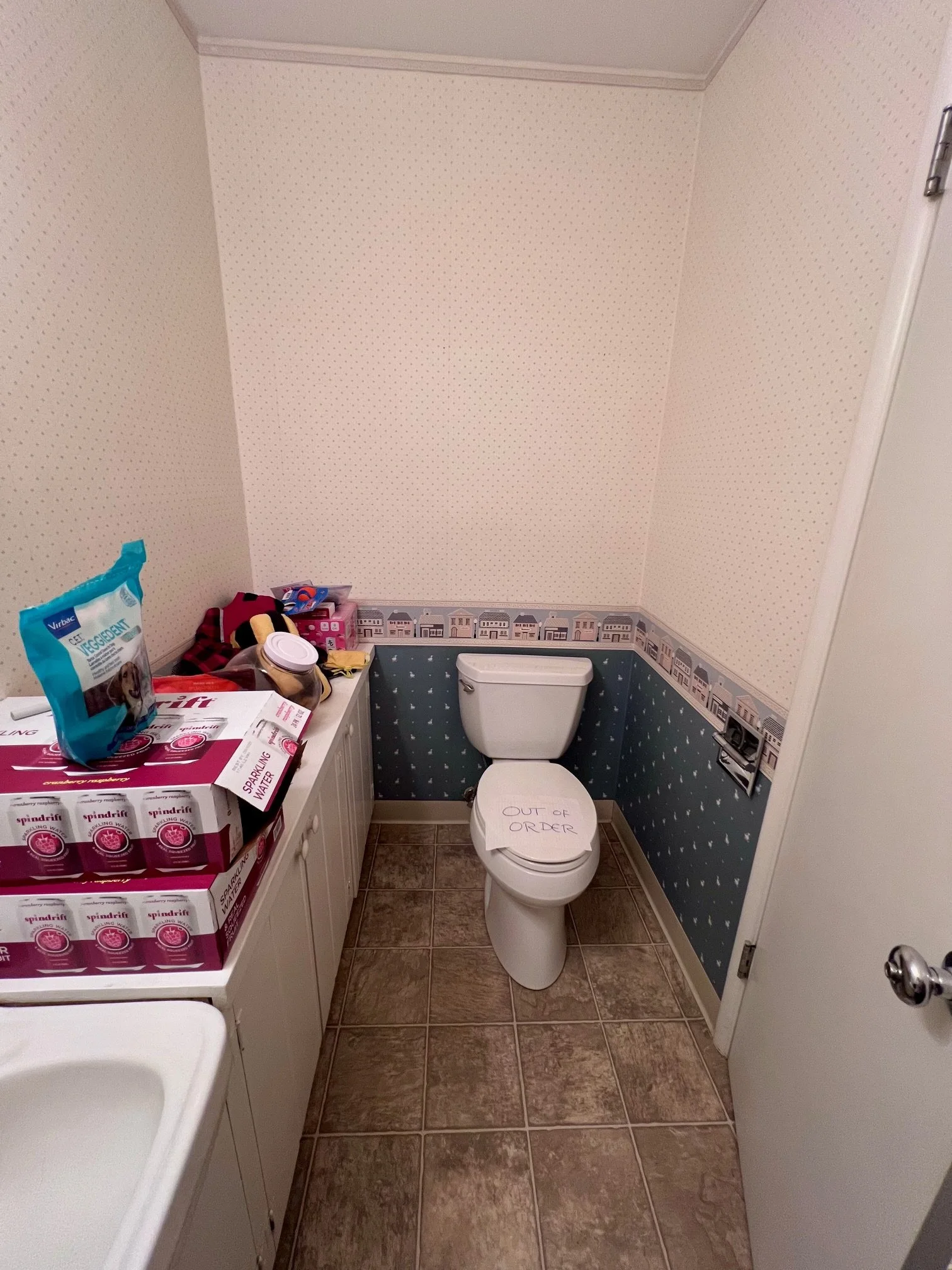
Before Photo: This bathroom didn’t function at all. The toilet was non-operational, and the layout made extremely inefficient use of the space. Positioned directly behind the door, the toilet was hit every time the door fully opened, creating an awkward and impractical circulation path that made moving around the bathroom frustrating and dysfunctional.
Guest Bathroom
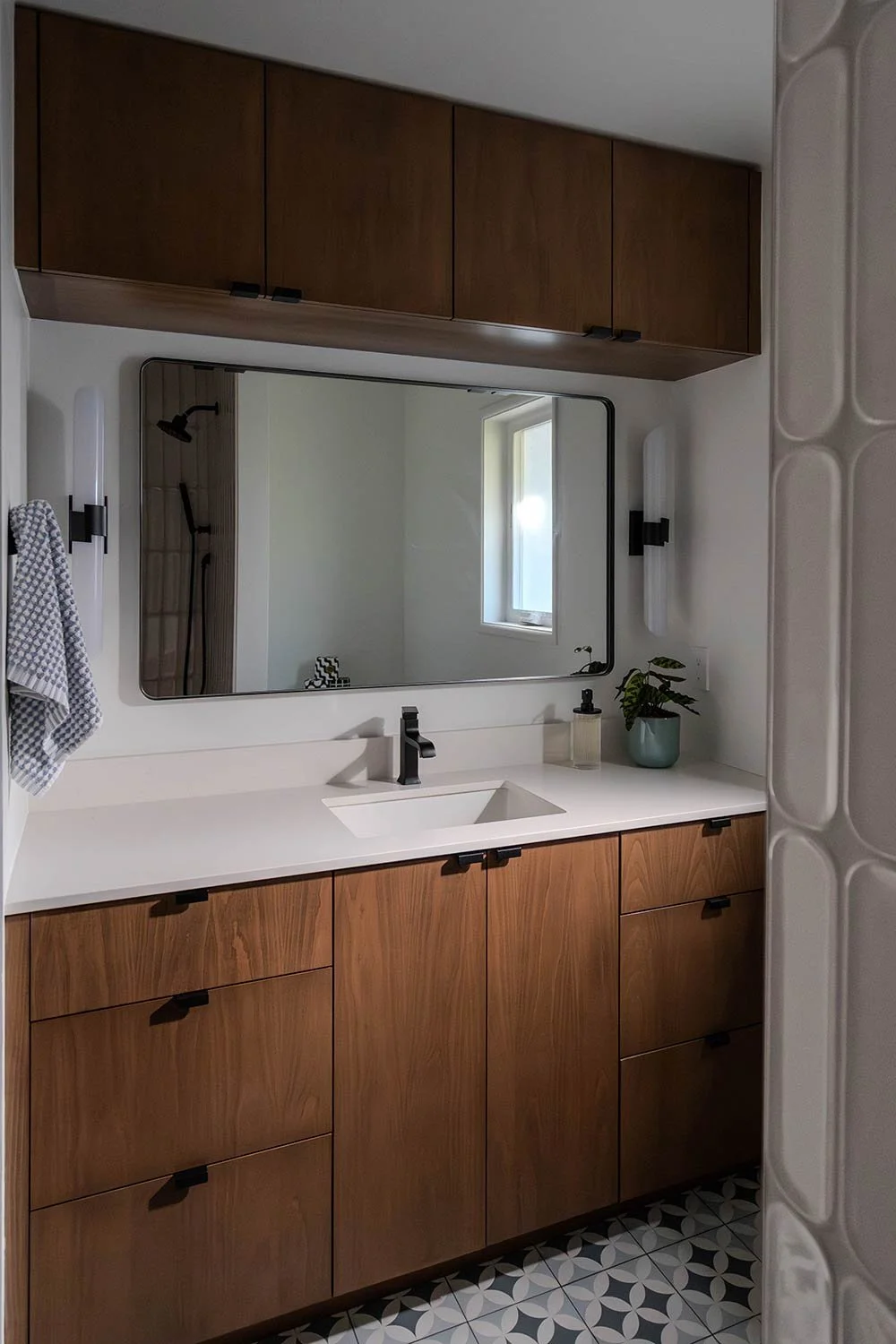
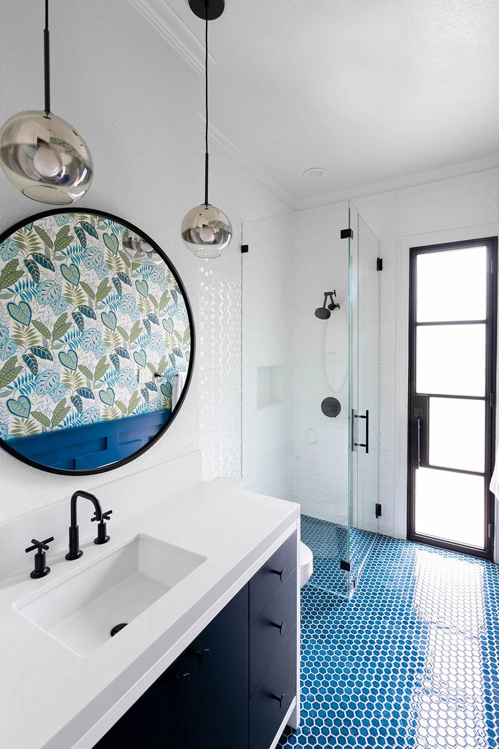
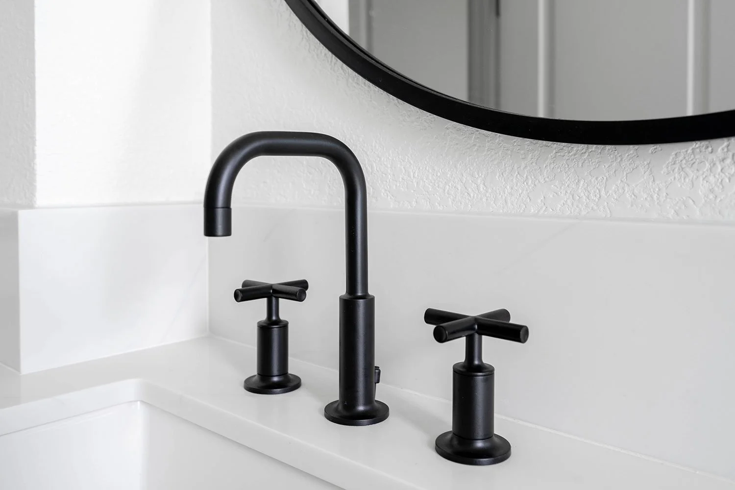
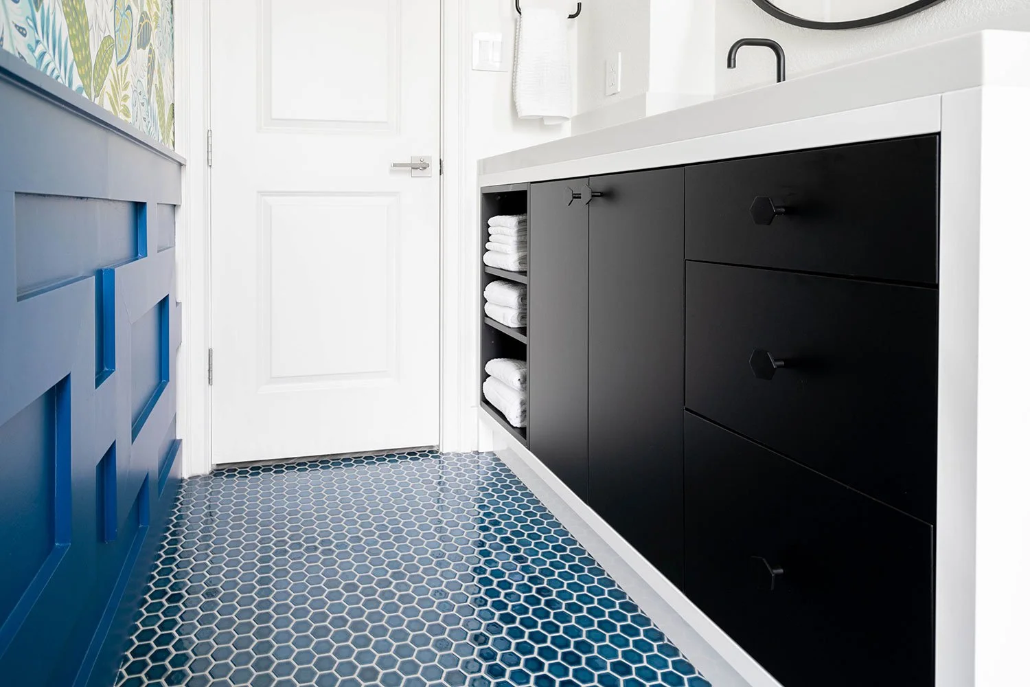
This guest bathroom will be the bathroom used by their children and overnight guests. Storage was a top priority, so we incorporated a clever over-mirror cabinet to maximize space without sacrificing style. To bring in true mid-century modern character, we paired rich walnut cabinetry with a rounded mirror and minimal hardware pulls for a clean, timeless aesthetic.
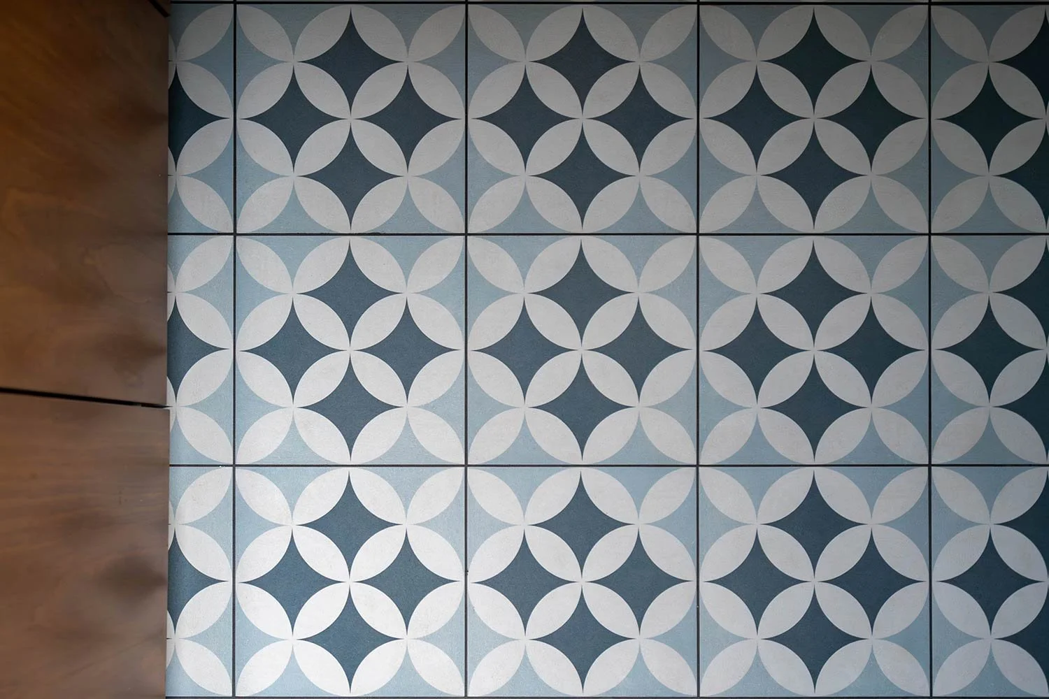
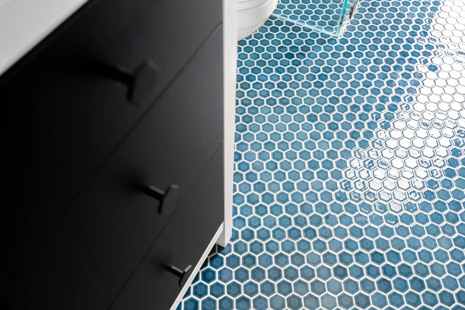
We chose this floor tile because its tone and texture are perfect for disguising the inevitable splashes, footprints, and daily wear that come with kids and frequent use.
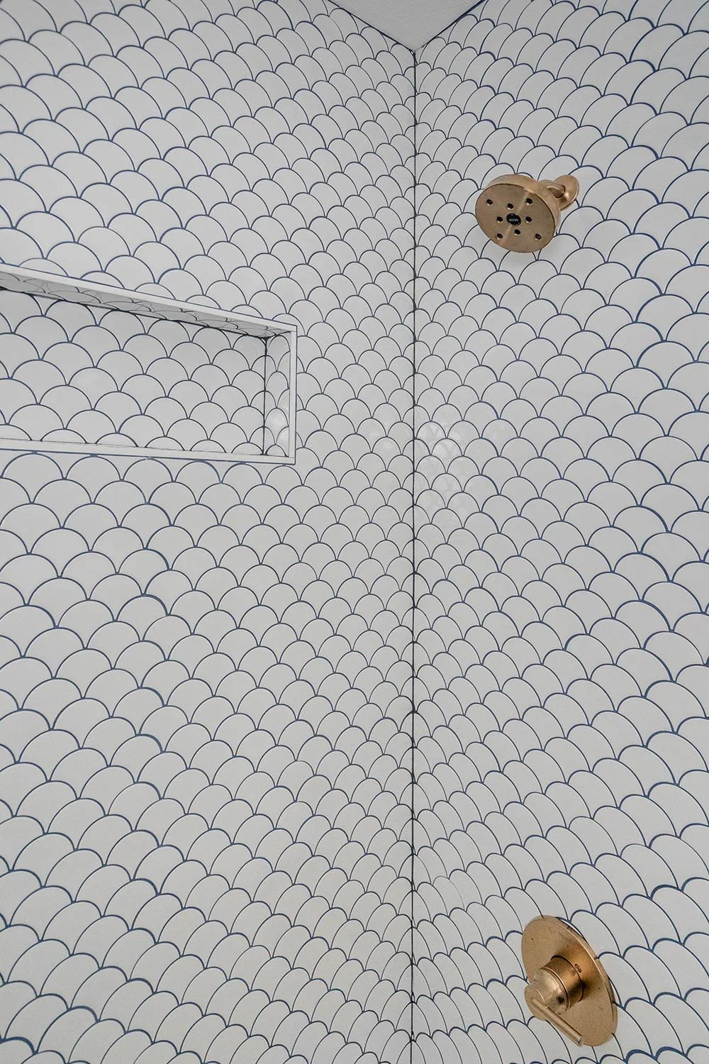
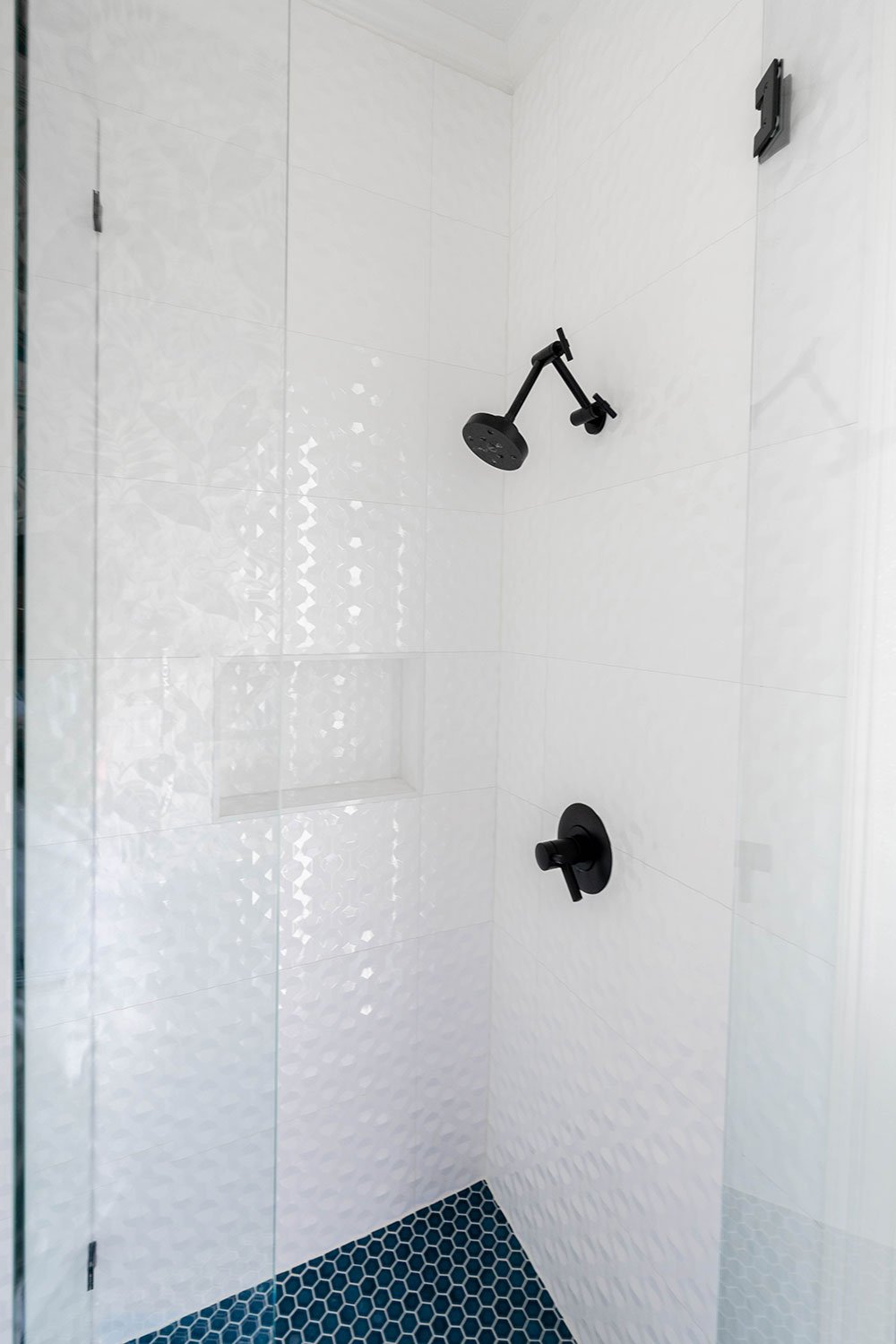
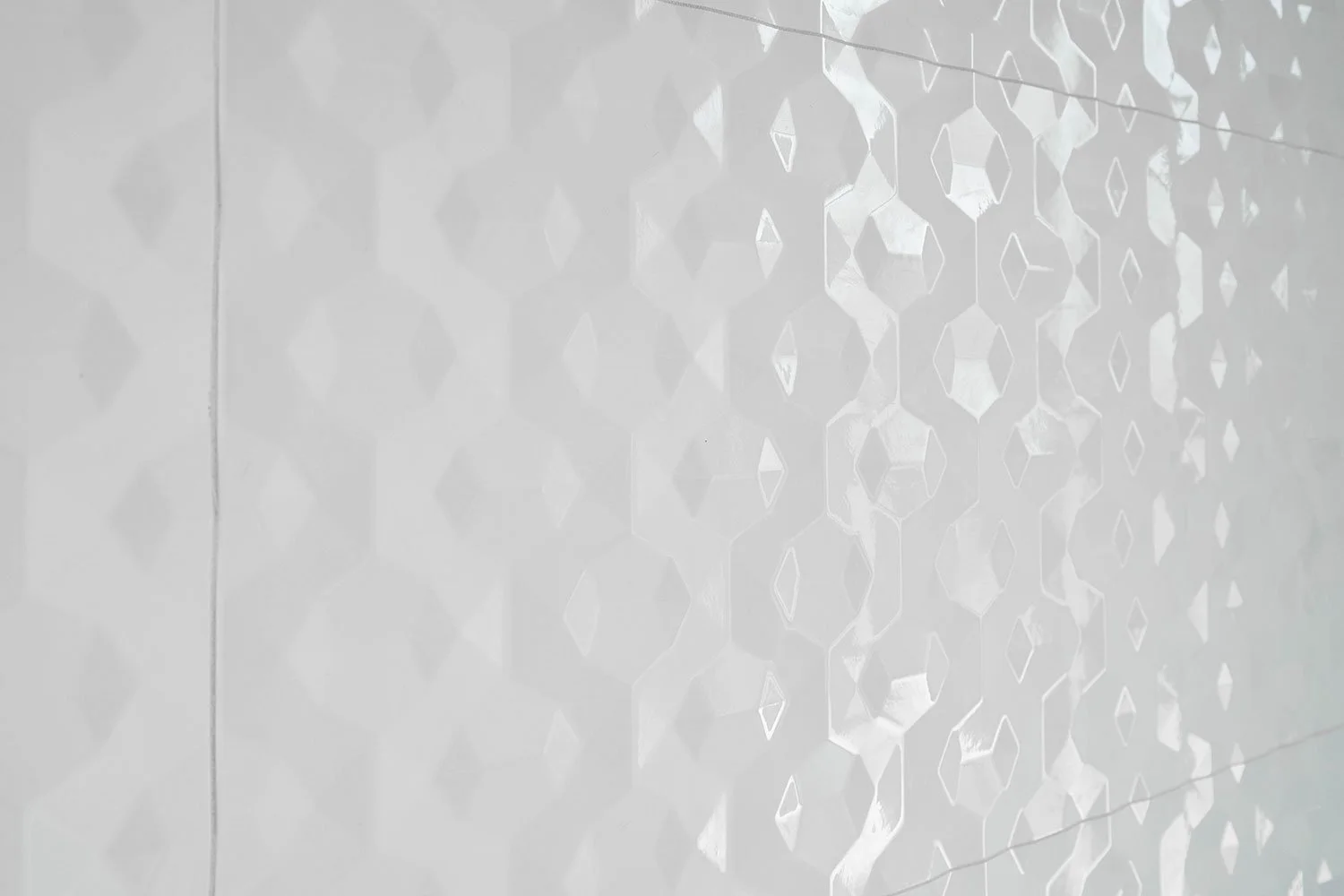
The shower tile is one of our favorite details in this bathroom! Its subtle beveled texture adds beautiful dimension and visual interest to the space. We chose to keep the tub for ease of use with young children, pairing it with both a hand shower and a rain shower to add flexibility and functionality for a growing family.
Before Photo: This bathroom featured an outdated color palette with mustard and red tile. While the mid-century modern style was iconic in its time, the space no longer met the needs of a growing family. The sink area felt crowded and inefficient, the tiled countertops with heavy grout lines easily trapped grime and messes, and the cabinetry offered limited, cramped storage that didn’t support everyday use.
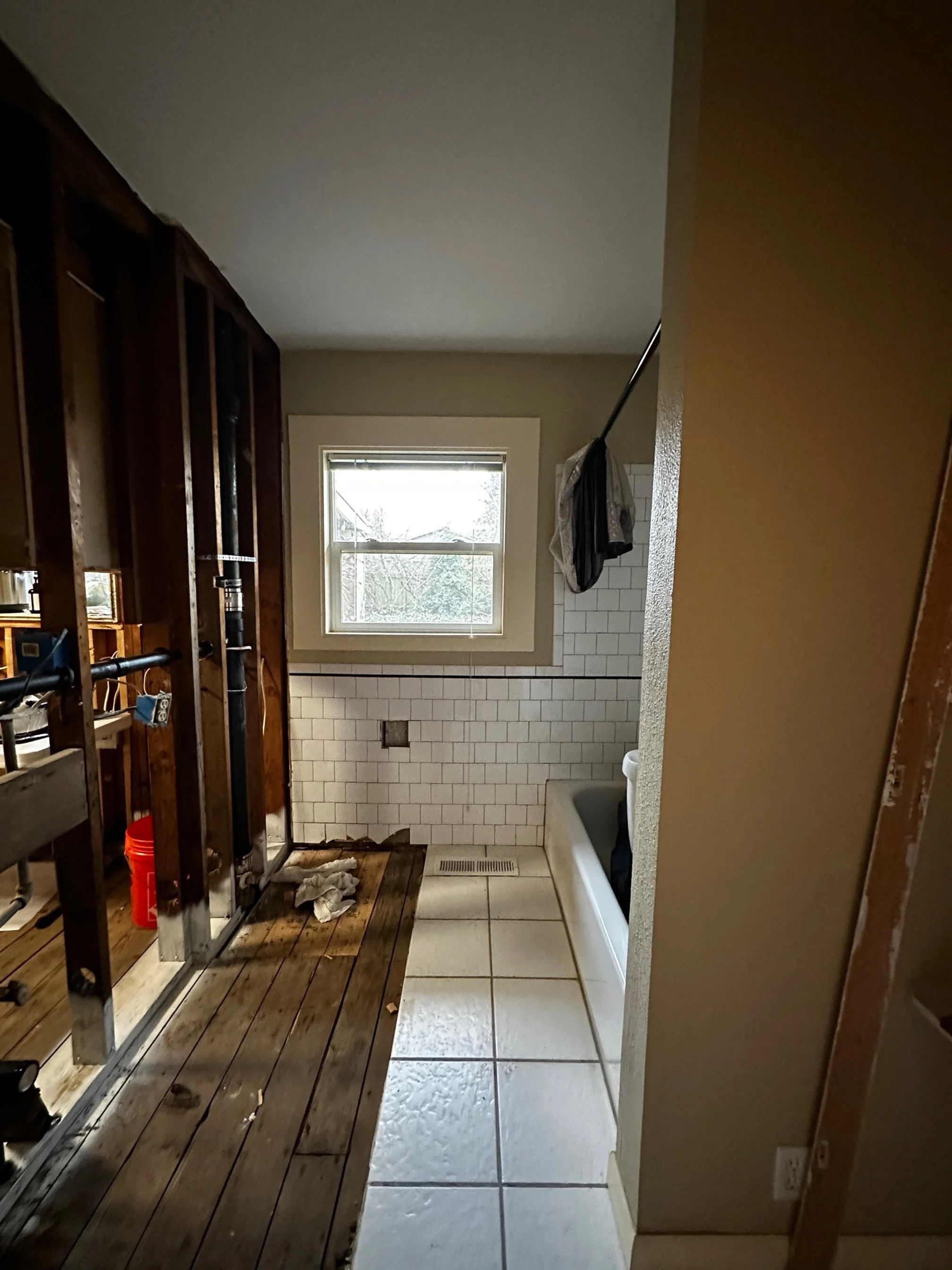
Before Photo: The acrylic tub in this bathroom was no longer a functional option. It felt outdated and, more importantly, posed a significant slipping hazard, making it an impractical and unsafe choice for a family-friendly space.
Nursery
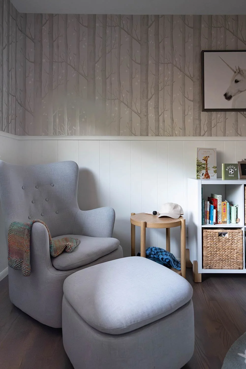
We created a darling nursery for their new baby, a cozy and neutral space inspired by the serenity of the woods. The subtle woodland theme adds a touch of whimsy without feeling overly themed, making it a space the baby can grow into.
Our favorite detail is the silvery stars scattered through the wallpaper, which catch the light just enough to bring a gentle, magical glow to the room, especially in the evening hours! Hope you enjoyed looking through this glorious Mid-Century modern remodel and that it inspires you to honor the character in your home!

