Design

Crisp & Bold Bedroom Suite Design

Originally this space was your traditional early-2000’s bedroom converted into a home office. Imagine cherry wood tones, plush beige carpeting in the bedroom, and green tiled floors, shower, and countertop in the bathroom. Needless to say, this room was in need of an update. With a dedicated home office in another part of the house, there was not a need for this space anymore, so we decided to transform it into a hotel-chic inspired guest bedroom suite.

best interior designers in Portland Oregon

A chrome four-post upholstered bed was chosen to visually raise the height of the room. Flanking oversized hanging lights bring home that hotel-chic style. The bold colors pop against a crisp white wall and taupe molding.

update bedroom design Portland Oregon

In order to add warmth to this crisp bedroom design, the trim was painted a warm taupe, gold accents were, and touches of warm jewel tones were layered throughout.

custom drapery design Portland Oregon

Classic herringbone tile flooring has a high-end custom style with layers of pattern and color around.

Carrara Marble countertop and marble mosaic tile in bathroom design

Mixing chrome and gold accents created modern interest. Because this bathroom is on the smaller side, a lighter wall colors and bright Carrara marble were chosen to maximize airiness.

brushed brass shower system with waterfall shower head

Mixing a modern wave ceramic tile with a waterfall of petal-shaped laser cut marble creates a timeless yet whimsical shower design. Bold brushed gold waterfall shower head and hand shower elevate the style perfectly.

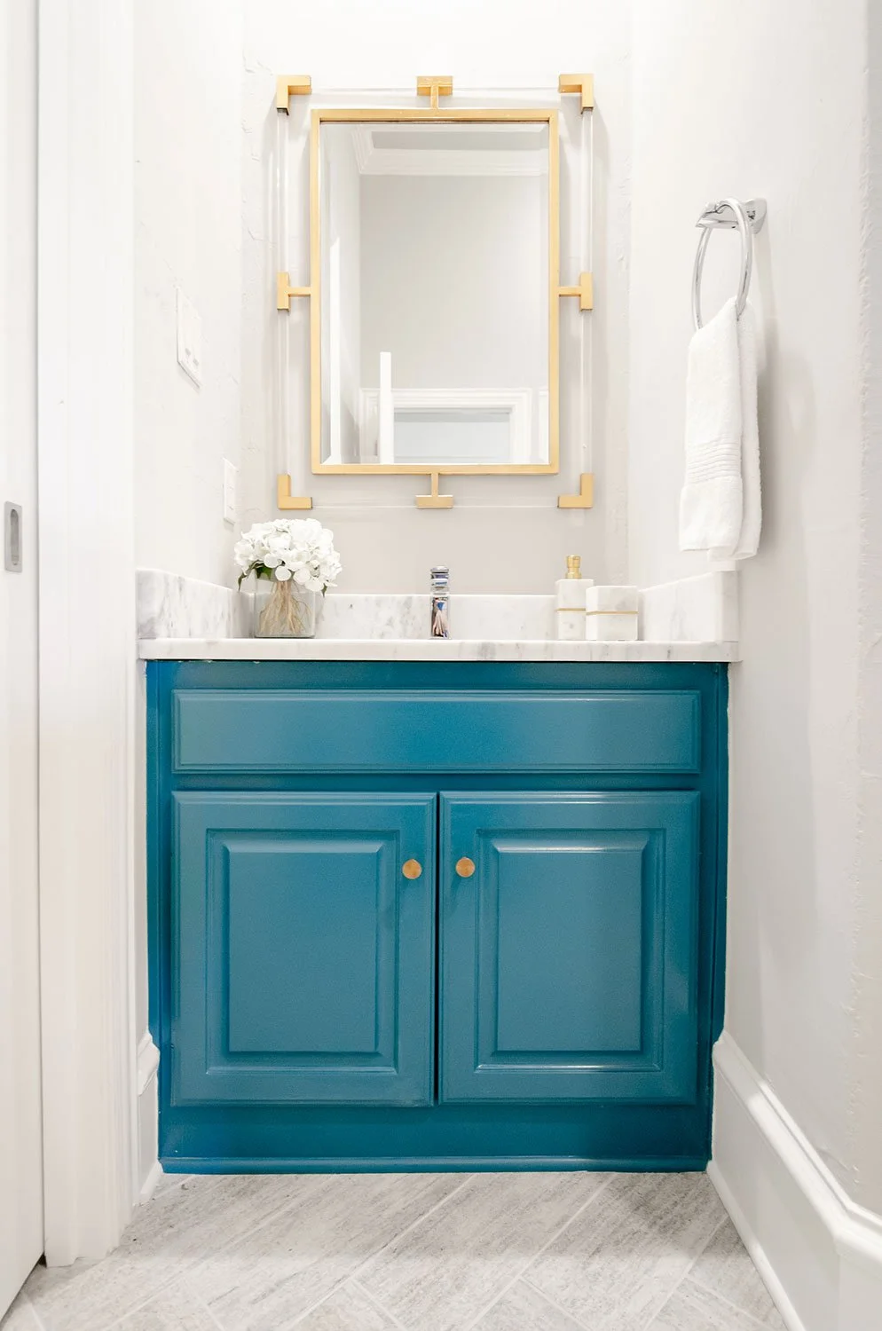
A bold teal color was chosen to seamlessly flow with the color scheme in the bedroom and add the unexpected punch of fun in this bathroom.

modern transitional bathroom design NW Hills Portland Oregon

Edgy polished chrome faucet and modern marble countertops create a cool juxtaposition in style and texture.

paint refresh on cabinetry

Simple brushed gold hardware contrast against the teal bathroom vanity. The circular shape soften the paneled door fronts of the cabinetry.

top Lake Oswego interior design firms

The colors for this bedroom started with a crisp white, a layering in of saturated jewel tone blues, and finished off with metallic accents. This truly encapsulates the hotel chic ambience.

Large pendant lights handing over nightstands

Balance and scale was artfully played with to create a completely unique and curated look.

custom furniture maker Portland Oregon

A bold turquoise color brings personality into this guest bedroom. The top is glass to keep things feeling light and airy and the bottom has storage to keep those tables, books, and other goodies guests may need during their stay. Custom gold hardware on these turquoise nightstands add a sophisticated tailored element created an understated elegance.

Modern bedroom furniture Portland Oregon

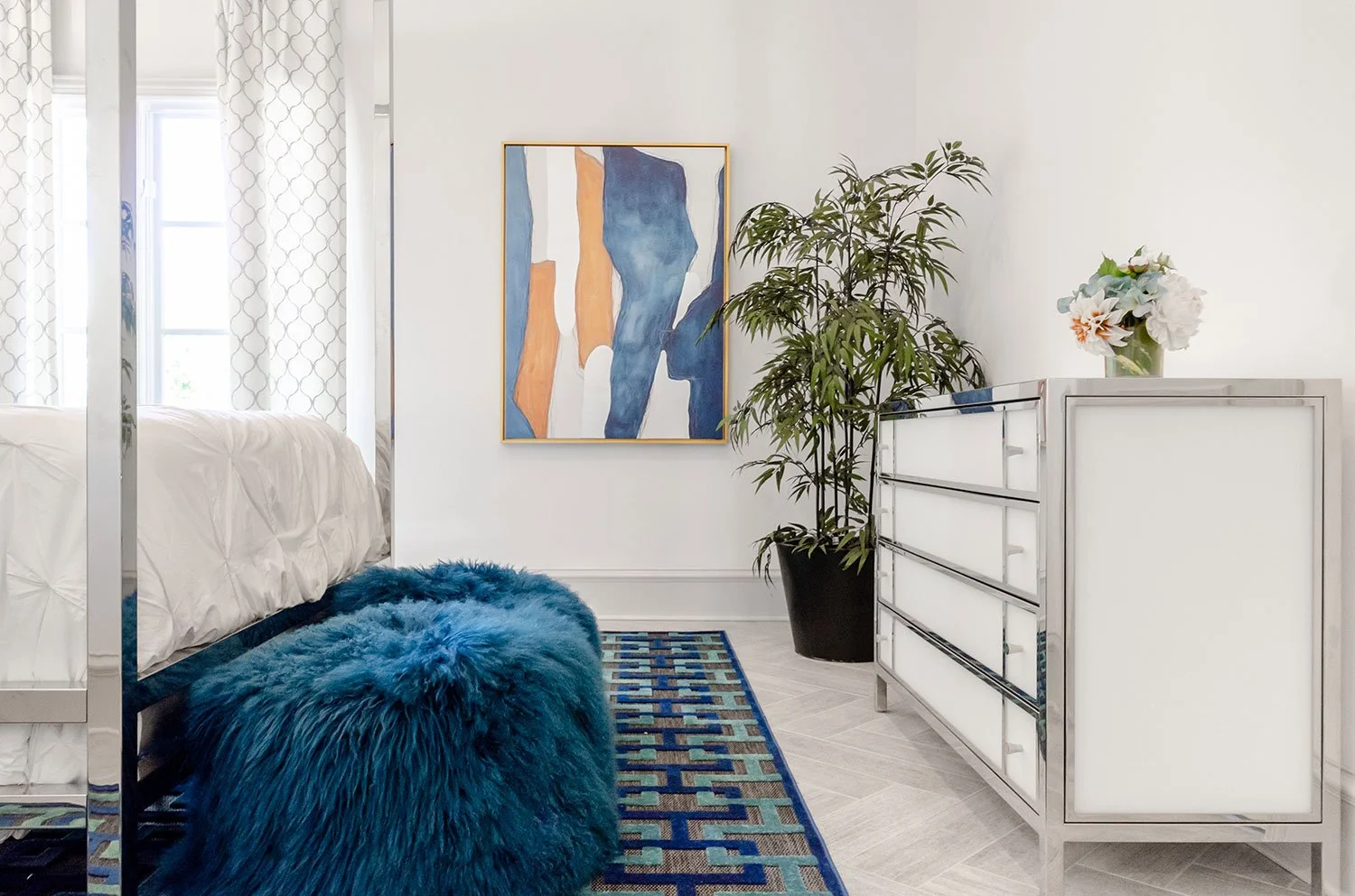
Live house plants bring life, natural color, and texture into every space. It also acts to frame this wonderful piece of modern art.

Fur pouf ottomans at the food of modern bedroom bed

Guests are surrounded in luxury with stylish elements such as white glass dresser trimmed in chrome. You can see the fantastic elongation of the tile in this photo as well.

Lake Oswego custom tailored pillows

The pillows on the bed embrace the maximalist design principal where more is more. We celebrated this in an artful way by combining mixed colors, textures, and sizes.

Modern luxurious interior design trends Portland Oregon

The shape of the oversized hanging light adds a nice softness to this bedroom suite retreat. Because the shade wraps around the edge of the drum, light is perfectly diffused to avoid harsh direct light to guests.

home staging accessories in Portland Oregon

To finish off this bedroom, we curated artistic designer cocktail table books, added modern sculptural pieces, and custom designed floral.

Spanish Contemporary Desert Home

My clients and I like to call this project “dirt-to-done". Everything in this home was a collaborative effort between the architect, client, and myself. The building process took about 18-months and was a labor of love. From the exterior in, this project has been one of the most wonderful experiences I have enjoyed. Nothing else makes me happier than being able to share this experience with everyone. I hope you enjoy the tour.

Exterior view of a Spanish style home featuring a stucco and stone exterior. Zeroscaping and drought resistant landscaping were used.

spanish style stucco camas washington custom home

Stone pavers lead guests to the front gate of this Modern Spanish Hacienda.

custom pavers leading to a wood arched front door

As you walk through the custom designed iron gates, the front interior courtyard greets you warmly.

fountain in an interior courtyard

The front courtyard was designed to remind the homeowner of her family home while growing up in Mexico.

home water fountain feature

The flowing water transports you to a tranquil place as you enter the home.

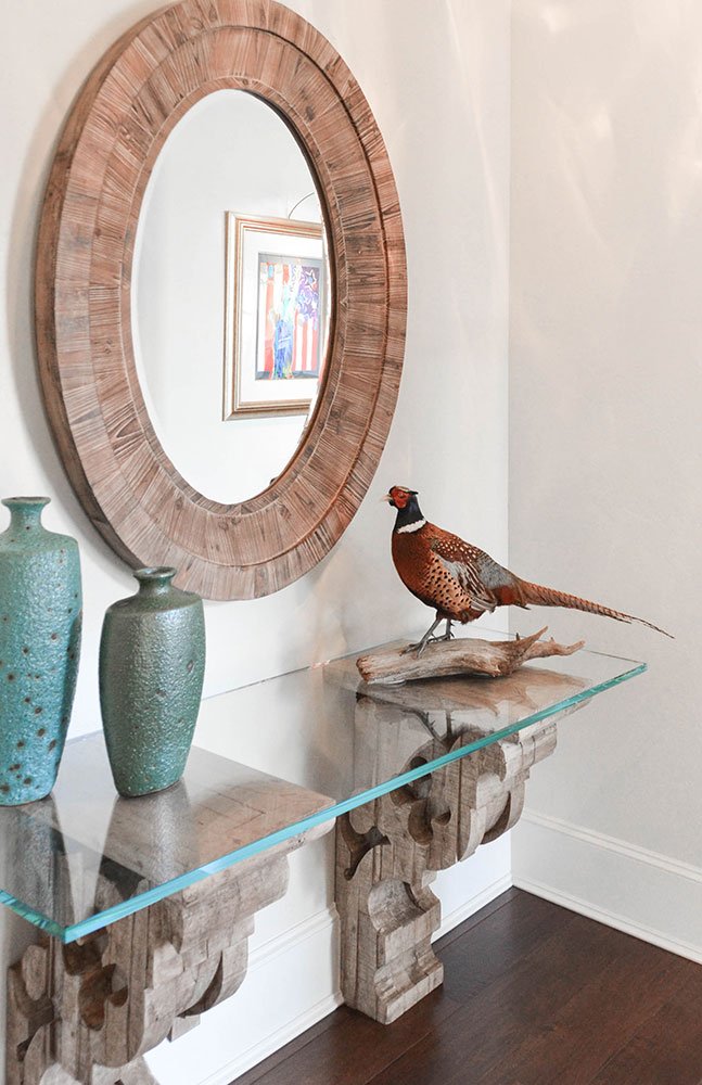
hand carved corbels console furniture

As you enter this Portland, Oregon home, the interior design is a mix of traditional antique finds and modern touches.

Transitional kitchen design Portland Oregon

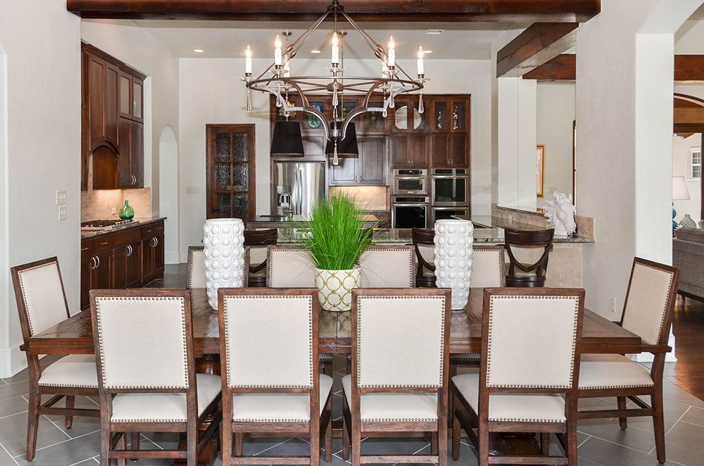
This kitchen stays true to the Spanish feel of natural wood tones. We used architectural beams to give character to the home. The kitchen remains open to the rest of the home to foster entertainment.

high end kitchen cabinets Portland Oregon

A traditional herringbone laid floor in a concrete grey color balances perfectly with the large arched doors and clean lines of the dining room entertainment area.

Portland Oregon architect and interiors

Great craftsmanship was used in this interior design through proper scale and balance. Everywhere you look is a delicate dance of traditionally classic design and modern interiors.

pair of button tufted sofas with chartreuse and blue accent color

A flame stitch pattern on the swivel chairs add interest through texture and color while warm neutral grey on other furnishings act as the perfect backdrop. The natural wood beams and coffee table are a nod to the nature seen all around Oregon.

Patterned furniture with pops of color

The living room has a focal wall of Versailles laid natural stone and a curved stucco fireplace with a hand-crafted mantle. Original native art was introduced to give this interior design more authenticity.

stone fireplace design Portland Oregon

Limestone is a traditional material to use for a fireplace surround. The basketweave pattern adds depth, texture, and dimension.

The primary bedroom has easy access to the backyard providing the homeowners with a true indoor-outdoor lifestyle. Hammer metal nightstands juxtapose with the soft tufted fabric of the headboard. Textual and colorful pillows were layered for a touch of fun.

chrome bathroom fixtures Portland Oregon

Traditional lighting was chosen for the master bathroom providing directional light for better visibility. Clerestory windows provide fantastic natural light.

mixing modern and traditional antiques Portland Oregon Interior Design

Vintage Spanish pendants are paired with a modern free standing bathtub in front of an arched shutter window.

transitional bathroom designer camas washington

Simple stone tiles are coupled with a glass mosaic waterfall in this large walk-in shower. A custom built in bamboo shower seat adds functionality while allowing smart space solutions.

colorful guest bedroom design

Spanish inlayed tile console pair perfectly with modern chartreuse nightstands and shaped wood headboard.

West Linn Oregon pool design

Backyard pool oasis under the bright blue skies. The pool is shaped to blend with the flagstone around it. The Spanish tile roof provides a great shaded seating area in the hot Oregon summer sun.

traditional outdoor furniture Vancouver Washington

Conversation circle and a wood burning outdoor fire pit provide a cozy ambiance in the evenings.

custom garage door manufacture Portland Oregon

Custom arched barn wood garage door with iron detailing and traditional outdoor lighting.

Rustic Lake House Retreat

Welcome to this lake house designed for a set of wonderful clients meant for them to create lasting memories with their family for a lifetime to come. When I started the project it was nothing but a plot of land and a set of architectural documents. From there, everything, from the exterior to the interior, was hand selected selected. My design goal was to create a light and bright modern lake house with refined rustic elements throughout. You will see a lot of features used on the outside of the house brought into the home to create continuity. Layers of whimsical touches keep each space fun and inviting. I hope you enjoy your journey through this wonderful family lake hour retreat.

lake house vacation home design portland oregon

Welcome to this lake house designed for a set of wonderful clients meant for them to create lasting memories with their family for a lifetime to come. 

casual coastal cottage furniture design

Because lake lots are expensive and small around this private lake, we wanted to make this heart of the home feel as big and open as possible. When designing an a fully open living space filled with the entry, kitchen, dining room, and family room, it is important to use clever ways of defining the spaces.

vacation home portland oregon

The base of the dining table is an x-base taupe washed wood. Indicative of that true farmhouse style. The texture of the rush seats on the dining chairs is fantastic and the metal detailing is amazing.

Rustin ameicana kitchen

We all know that everyone congregates around the kitchen and with a large family, it is important to have a kitchen that can accommodate everyone. This fantastic wrap around bar top serves multiple purposes. It is perfect for giving the homeowner more prep space, it allows all of the kids to sit around the kitchen, and it provides a serving spot for food when entertaining.

high end custom kitchen design portland oregon

This kitchen is not lacking in design. The corner range wall creates a fun feature for this home, the detailing in the bead board cabinetry add to that farmhouse country style, and the shades of white, cream, beige, and taupe make this neutral kitchen have so much interest.

reclaimed kitchen pendants

Bringing elements that remind us of the lake is important. These metal kitchen pendant lights reminded us of the metal seen on old fishing boats. The perfect detail for such a fun lake house. You can also see how we brought a touch of deep teal into the space along the painted stair railing leading up to the second floor kids area.

lillian august metal dining table

A dining room for entertaining! This zinc top farmhouse dining table is large enough to seat up to 10 guests comfortably. We decided to bring a weathered reclaimed wood chair with a gunmetal x-back for detail. Perfectly speaks to the farmhouse style. To bring a splash of color into the space, we put a flat weave rug with a touch of blue. 

lake house with a wrap around porch

From this angle you can see the fun vintage boat style light fixture. It also give you a great view of the sea foam blue and green flat weave. Another relax at the lake sign and a wall full of glass doors and windows and we are ready to enjoy lake house living.

cozy family room with cocktail ottoman

In our defined family room space, we were aware that the floor to ceiling stone fireplace would be the show stopper. We also knew that we needed to soften the harshness that comes with so much stone. To accomplish this, we decided to keep the amount of wood pieces in the space to a minimum. One of our favorite pieces in this room is the turned leg cocktail ottoman.

sofa arm with nailhead detail

The little details in the furniture throughout the space is what makes this hime special. This is an updated take on a traditional English Armed sofa. The nailhead trimming on the outside of the arm adds an understated detail we just loved. We also layered a strong stripe pattern, traditionally seen in materials by the lake, with a flame stitch patterned pillow.

stone cabin fireplace

Around this feature fireplace, we brought the stone used on the exterior of the house inside. We loved how this connected the elements to one another. We decided to build up the hearth to allow for even more seating when entertaining large groups.

natural stone countertops portland oregon

A close up of the granite countertops. Light, bright and airy. There are little veins of medium brown throughout to tie in with the hardwoods in the house.

cottage style bedroom design with sitting room

My clients wanted a primary bedroom retreat, so that is what we gave them. They wanted to keep the bedroom side muted and neutral while having the sunroom be a place of bright cheer surrounded in light. We ran bits of lavender color throughout the space to add just enough color while punching a vibrant green to bring the outdoors in.

full length mirror in bedroom

Layering neutrals in a room adds interest. Don't be afraid to mix it up with black, brown, grey, beige, and all shades in between.

sunroom design portland oregon

When looking into the sun room off the primary bedroom you can't help but feel invited to come in to enjoy a good book, gaze out of the windows into nature, or enjoy a nice cup of tea. My client is all about have a whimsical chair in every bedroom and to accomplish that in her master bedroom, we took a traditional spool chair, custom painted it a light green.

traditional painted spindle chairs

Contrast is the name of the game in this room. The camel back sofa in a crisp white linen brings an updated traditional feel to this space, while the light green spool chairs add a touch of whimsical. A set of nesting tables allows the client to move them to accommodate any seating space in the room.

house plants oregon

Some tin pots with lavender was the entire inspiration for this area of the primary bedroom. It made my client light up and smile the first time she saw it. In this photo you can also see the texture in the sofa, adding another layer of depth. I love adding pig punched in small space!

vacation house bunk bed room

Upstairs we have a bunk room with four beds for when grandkids come and stay. To add extra storage, we designed a custom build-in bunk system that has drawers under the bottom bed and storage compartments inside each step. A cleaver way to hid the toys! In the bunk room we decided to go with the classic nautical theme to spark imagination with all the kids. Ahoy matey!

rustic lake house decor

Boat shaped wall hook leading into this sweet guest bedroom.

cottage style window coverings

To play off the "Boats and Birds" theme, we chose to play with the colors of blue and yellow. The wall is Sherwin Williams Tradewinds SW6218, which is perfect for feeling like we are sailing off into the ocean. The headboard and nightstand have that shiplap planked design. We kept it light and airy with the white washed finish.

Bird art bedroom

Because these guest rooms are on the smaller side, we wanted to bring as much natural light in as we could by adding large windows. To allow the breeze off the lake to come in, we made sure the windows could slide open. Understanding the need for privacy, we installed custom roman shades in a crisp white linen material.

light green painted bedroom with pink accents

The second guest bedroom is the "Garden Room." We used a fuchsia pink and minty green combination and a fresh take on the traditional floral print fabrics to bring this room to life. The client wanted to have a space that felt comfortable for her mother when she came to visit but did not compromise on that funky and fun whimsical feel.

grandma's bedroom design

Because of the lot size, this room is a little smaller than the previous guest bedroom. We did not have room to put a traditional closet so we designed a custom wardrobe to help with our storage solution. This also crated the perfect corner to put our accent chair for guests to sit back and relax in.

SOFT TRANSITIONAL HOME

Welcome to one of my favorite projects! As you make your way through this open concept one story you will get the feeling of how comfortable and casual, yet elegant, this home is. The colors are properly bold but not overwhelming and the layered mix of all different fabrics, metals, materials and color create a truly unique home. 

PDX bright and airy dining room design

Wouldn't you want to have breakfast in this soothing and stylish kitchen dining every morning? We wanted to have a very casual, and simple yet elegant style as you make your way through the home. We have achieved this in the kitchen dining with the white washed light fixture with crystals. The crystals play very nicely off the lucite chair legs and glass top table. 

Transitional Dining Room Design

Another view into the kitchen dining room. After editing these photos I noticed the remote controls. One is for the TV and the other is for the motorized Hunter Douglas Pirouettes. You will see in a moment how open this home it. 

white dining room chairs

The detail shots of this transitional glass top dining table with gold metal base make everything feel so delicious.

open concept traditional home in portland oregon

The view form the breakfast nook shows how all of the elements in this dining nook are about to home into full view.

living room with wood beams

The view from the kitchen out is one of my favorite in the house. This really shows you just hoe open this space is. It was a fun challenge to make such an open space feel cozy and homey.

Portland Oregon interior designed family room

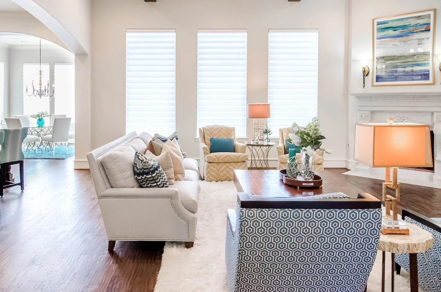
The natural light flows nicely in this space to show off the color pops around. The curved in the swivels, sofa and wood exposed chairs speak great to one another while being unique in their own right. 

Colorful living room design in Portland Oregon

WOW! I just love how soft and dynamic this room feels. It's the perfect space for entertaining. Plenty of room to pull up some extra chairs or ottamans have have a glass of wine while catching up with close friends. 

Family room with built in tv cabinet

From this angle you are able to see the fantastic window coverings from Hunter Douglas. You are also able to see how the use of gold was trickled through this room to add warmth. It plays nicely off of the yellow as well.

Large transitional home in portland oregon

Another view showing the large open floor plan. You also get a view of this great little petrified wood side table between the wood exposed chairs. Such a great little find.

view from a traditional living room into a chefs kitchen

If the TV were to look back at you this is what you would find. The way that the natural wood in the vent hood play off the wood floors and cocktail table are wonderful. We also brought a black wood on the framing of the chairs to tie in with the island and vent hood as well. Mixing woods makes for a very dynamic and visually interesting space.

built in with accessories

I love how a piece of art can inspire an entire room. This was the art I based the entire bookshelf off of. MY goal was the mix metals and colors throughout to give us a wonderfully balanced built in.

yellow zebra swivel chair

Close up on the cocktail table accessories. This is also a great view to see how the backsplash in the kitchen and the cocktail table speak to each other. 

beautiful faux floral arrangement

Another close up on the cocktail table accessories. I love the yellow zebra swivel chair in the background. So fun!

geometric pattern lounge chairs

These wood trimmed club chairs are my favorite in the house. They are so chic! The small geometric pattern adds such a great detail. It's the perfect place to sit and relax with a friend.

traditional two tier chandelier

The dining room shows off my client's funky style the best. I love how the traditional chandelier makes a statement in the middle of the space. It tiers down to the turned leg dining table and is surrounded by updated winged dining chairs. 

traditional dining room with sunburst mirrors

Because we have mixed many styles in this dining room I felt it was necessary to have elements speak to each other throughout the space. The main element is the use of gold. You will notice that the starburst mirrors flanking the china cabinet, striping on the china cabinet, nail heads on the dining chairs and centerpieces on the table are all gold. 

traditional home with many arches

When you walk into the home and look left you can see a clear line of sight to the back of the home. I love how open this space feels. You also notice how the use of color is sprinkled throughout.

Traditional dining room home decor

This is a great view showing how the china cabinet balances with the height of the window and the mass of the chandelier.

close up wing back dining room chair

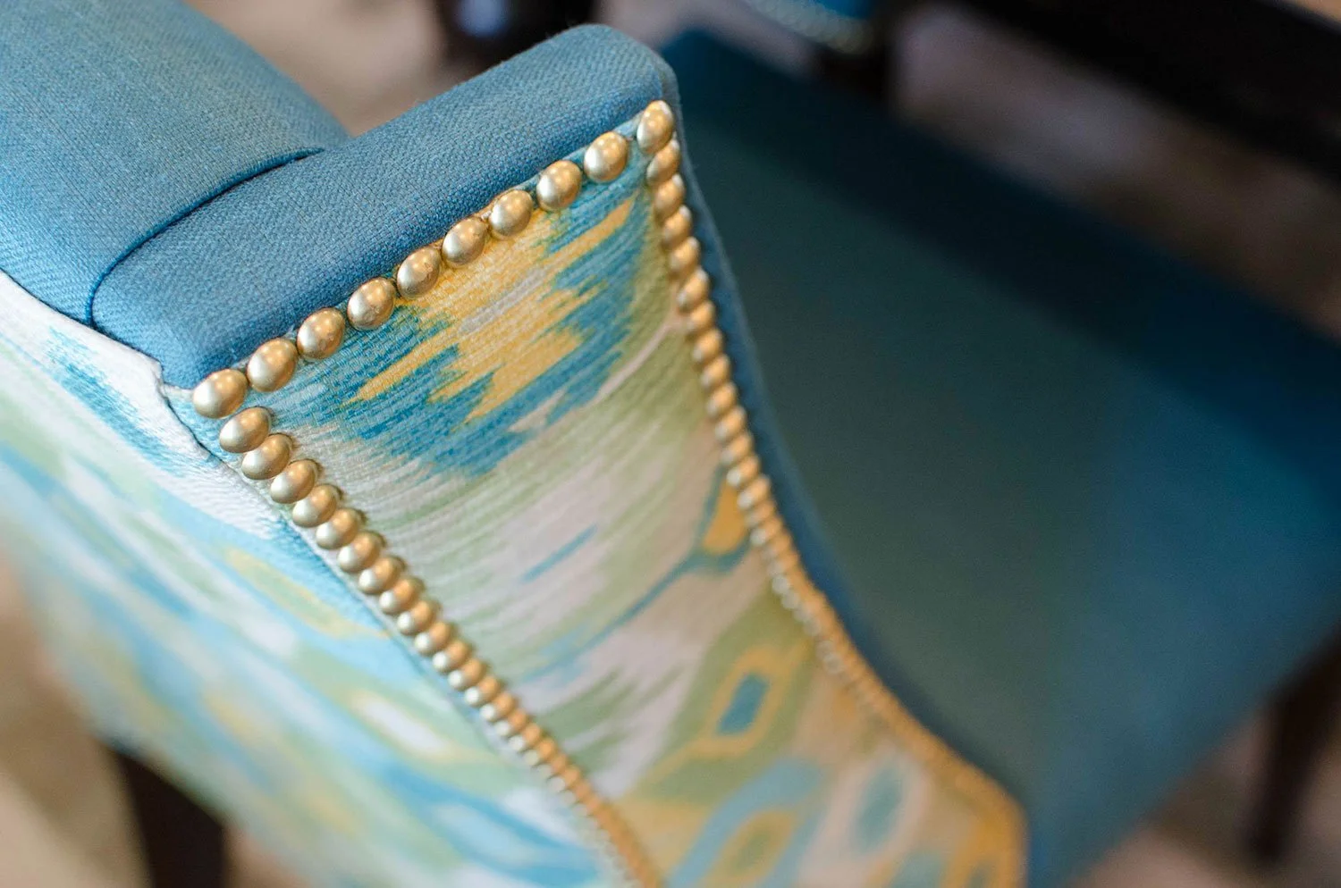
This close up shows the incredible details of this custom dining room chair. From the slight curve in the wing accented by fabulous gold nail heads to the contrasting fabric, this chairs has everything anyone could ask for.

gold starburst accessories

This modern gold sculptural dining table centerpiece adds great texture and depth to this space. 

modern entryway design

When you walk in the front door, this is what sets the stage for the entire home. What better way to say "Welcome to our Home" than with a spectacular entry. 

transitional style entry design

From the front door you can see the coordination between the multiple works of art in the space. A nice warm welcome for any guest.

white orchid on entry console

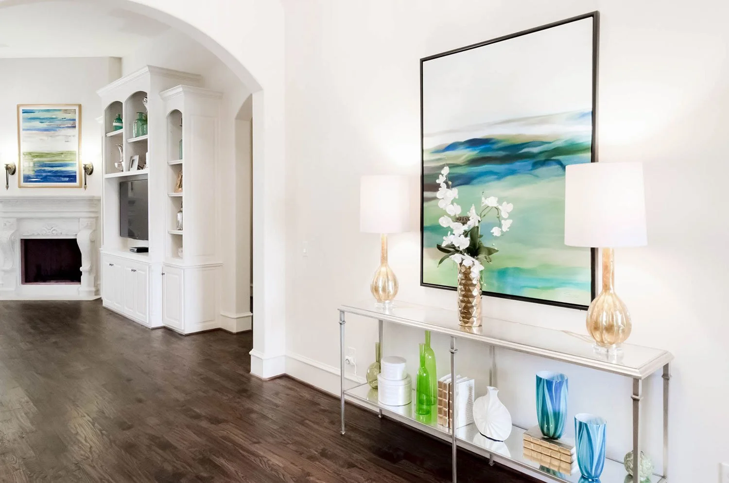
I love this intimate close up of the entry floral and art. The contrast of the white orchid off the soft blues and greens is very exciting! 

modern home decor

Close up of console accessories.

cut agate framed art

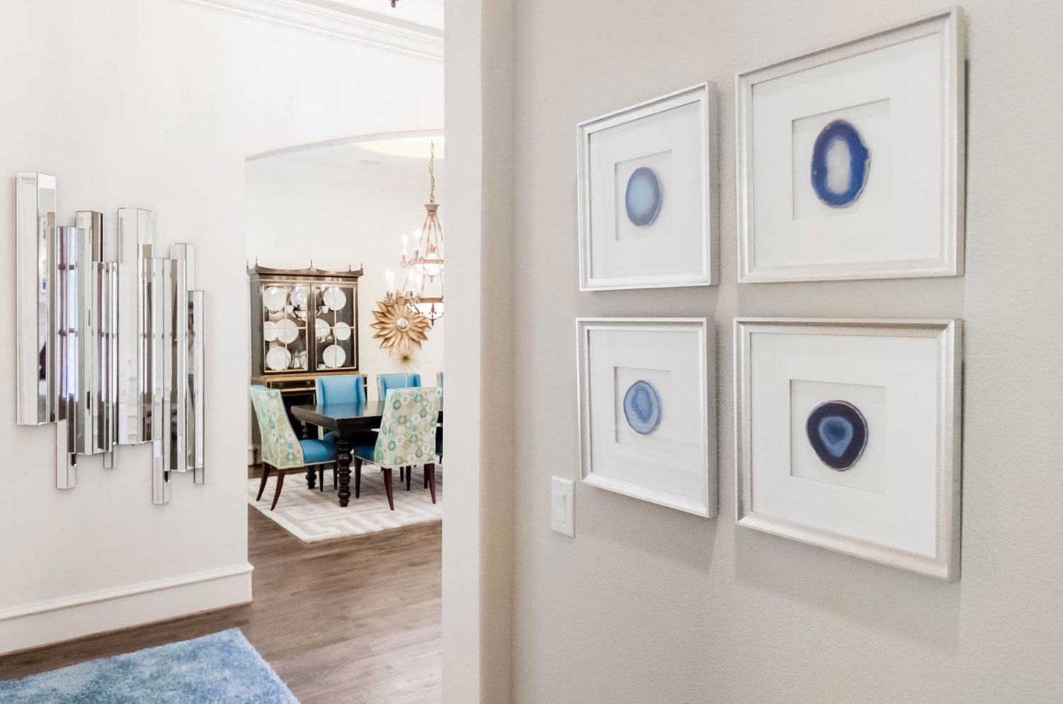
A view from the back hallway into the entry and ending in the dining room. 

high end mirrored desk

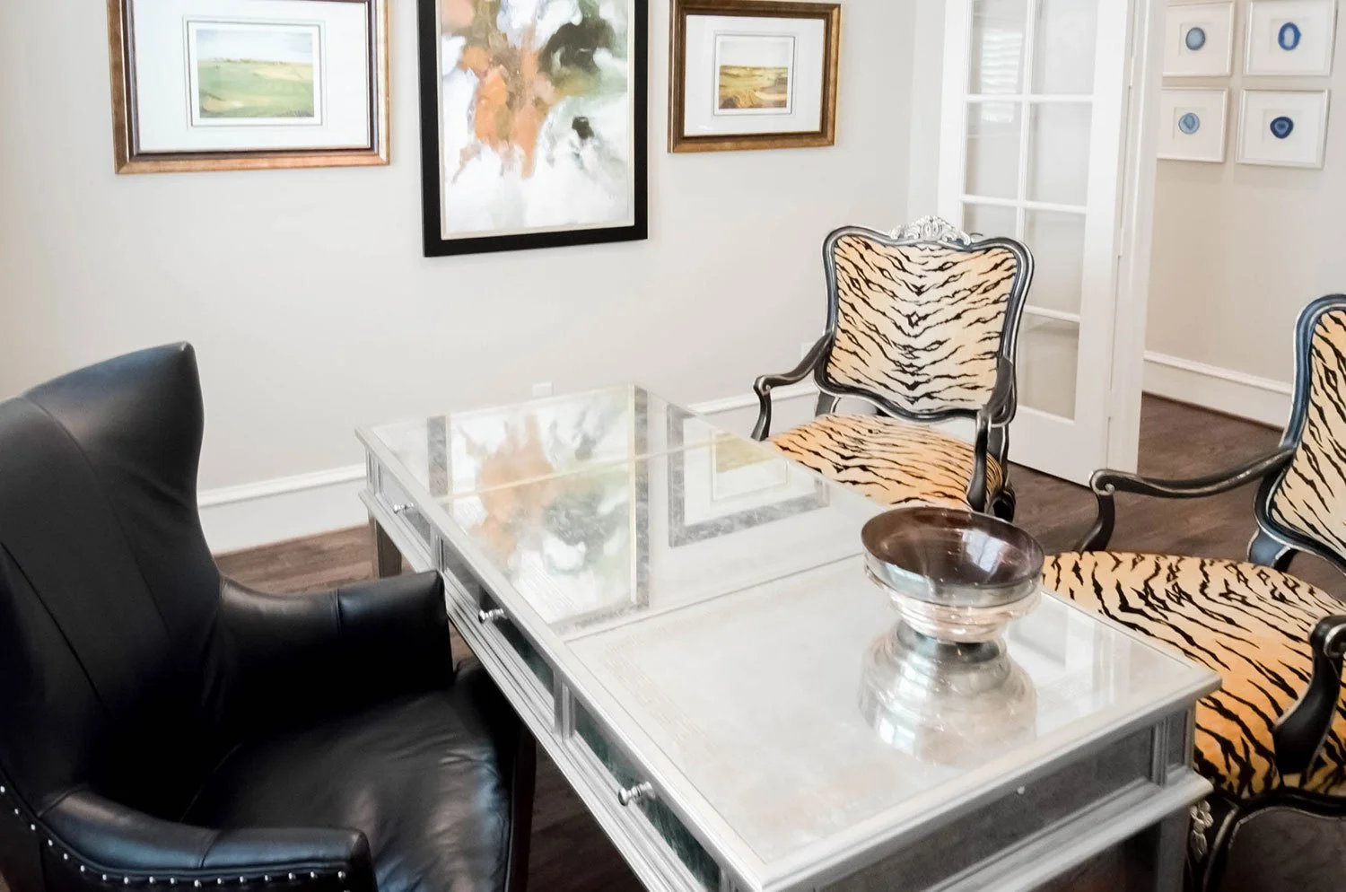
By mixing my client’s traditional tiger striped chairs with a more modern black leather office chairs and églomisé mirrored desk, we created a fresh transitional interior design.

tiger print traditional wood carved chairs

Symmetry is the name of the game with this design. I love how this interior has a lot of juxtaposition in style yet remains modern and fresh.

greek key gold inlay on mirrored desk

The detailing on this églomisé mirrored desk is breathtaking. This photo shows the gold greek key motif that contrasts with the silver leaf framing on the desk.

high end design accessories

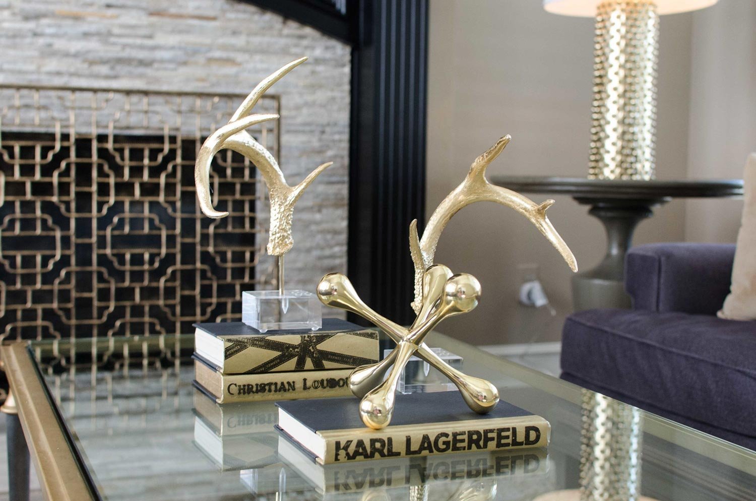
We kept the accessories in the office a blend of artistic sculpture, transitional accents, and metallic gold spine books.

high end upholstered headboard

This master bedroom is a soft blend of classic traditional and clean modern designs. From here you can see how we were able to pack a lot of punch in this room.

bed with mirrors above the nightstand

I love the symmetry in this room. By flanking the bed with unique mirrors and topping it off with a custom art piece, we were able to crate a focal point for the room.

charcoal velvet wingback chair

We were able to keep the room light and airy with this Vanguard metal framed bed and upholstered headboard and footboard and stay true to our transitional style by sprinkling in dark walnut wood tones.

best quality bedroom furniture

When walking around my client’s master chic bedroom retreat, I looked up and saw this fantastic view of her design looking back at me.

custom expensive transitional bedding

As I took a closer look, I was taken aback by the stunning custom bedding we did in this space.

silver metal base leather bench

The bench at the foot of her bed tied in all of the metallic features of the room. I love the warm charcoal leather snake skin top and the silver leaf finish on the legs. Brings a fantastic bit of texture into this design.

dark wood mahogany nightstands

These Bernhardt interiors night stands have a fantastic detailing with the inlaid contrasting wood. It brings modernization to a more traditional piece of furniture.

cabinetry hardware close up with wood inlay

A detailed shot of these night stands allows you to appreciate the great detailing work that went into them. They have a fantastic dark walnut finish, contrasting inlaid wood, and unique knobs.

nightstand decor

The mirrors over the night stands have an ode to the Greek key motif. I also love the beading detail and mirrored border to added delight.

custom luxury bedding with high end styling

The custom made bedding is a mix of light gray and charcoal hues with a touch of earthy light blue. Makes me want to dive right in for an afternoon nap!

CLASSIC, CHIC & SEXY RANCH STYLE HOME

Sexy is back in vogue and this house remodel proves it. The goal for this design was to keep it chic and keep it foxy. Other than enjoying each other's company and the cuddles of their dog kids, these clients love to entertain. We wanted to create a classic interior design that layered every neutral tone in the book. I hope you love walking through this stylish interior design as much as I loved pulling it all together.  

This is a grand formal living room dripping in style! Features a fantastic black painted wood fireplace with a deer head crowning it off. We used gold accents in a strong way to keep this space feeling classic and chic.

Painted pictures of their dogs flank the fireplace and peek over these sculptural gold lamps. A gold tone shad run connects the two sister sofa’s and plays nicely off the warm tone of the wall color.

The purpose of this space was to create an intimate space to hang out with an after dinner cocktail. Because of the soaring ceilings, we decided to set the room up with twin sofas facing each other to direct the conversation towards one another, allowing that feeling of intimacy.

Both sides of the room are also flanks with sets of large windows which allow fantastic natural light to flood in. This meant we were able to go deeper with the color choices in the room without making it feel dank and dreary.

By layer neutrals from across the spectrum, we were able to accomplish created a a dynamic space with a ton of visual interest.

The large windows allow so much natural light in lifting the vibe of the room. Having a glass top cocktail table also gave us a surface for that natural light to bounce off and great ambient glow.

The base of this cocktail table is amazing! The subtle shape of the stretchers provide just enough pattern to make this design sing.

The stark contrast from the natural tones in the trophy agains the black painted wood fireplace truly modernizes the use of taxidermy.

These gold antlers is a fun way of modernizing the use of deer in a Texas interior design. Other modern gold accents were used to bring it all together.

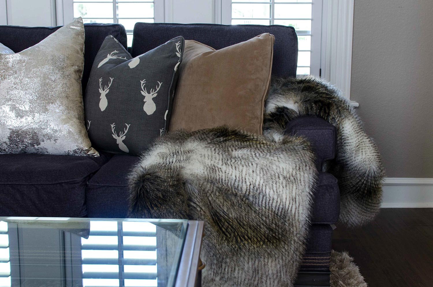
To connect with the deer head on the fireplace, we decided to use a modern silhouette of a deer on throw pillow.

I love the peek-a-boo of the detailing on the contrasting trim we did around the base of the sofa. Additionally, adding natural wood elements brings so much life into this design.

This fabulous updated stacked stone fireplace front was added to give a lot of texture and dimension. What I love most about it is the metallic flecks of copper throughout.

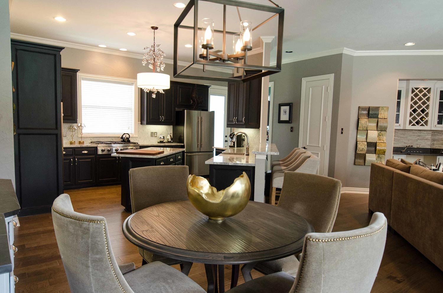
Walking into the main heart of the home is a treat for the eyes. We packed a lot into this open concept living dining, and kitchen area.

We wanted to use high end materials for this design project to make every square foot have impact. The dining chairs are made out of mohair bringing that sexy luxe flavor.

The caramel colored mohair dining chairs lined in antiqued brass nail heads in detail allow you to see how fantastic they are. The curved back is sheer perfection with this round top dining table.

The dining area has great storage with a custom build in cabinet. We highlighted the wood by painting the back black and using black marble for the counter tops.

We elevated the design of the dining rooms built in by adding a honed back marble counter top and continuing it up on to the backsplash. I also love how it allows gold accessories like this sculpture to make an impact!

Other elements in this space is the mixing of metals, which is very important when doing a layered neutral design. The dining table base and fixture are an industrial feeling oil rubbed bronze while you will see other accents in the space having gold and silver tones.

Natural colored barstools with caramel colored wood legs provide much needed extra seating for clients who love to entertain.

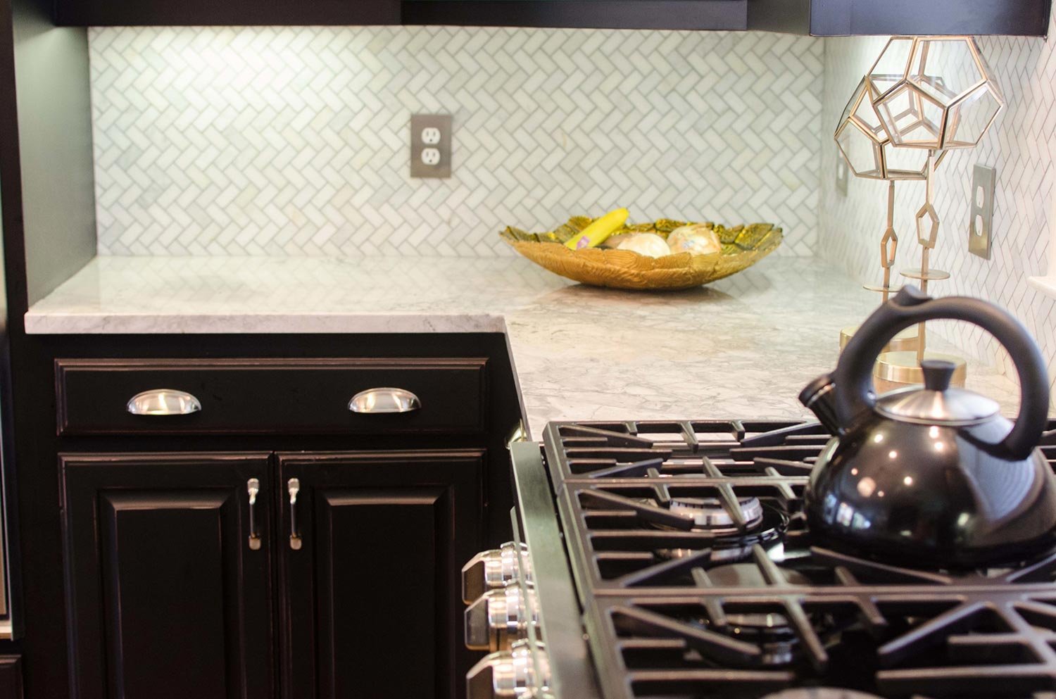
This is the epitome of a sexy classic kitchen design. We did a deep black kitchen cabinet color with classic marble for the countertops. The backsplash is chevron marble creating texture and style. An angled center island was added for extra workspace and to define the space.

Having a window above the sink lets in a lot of natural light which helps this kitchen not feel so dark. The other way we lightened the kitchen was with the contrasting white marble throughout.

This view lets us see how much of a chefs kitchen this truly is. It' was very important to be able to have a high end gas range for all of the fantastic meals that would be cooked.

Another classic element infused into this interior design was the white porcelain farmhouse apron front sink.

To create something different and unexpected, we used a chevron marble backsplash and turned it on it’s side. This helped visually raise the backsplash area and draw the eye up.

One final way we decided to help the cabinets not feel so dark was with nickel hardware. This not only contrasts well with the kitchen cabinets, it adds a classic design element.

One last look into this fabulous kitchen for appreciation. I love a good classic traditional black and white kitchen.

I love the natural variations with marble and these counter tops deliver!

We continue our tour with more layers of neutrals throughout the main living space.

When designing a living room that has an unusual shape, it’s important to fill it with the right furniture to maximize usability while maintaining an open and inviting feel. We did this by having a sectional with a chaise and a single swivel chair.

Adding to the entertaining vibe of this home is a fantastic built in dry bar with plenty of wine storage. We also left the built in tv cabinet because my client didn’t want to draw focus away from the fireplace.

The main feature of the room is this original artwork of a lounging male nude. This view has so many layers to unpack, layering everything that is sexy about this design.

A fun fact about this project is we designed the entire home around my clients favorite work of art they own. I love the vulnerability of this art and how it’s the main feature of this design.

I can’t get enough of a curated cocktail table. We brought in depth, texture, and gold to create this perfectly accessorized coffee table.

A touch of rustic elegance with the metal top coffee table brings a casual element into the space that say, “kick your feet up and relax."

We decided to keep the windows unobscured and simple add non functioning drapes to the family room. It finished the space and allowed the natural light to flow through the home.

An unexpected detail in the draperies is the oil rubbed bronze twisted metal rod. Add’s just enough traditional element without overwhelming the space. We also chose to keep it simple with a pinch pleat on the drapes.

This fabric is one of my favorites! It surprises you with a classic traditional houndstooth pattern, but layered in is an updated check.

The fireplace screen is a mixed metal traditional style layered nicely.

To leave a natural element in the room, we decided to use a natural edge stone slab for the fireplace hearth. Another fun and unique feature to this classic, chic, and sext interior.