My clients and I like to call this project “dirt-to-done". Everything in this home was a collaborative effort between the architect, client, and myself. The building process took about 18-months and was a labor of love. From the exterior in, this project has been one of the most wonderful experiences I have enjoyed. Nothing else makes me happier than being able to share this experience with everyone. I hope you enjoy the tour.
Rustic Lake House Retreat
Welcome to this lake house designed for a set of wonderful clients meant for them to create lasting memories with their family for a lifetime to come. When I started the project it was nothing but a plot of land and a set of architectural documents. From there, everything, from the exterior to the interior, was hand selected selected. My design goal was to create a light and bright modern lake house with refined rustic elements throughout. You will see a lot of features used on the outside of the house brought into the home to create continuity. Layers of whimsical touches keep each space fun and inviting. I hope you enjoy your journey through this wonderful family lake hour retreat.
Welcome to this lake house designed for a set of wonderful clients meant for them to create lasting memories with their family for a lifetime to come.
Because lake lots are expensive and small around this private lake, we wanted to make this heart of the home feel as big and open as possible. When designing an a fully open living space filled with the entry, kitchen, dining room, and family room, it is important to use clever ways of defining the spaces.
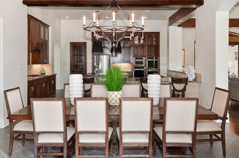
The base of the dining table is an x-base taupe washed wood. Indicative of that true farmhouse style. The texture of the rush seats on the dining chairs is fantastic and the metal detailing is amazing.
We all know that everyone congregates around the kitchen and with a large family, it is important to have a kitchen that can accommodate everyone. This fantastic wrap around bar top serves multiple purposes. It is perfect for giving the homeowner more prep space, it allows all of the kids to sit around the kitchen, and it provides a serving spot for food when entertaining.
This kitchen is not lacking in design. The corner range wall creates a fun feature for this home, the detailing in the bead board cabinetry add to that farmhouse country style, and the shades of white, cream, beige, and taupe make this neutral kitchen have so much interest.
Bringing elements that remind us of the lake is important. These metal kitchen pendant lights reminded us of the metal seen on old fishing boats. The perfect detail for such a fun lake house. You can also see how we brought a touch of deep teal into the space along the painted stair railing leading up to the second floor kids area.
A dining room for entertaining! This zinc top farmhouse dining table is large enough to seat up to 10 guests comfortably. We decided to bring a weathered reclaimed wood chair with a gunmetal x-back for detail. Perfectly speaks to the farmhouse style. To bring a splash of color into the space, we put a flat weave rug with a touch of blue.
From this angle you can see the fun vintage boat style light fixture. It also give you a great view of the sea foam blue and green flat weave. Another relax at the lake sign and a wall full of glass doors and windows and we are ready to enjoy lake house living.
In our defined family room space, we were aware that the floor to ceiling stone fireplace would be the show stopper. We also knew that we needed to soften the harshness that comes with so much stone. To accomplish this, we decided to keep the amount of wood pieces in the space to a minimum. One of our favorite pieces in this room is the turned leg cocktail ottoman.
The little details in the furniture throughout the space is what makes this hime special. This is an updated take on a traditional English Armed sofa. The nailhead trimming on the outside of the arm adds an understated detail we just loved. We also layered a strong stripe pattern, traditionally seen in materials by the lake, with a flame stitch patterned pillow.
Around this feature fireplace, we brought the stone used on the exterior of the house inside. We loved how this connected the elements to one another. We decided to build up the hearth to allow for even more seating when entertaining large groups.
A close up of the granite countertops. Light, bright and airy. There are little veins of medium brown throughout to tie in with the hardwoods in the house.
My clients wanted a primary bedroom retreat, so that is what we gave them. They wanted to keep the bedroom side muted and neutral while having the sunroom be a place of bright cheer surrounded in light. We ran bits of lavender color throughout the space to add just enough color while punching a vibrant green to bring the outdoors in.
Layering neutrals in a room adds interest. Don't be afraid to mix it up with black, brown, grey, beige, and all shades in between.
When looking into the sun room off the primary bedroom you can't help but feel invited to come in to enjoy a good book, gaze out of the windows into nature, or enjoy a nice cup of tea. My client is all about have a whimsical chair in every bedroom and to accomplish that in her master bedroom, we took a traditional spool chair, custom painted it a light green.
Contrast is the name of the game in this room. The camel back sofa in a crisp white linen brings an updated traditional feel to this space, while the light green spool chairs add a touch of whimsical. A set of nesting tables allows the client to move them to accommodate any seating space in the room.
Some tin pots with lavender was the entire inspiration for this area of the primary bedroom. It made my client light up and smile the first time she saw it. In this photo you can also see the texture in the sofa, adding another layer of depth. I love adding pig punched in small space!
Upstairs we have a bunk room with four beds for when grandkids come and stay. To add extra storage, we designed a custom build-in bunk system that has drawers under the bottom bed and storage compartments inside each step. A cleaver way to hid the toys! In the bunk room we decided to go with the classic nautical theme to spark imagination with all the kids. Ahoy matey!
Boat shaped wall hook leading into this sweet guest bedroom.
To play off the "Boats and Birds" theme, we chose to play with the colors of blue and yellow. The wall is Sherwin Williams Tradewinds SW6218, which is perfect for feeling like we are sailing off into the ocean. The headboard and nightstand have that shiplap planked design. We kept it light and airy with the white washed finish.
Because these guest rooms are on the smaller side, we wanted to bring as much natural light in as we could by adding large windows. To allow the breeze off the lake to come in, we made sure the windows could slide open. Understanding the need for privacy, we installed custom roman shades in a crisp white linen material.
The second guest bedroom is the "Garden Room." We used a fuchsia pink and minty green combination and a fresh take on the traditional floral print fabrics to bring this room to life. The client wanted to have a space that felt comfortable for her mother when she came to visit but did not compromise on that funky and fun whimsical feel.
Because of the lot size, this room is a little smaller than the previous guest bedroom. We did not have room to put a traditional closet so we designed a custom wardrobe to help with our storage solution. This also crated the perfect corner to put our accent chair for guests to sit back and relax in.
SOFT TRANSITIONAL HOME
Welcome to one of my favorite projects! As you make your way through this open concept one story you will get the feeling of how comfortable and casual, yet elegant, this home is. The colors are properly bold but not overwhelming and the layered mix of all different fabrics, metals, materials and color create a truly unique home.
Wouldn't you want to have breakfast in this soothing and stylish kitchen dining every morning? We wanted to have a very casual, and simple yet elegant style as you make your way through the home. We have achieved this in the kitchen dining with the white washed light fixture with crystals. The crystals play very nicely off the lucite chair legs and glass top table.
Another view into the kitchen dining room. After editing these photos I noticed the remote controls. One is for the TV and the other is for the motorized Hunter Douglas Pirouettes. You will see in a moment how open this home it.
The detail shots of this transitional glass top dining table with gold metal base make everything feel so delicious.
The view form the breakfast nook shows how all of the elements in this dining nook are about to home into full view.
The view from the kitchen out is one of my favorite in the house. This really shows you just hoe open this space is. It was a fun challenge to make such an open space feel cozy and homey.
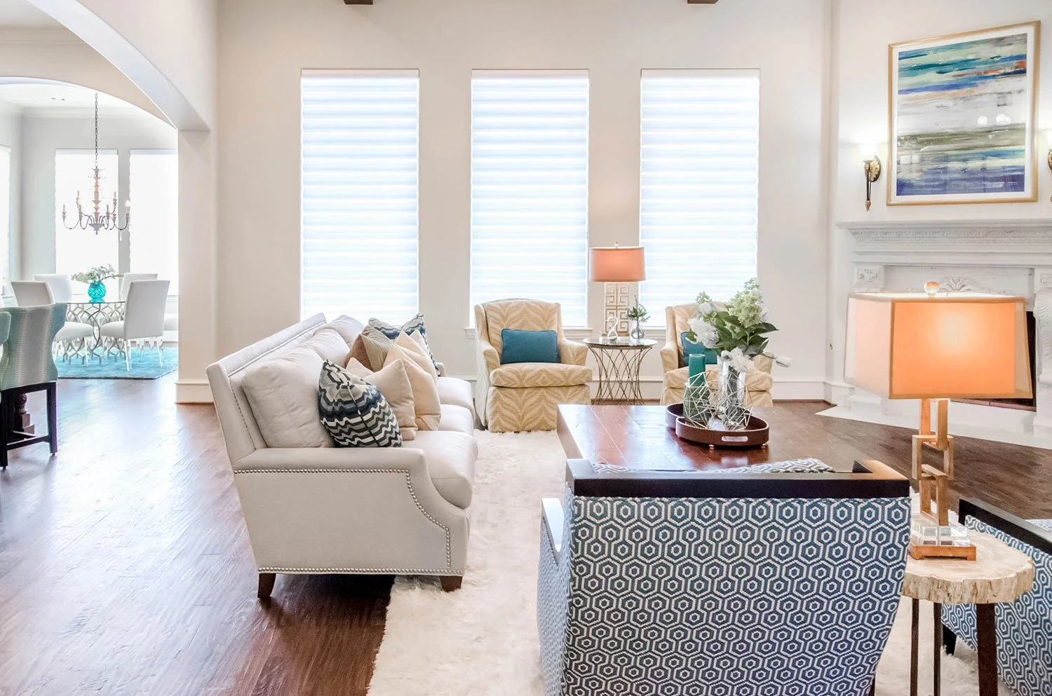
The natural light flows nicely in this space to show off the color pops around. The curved in the swivels, sofa and wood exposed chairs speak great to one another while being unique in their own right.
WOW! I just love how soft and dynamic this room feels. It's the perfect space for entertaining. Plenty of room to pull up some extra chairs or ottamans have have a glass of wine while catching up with close friends.
From this angle you are able to see the fantastic window coverings from Hunter Douglas. You are also able to see how the use of gold was trickled through this room to add warmth. It plays nicely off of the yellow as well.
Another view showing the large open floor plan. You also get a view of this great little petrified wood side table between the wood exposed chairs. Such a great little find.
If the TV were to look back at you this is what you would find. The way that the natural wood in the vent hood play off the wood floors and cocktail table are wonderful. We also brought a black wood on the framing of the chairs to tie in with the island and vent hood as well. Mixing woods makes for a very dynamic and visually interesting space.
I love how a piece of art can inspire an entire room. This was the art I based the entire bookshelf off of. MY goal was the mix metals and colors throughout to give us a wonderfully balanced built in.
Close up on the cocktail table accessories. This is also a great view to see how the backsplash in the kitchen and the cocktail table speak to each other.
Another close up on the cocktail table accessories. I love the yellow zebra swivel chair in the background. So fun!
These wood trimmed club chairs are my favorite in the house. They are so chic! The small geometric pattern adds such a great detail. It's the perfect place to sit and relax with a friend.
The dining room shows off my client's funky style the best. I love how the traditional chandelier makes a statement in the middle of the space. It tiers down to the turned leg dining table and is surrounded by updated winged dining chairs.
Because we have mixed many styles in this dining room I felt it was necessary to have elements speak to each other throughout the space. The main element is the use of gold. You will notice that the starburst mirrors flanking the china cabinet, striping on the china cabinet, nail heads on the dining chairs and centerpieces on the table are all gold.
When you walk into the home and look left you can see a clear line of sight to the back of the home. I love how open this space feels. You also notice how the use of color is sprinkled throughout.
This is a great view showing how the china cabinet balances with the height of the window and the mass of the chandelier.
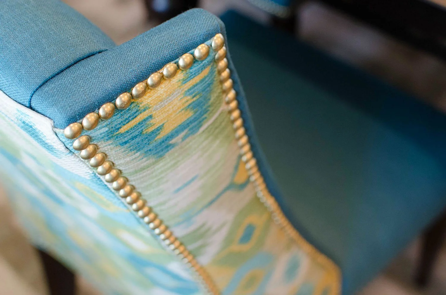
This close up shows the incredible details of this custom dining room chair. From the slight curve in the wing accented by fabulous gold nail heads to the contrasting fabric, this chairs has everything anyone could ask for.
This modern gold sculptural dining table centerpiece adds great texture and depth to this space.
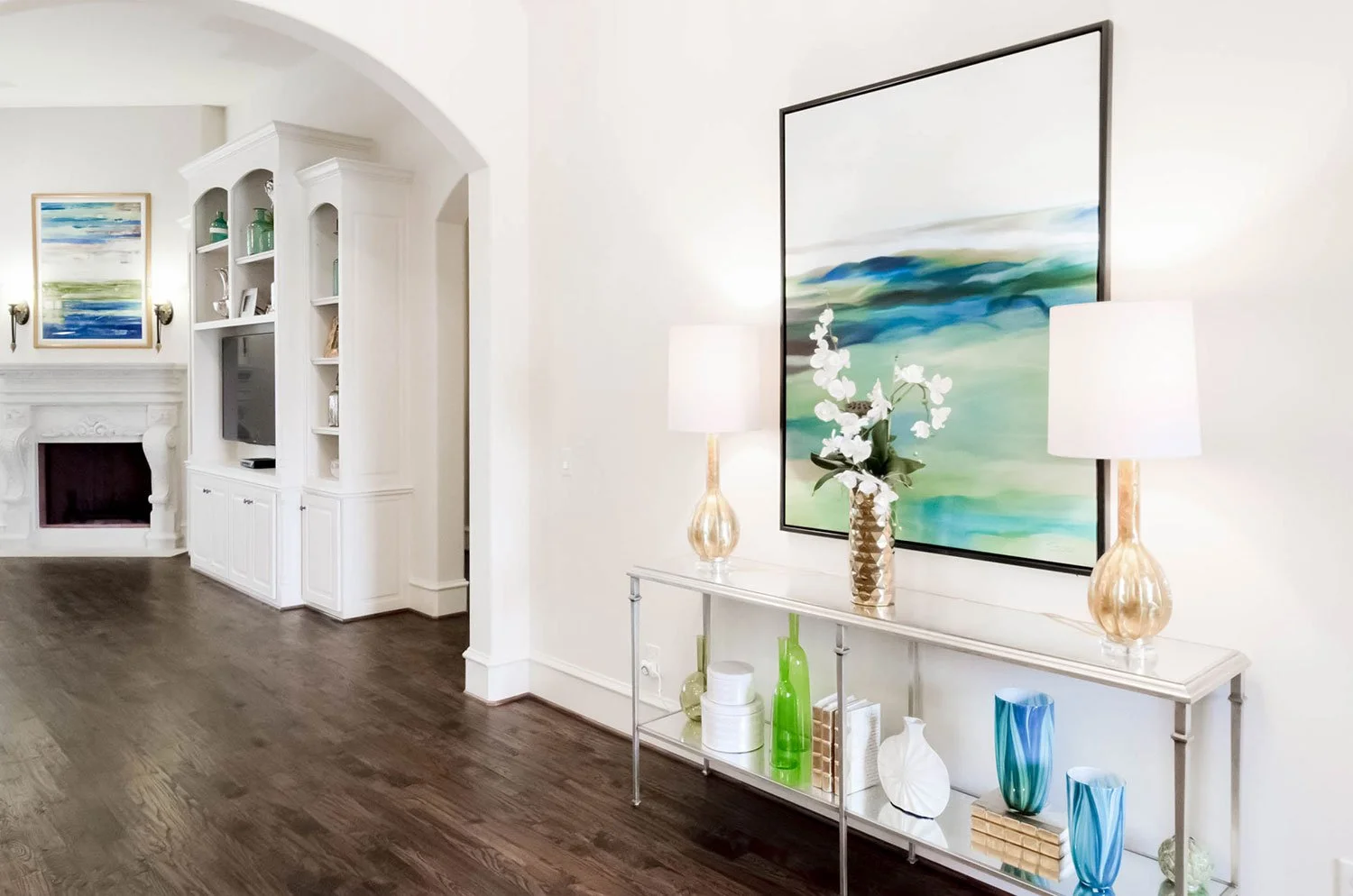
When you walk in the front door, this is what sets the stage for the entire home. What better way to say "Welcome to our Home" than with a spectacular entry.
From the front door you can see the coordination between the multiple works of art in the space. A nice warm welcome for any guest.
I love this intimate close up of the entry floral and art. The contrast of the white orchid off the soft blues and greens is very exciting!
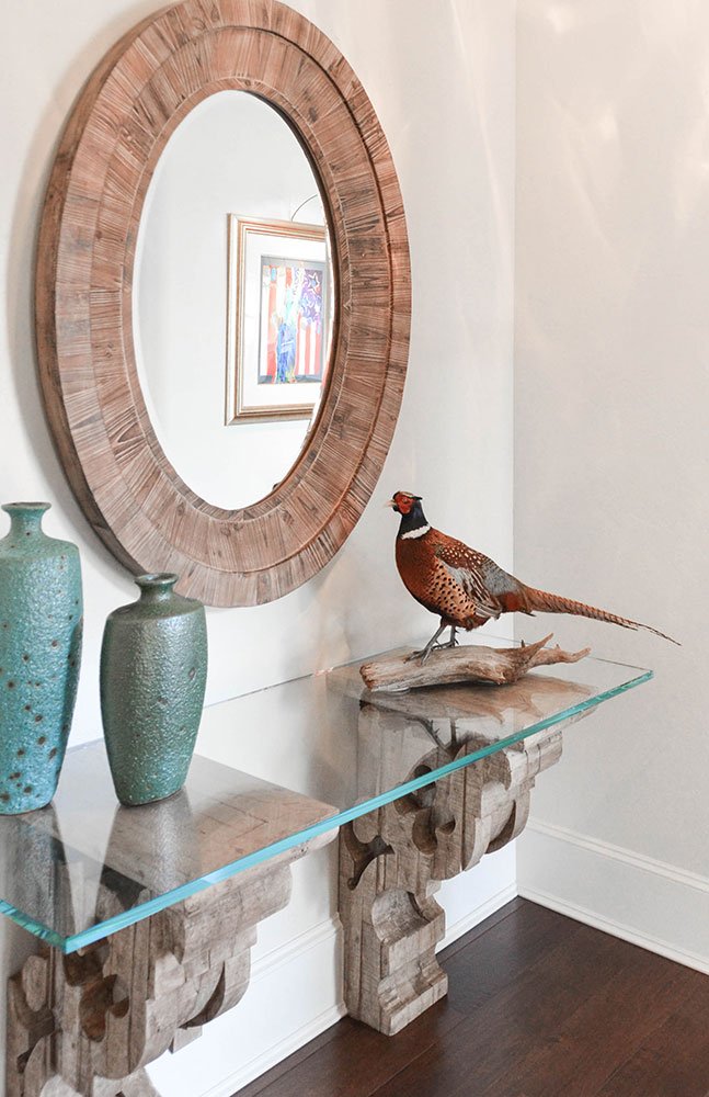
Close up of console accessories.
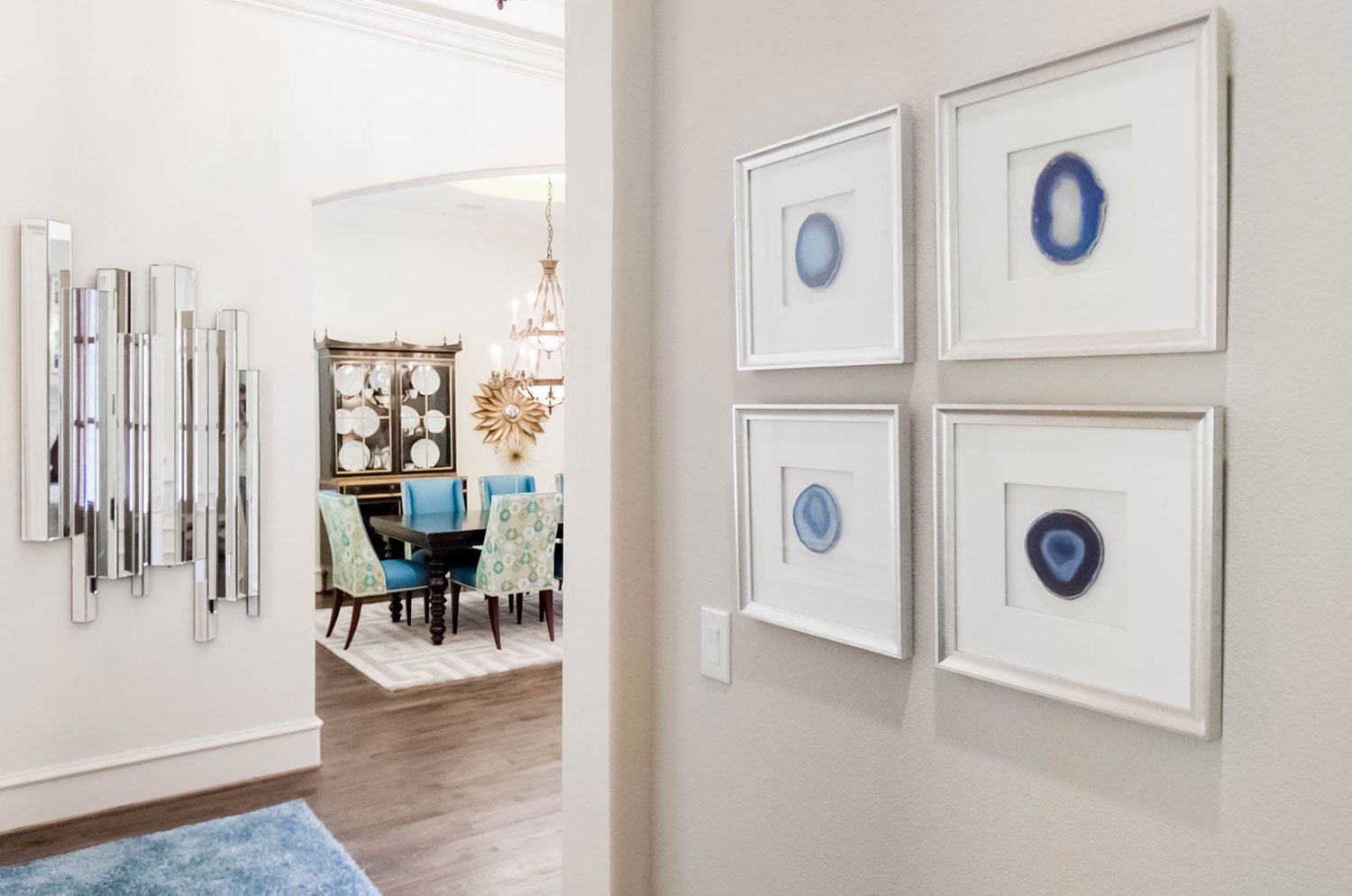
A view from the back hallway into the entry and ending in the dining room.
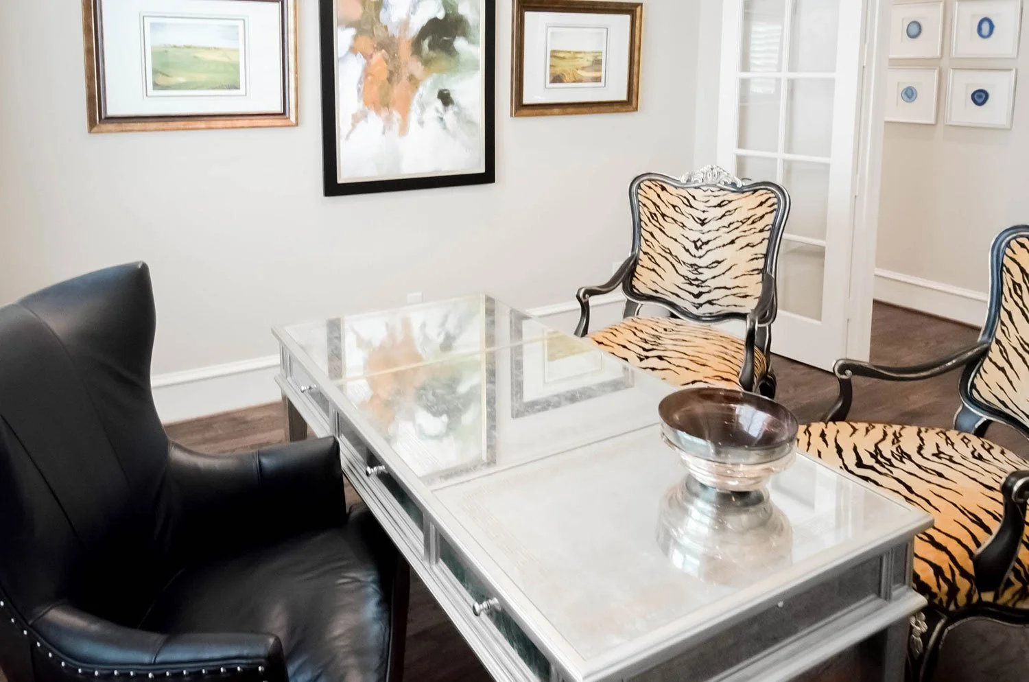
By mixing my client’s traditional tiger striped chairs with a more modern black leather office chairs and églomisé mirrored desk, we created a fresh transitional interior design.
Symmetry is the name of the game with this design. I love how this interior has a lot of juxtaposition in style yet remains modern and fresh.
The detailing on this églomisé mirrored desk is breathtaking. This photo shows the gold greek key motif that contrasts with the silver leaf framing on the desk.
We kept the accessories in the office a blend of artistic sculpture, transitional accents, and metallic gold spine books.
This master bedroom is a soft blend of classic traditional and clean modern designs. From here you can see how we were able to pack a lot of punch in this room.
I love the symmetry in this room. By flanking the bed with unique mirrors and topping it off with a custom art piece, we were able to crate a focal point for the room.
We were able to keep the room light and airy with this Vanguard metal framed bed and upholstered headboard and footboard and stay true to our transitional style by sprinkling in dark walnut wood tones.
When walking around my client’s master chic bedroom retreat, I looked up and saw this fantastic view of her design looking back at me.
As I took a closer look, I was taken aback by the stunning custom bedding we did in this space.
The bench at the foot of her bed tied in all of the metallic features of the room. I love the warm charcoal leather snake skin top and the silver leaf finish on the legs. Brings a fantastic bit of texture into this design.
These Bernhardt interiors night stands have a fantastic detailing with the inlaid contrasting wood. It brings modernization to a more traditional piece of furniture.
A detailed shot of these night stands allows you to appreciate the great detailing work that went into them. They have a fantastic dark walnut finish, contrasting inlaid wood, and unique knobs.
The mirrors over the night stands have an ode to the Greek key motif. I also love the beading detail and mirrored border to added delight.
The custom made bedding is a mix of light gray and charcoal hues with a touch of earthy light blue. Makes me want to dive right in for an afternoon nap!
Modern Global Living Room Designs
This design project is the perfect example of sprucing up an outdated space. My client had a lot of her own outdated pieces of antique furniture that simply needed to be reupholstered, space planned, and funked up with some color! Infusing a few additional updated elements make this space feel eclectic, global, and fun!