There is a real resurgence of downtown living. People are wanting the ease of walking out of their front door and having everything at their fingertips, which is one of the reason why we moved to Portland, Oregon. To celebrate this shift in lifestyle preferences, I wanted to revisit a previous project of mine. I feel like this client was ahead of the curve with an urban active lifestyle and it has payed off greatly.
Welcome this downtown loft with a great open floor plan. We created separate seating areas to create intimacy and comfort in this family room. The light bamboo floors keep everything light and bright while still having a great modern feel. The furniture, fixtures, and accents mix mid-century modern, transitional, and punches of glam. I hope you enjoy exploring a project I am still proud of to this day.
Immediately as you walk through the front door we wanted to have that grand entrance feel even though you are stepping into a condo. The first thing you notice is how the light is bouncing around the room making everything feel brighter. The entrance is setting the tone for the entire style of this home; mid-century modern glam.
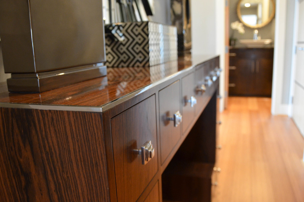
A close up showing the detail in the console. I am in love with the fantastic chrome trimming and perfectly art deco hardware. The square lines play nicely off of the form of the mirror. This is the perfect way to welcome guests!
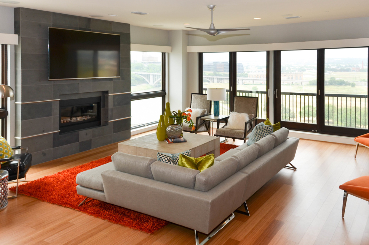
I love how the natural light from the wall of windows floods into the family room highlighting the original style of the homeowner. The crowning jewel is the unique design for the fireplace. Strips of chrome were inlayed between the tile creating visual interest and style.
Behind the main sitting area, we put a desk workspace flanked with extra seating. You are also able to get a great view of the modern barn doors that add such a great classic loft touch.
This angle allows you to get a better look at our design in the family room. We anchored the room with an orange shag rug as a nod to the carpeting popular in the 1960s & 70s. We then layered neutral furniture pieces on top as a visual break in color. Then we sprinkled more color in with green and turquoise throw pillows.
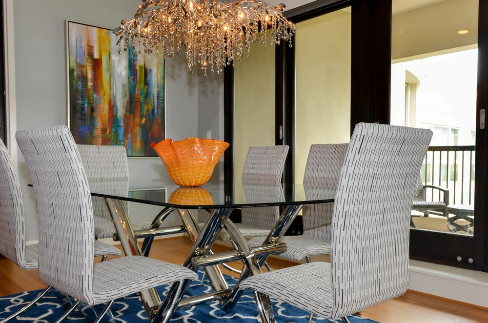
We built the dining room around the light fixture the homeowner found and fell in love with. Because it has a little glam undertone, we decided to use modern chrome accents to tie in everything. Color is brought in with this fantastic abstract cityscape artwork.
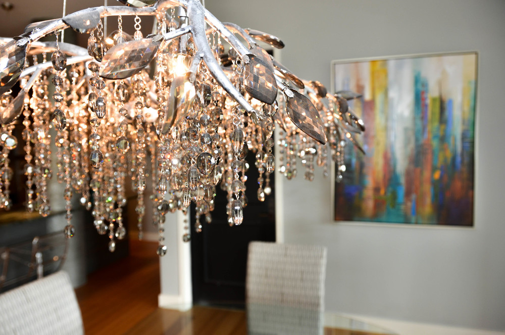
A close up of this show stopping dining chandelier. It’s a chrome faux bios center with large crystal leaves attached. It’s then dripping in smaller crystals giving you the illusion of falling leaves or morning dew.
To create juxtaposition with the kitchen island pendants, we decided to use a streamline modern style. This minimalistic approach works beautifully.
These clients love to entertain so we wanted to maximize seating for the kitchen counter top without taking away from the nickel inlayed design element running along the bar front. These acrylic chairs were the perfect solution.
The support columns for the building were your traditional style painted posts. In order to update them to the client’s style, we wrapped them in a metallic concrete paper to give them that luxe industrial vibe.
We wrapped the countertops around the post and extended them beyond, giving the illution of a much larger kitchen. It also provided a lot more space to set things out when entertaining. To crown off this end of the kitchen, we selected this large scale exciting abstract artwork.
My client's master bedroom took on a more transitional look while still having the mid-century modern elements throughout. We added an exciting orange and white color scheme and accented with a touch of green and blue. The curved mid-century modern stools at the end of the bed are a great place to sit and take off your shoes. They also add and more natural element to the space. The Hunter Douglas roller shades are a great way to diffuse light and soften the room.
A close-up view of the bedding in this space shows how we did a fun layering of white and orange bedding. It has a crisp contrast which is very refreshing. Mixing in gold frames on the artwork gave us a nod to the 1960’s gold used in mid-century design.
Detailed view of the demilune dresser highlight the classic zebra wood surround, inlayed chrome border, and blackened crocodile skin body. I cannot get enough of the chic details in this room.
Give me the drama! I love how bold we went with the materials in this master bathroom. It has a great hotel feel. A view into this bathroom mirror sheds the perfect light on this design.
Take a peek inside this stylish upscale master shower. Strong linear tiles mixed with ribbons of glossy black elongated subway tiles bring the sexy into this remodel.
This client works from home, so it was important to create a fun space for her to enjoy. As an avid biker, we wanted to brink that element into her space. By taking bike wheels and attaching them to the wall we created a unique and modern personalized piece of sculptural wall art.
We made sure to have wheels with chrome and black as to play nicely off the desk and abstract art. This would be an easy DIY project for you to try out! :-)
For guests we wanted to give them a more modern "W Hotel" feel when staying over. It was important for us to give them a multi-use room which includes a fabulous silver metallic tone on tone chairs in the corner for reading. To continue the biking theme, we punch a colorful abstract bike art series above the low-profile bed.
By weaving in earthier tones with the carpet and wooden doors, we kept this space feel warm and not to stark. Here is a close up of the fabulous silver metallic tone on tone chairs in the corner for reading. We love how the glamor play off of the natural two toned striped closet doors. The dark side table tied in with the striping in the door as well.
We wanted to create a warm and inviting entrance just outside of the condo's front door. Our goal was to let neighbors and visitors know what to expect before walking through the front door. This mid-century inspired vintage burl wood entrance table is couples with more modern/eclectic style accessories and topped off with a unique woven paper framed piece of art.
Thanks for walking through this project of mine. I hope you enjoyed yourself! Let me know what you think.


