Blog

Work-Life Balance in the PNW

Work-Life Balance in the PNW

Work–life balance is essential to how we live, function, and feel our best as humans. We all need spaces that remind us life isn’t just about working nonstop, but about finding meaning, comfort, and moments of enjoyment outside of our day-to-day responsibilities. This apartment community we renovated in downtown Seattle is a great example of how thoughtful design can truly prioritize quality of life. From expansive rooftop living and inviting social spaces to a well-designed gym and a comfortable, welcoming leasing office, every amenity is intentionally crafted to support both productivity and restoration. The result is a community that feels less like a place you simply live, and more like a place that actively supports the way you want to live.
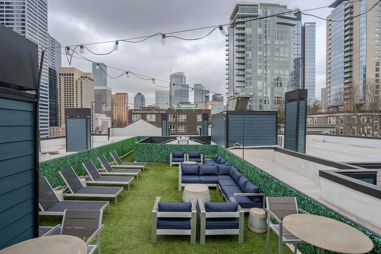

Outdoor living design and patio spacing

The outdoor spaces feel like an elevated extension of city living, designed to be both social and serene. Low-profile lounge seating is arranged to encourage gathering, conversation, and long, relaxed afternoons. The deep navy cushions paired with clean-lined metal frames strike a modern note, while the greenery wrapping the perimeter softens the space and creates a sense of privacy high above the street.
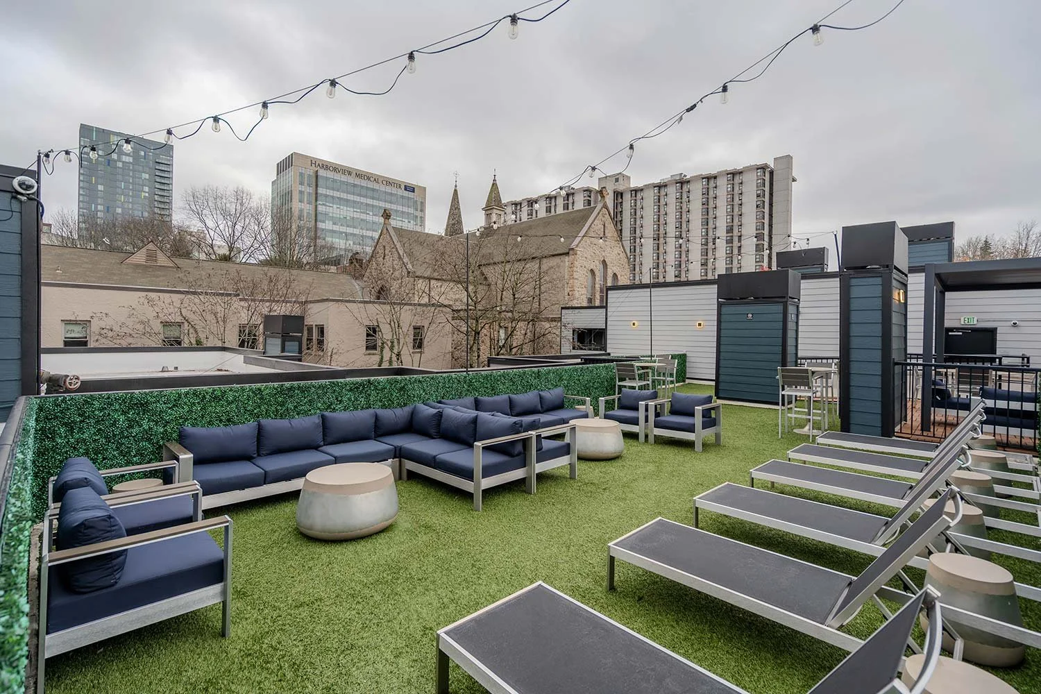
Sunbathing spot in outdoor living area

String lights overhead add a subtle glow that transforms the rooftop from day to night with ease. As the sky shifts, the atmosphere becomes warmer and more intimate, making this space just as inviting for evening hangs as it is for sunny weekend lounging. It’s the kind of lighting that makes everything feel a little more magical without trying too hard.
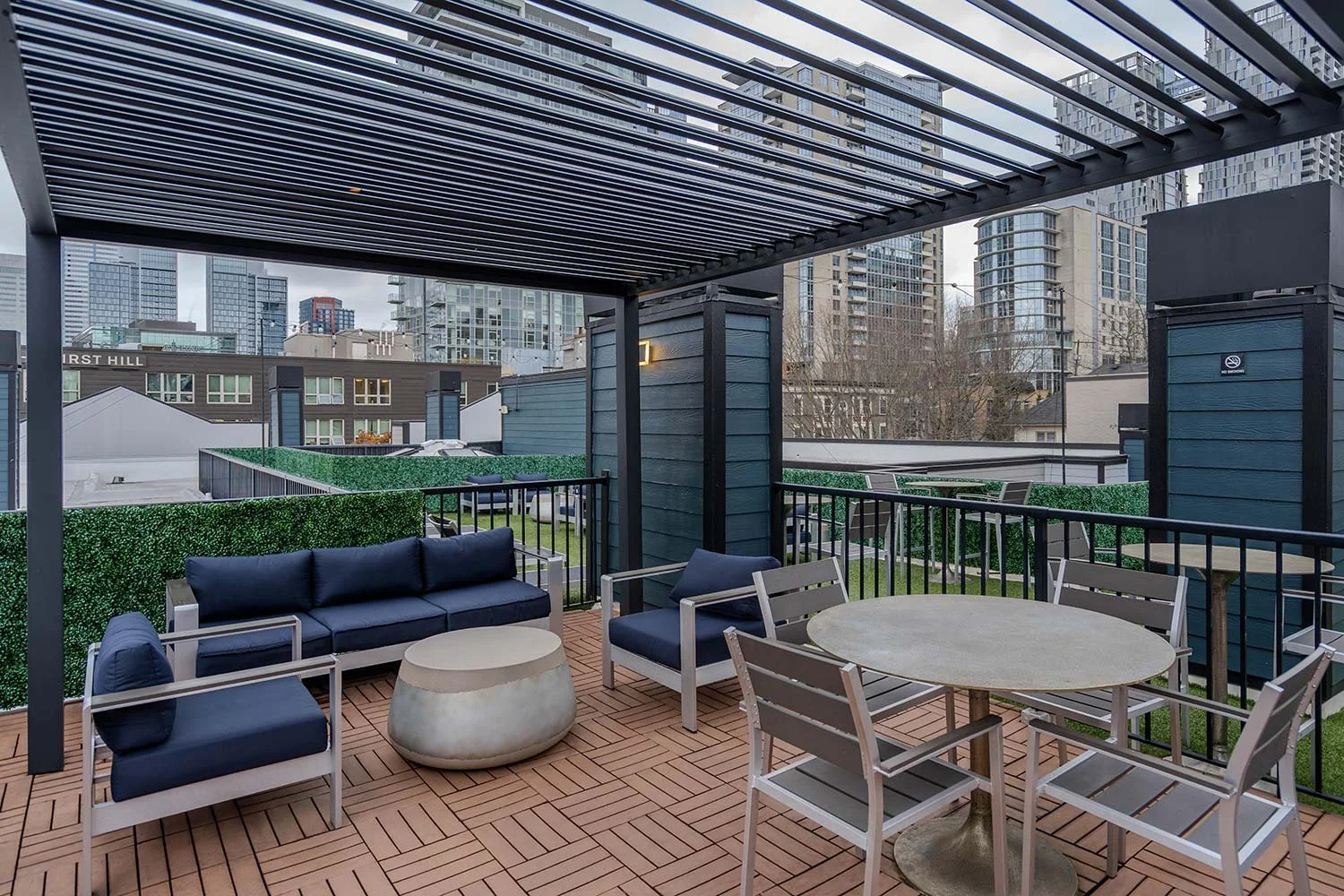
Round dining table and rounded coffee table

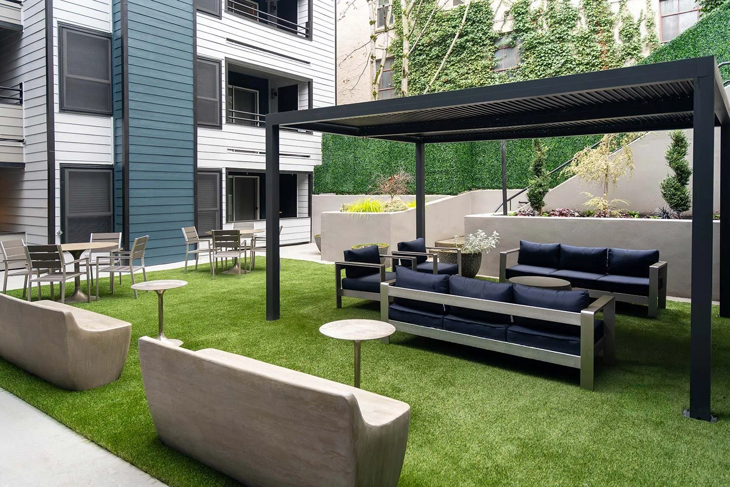
A covered pergola anchors another section of the rooftop, offering a shaded retreat that still feels open and connected to the skyline. Beneath it, dining tables and lounge seating create the perfect spot for shared meals, work-from-home breaks, or evening dinners with friends. The architectural lines of the pergola bring a strong, modern presence that balances beautifully with the softer elements around it.
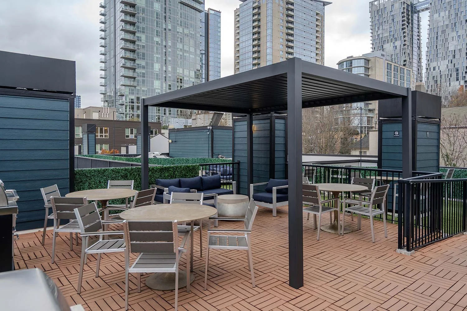
Unique outdoor living area done by interior designer.

What really makes these outdoor areas special is the way they frame the city. Surrounded by urban views, the spaces feel energetic yet thoughtfully composed, giving residents a front-row seat to the skyline without sacrificing comfort. It’s a rooftop designed to be lived in, not just looked at.
Unique seating for outdoor area.

The mix of open-air lounging and structured zones gives the rooftop great flexibility. Whether you want to stretch out on a chaise, gather around a coffee table, or pull chairs together for a casual meetup, the layout supports it all. The artificial turf underfoot keeps things low-maintenance while adding a fresh, playful texture that contrasts nicely with the sleek furnishings.
Green and blue apartment building.

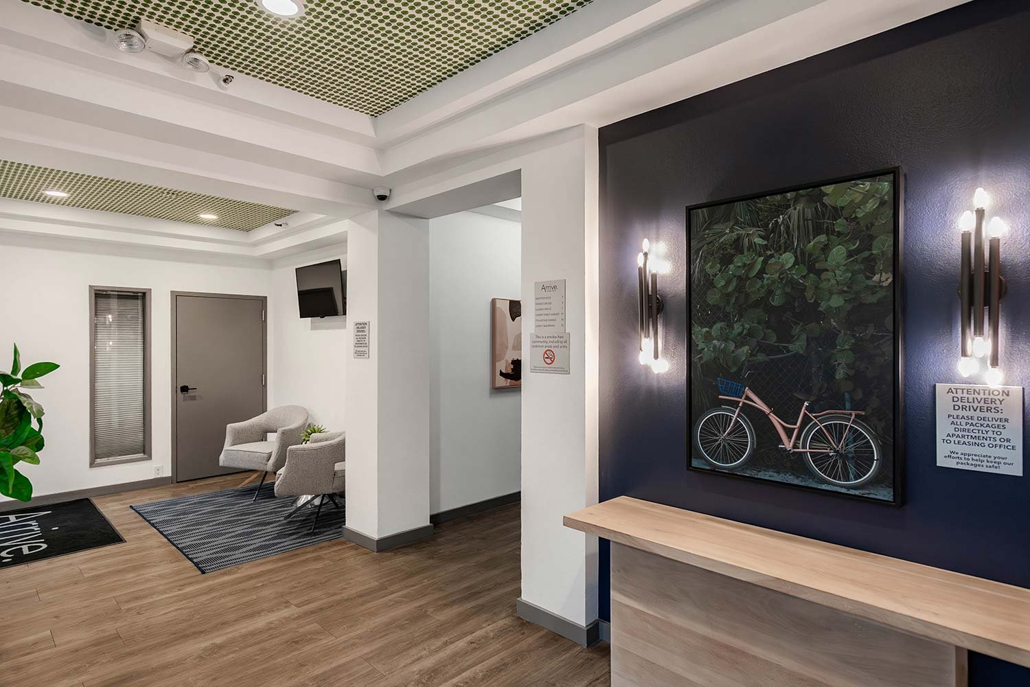
The leasing office carries that same polished, welcoming energy indoors. A rich, moody blue accent wall sets the tone, creating an instant sense of warmth and intention as you enter. Clean-lined furniture, soft textures, and thoughtful lighting make the space feel calm and approachable, while still feeling elevated and professional.
Commercial wallpaper for apartment building.

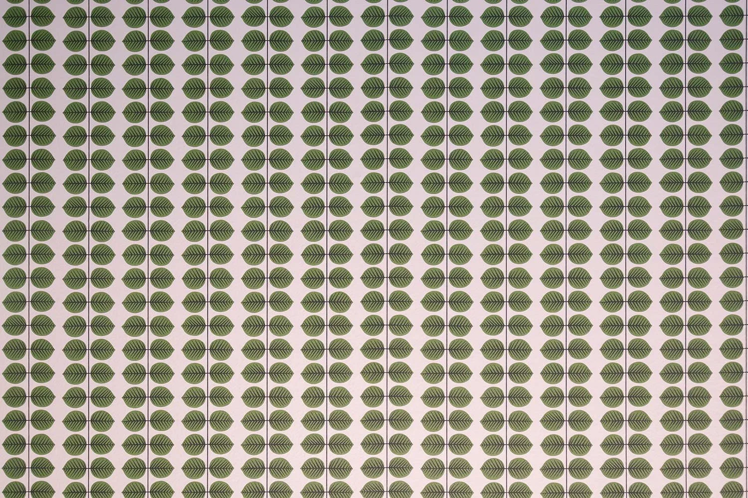
The ceiling wallpaper in the leasing office is an unexpected and playful design moment that completely transforms the space. By drawing the eye upward, it adds depth, texture, and personality in a way that feels bold yet refined. It’s a subtle surprise that reinforces the attention to detail throughout the building and proves that great design doesn’t stop at eye level.
Apartment leasing office.

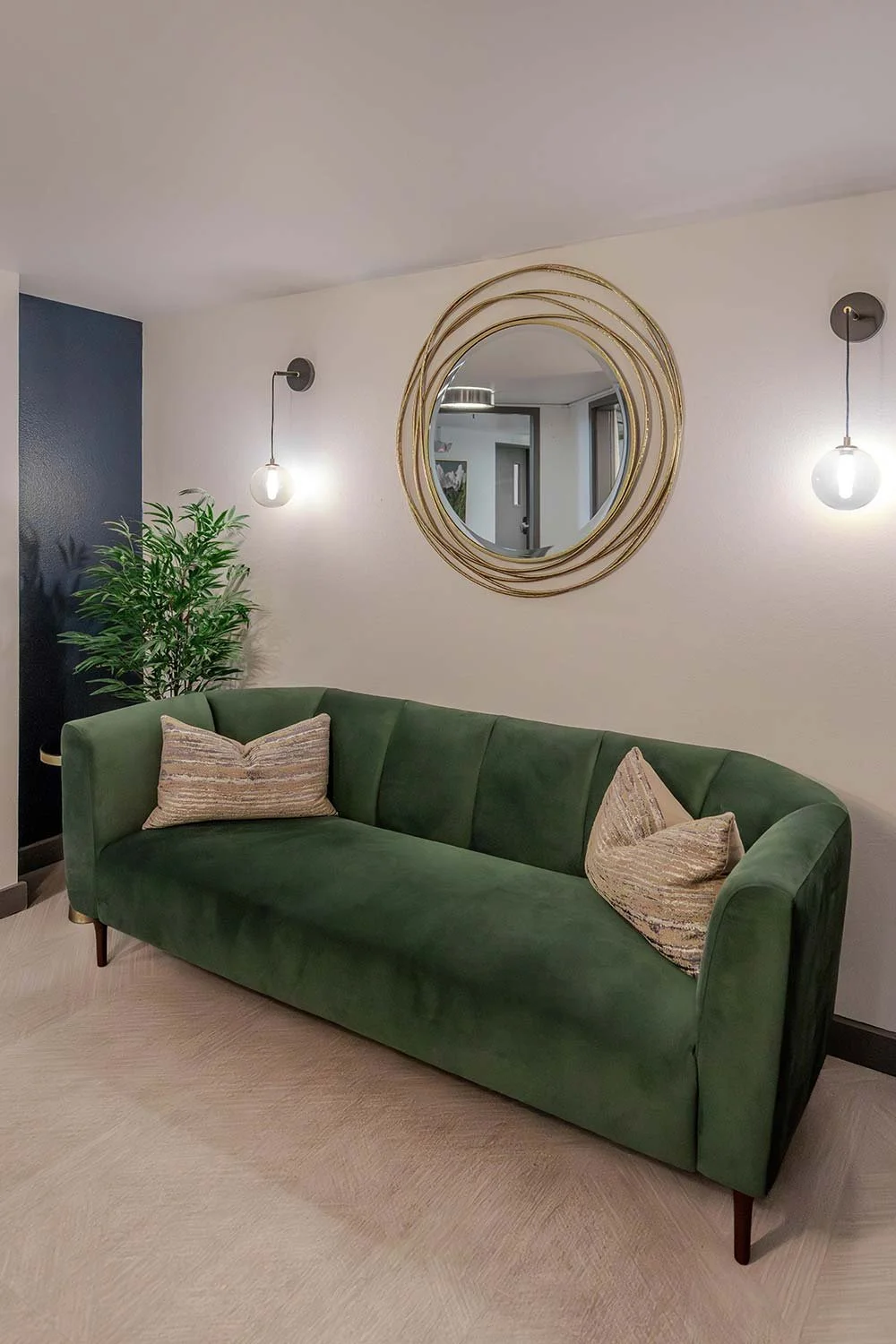
This plush green velvet couch brings a sense of warmth and personality to the space, instantly keeping it from feeling like a dull leasing office. We flanked it with sconces on either side to turn the seating area into a true statement moment, adding both ambiance and intention. An organic-shaped mirror completes the look, keeping the space feeling fresh, inviting, and thoughtfully designed.
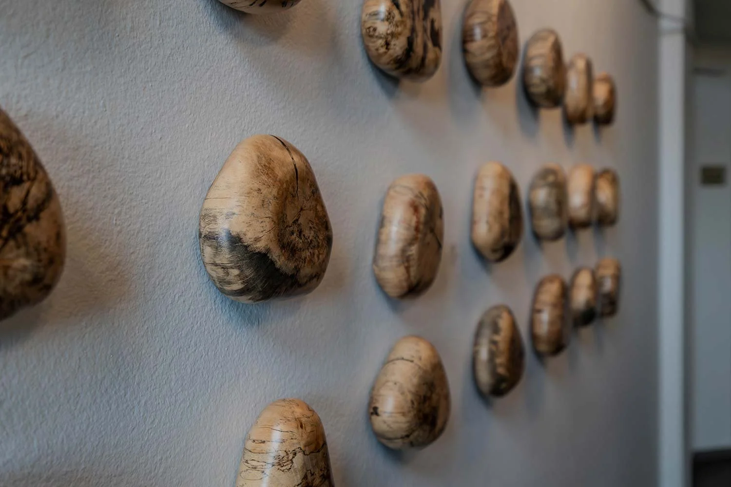
Out of the ordinary artwork for apartment buildings.

We love incorporating art that moves beyond the traditional idea of a framed painting and instead feels like it breaks out of the box. These wooden pebbles were chosen to bring a natural, sculptural element into the space while thoughtfully activating what would otherwise be blank wall space. The result feels organic, intentional, and fun!
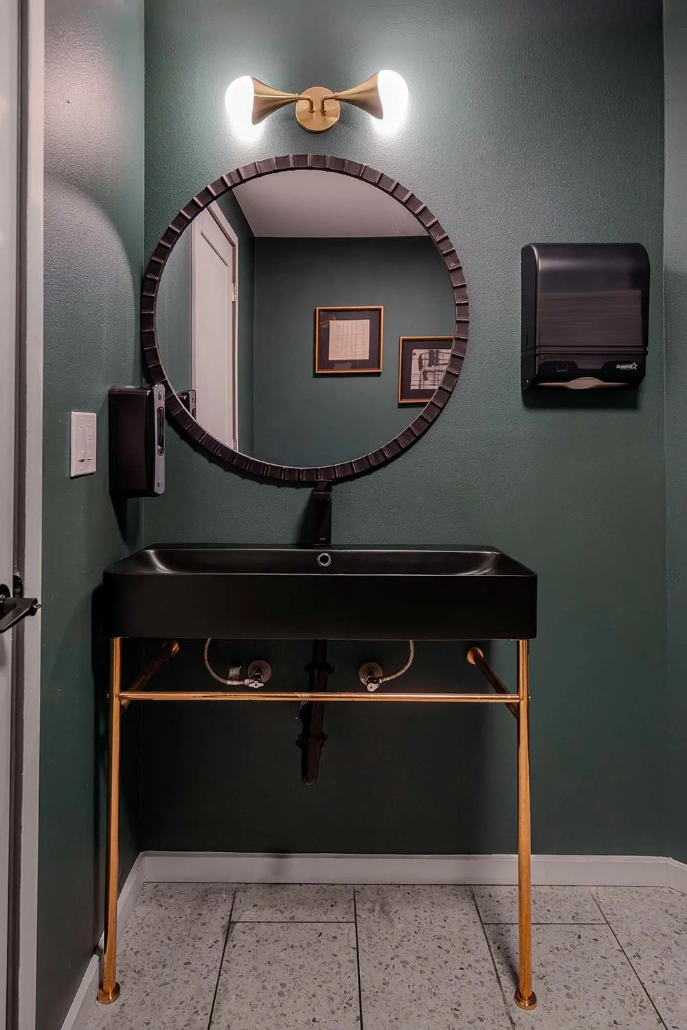
Gold pedestal legs on  black sink

We wanted this bathroom to feel classic and timeless, so we leaned into a clean, elevated palette of brushed gold, sleek black, and rich green. The black sink is an unexpected choice for a commercial space, but that’s exactly what makes it special!
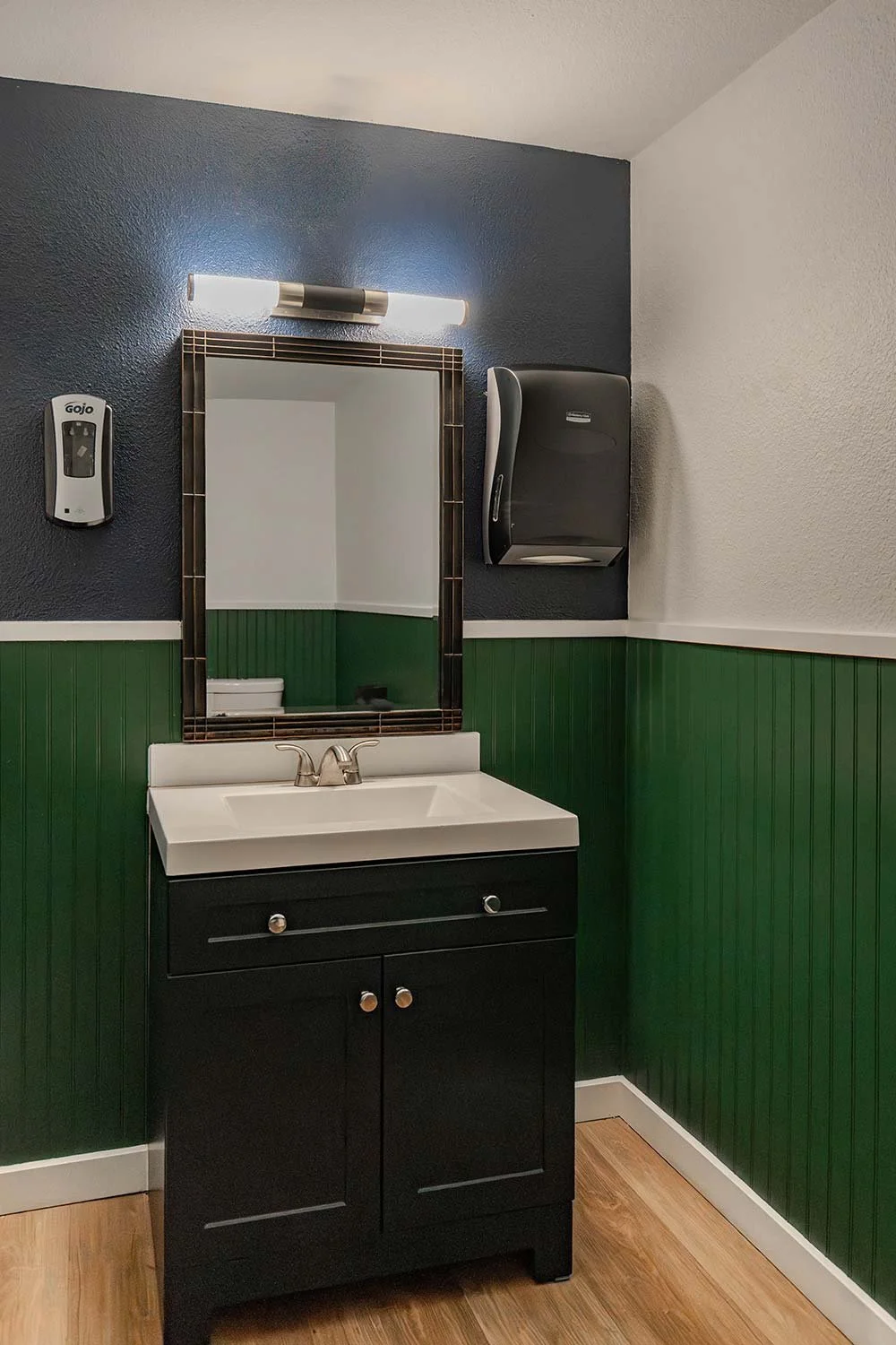
Green and black bathroom in apartment building

This bright green bathroom is a true standout moment within the space. The Kelly green wainscoting keeps the room feeling funky, fresh, and full of personality, while still feeling thoughtfully designed. It also mirrors the color palette of the other bathroom in the leasing complex, creating a cohesive, connected experience throughout the building.
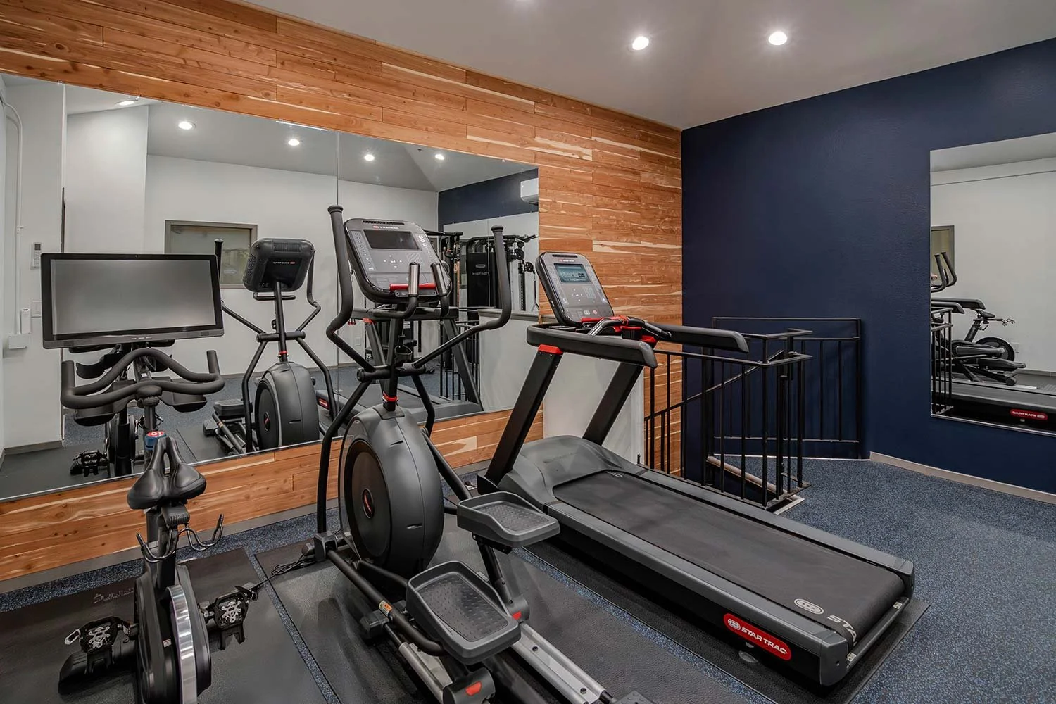
Unique colors for apartment building gym

We designed this custom workout space with the residents’ needs at the forefront, creating a truly valuable amenity that supports a healthy work–life balance within the complex. By keeping the gym onsite, residents can skip the commute and use the space to work off stress, refocus on their goals, or build strength and feel good in their bodies. This makes wellness an easy, everyday part of life!
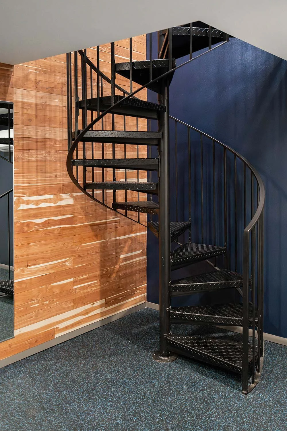
Black, blue and wood color scheme

A standout feature of the gym is the unique spiral staircase, which we chose to celebrate by painting it black so it stands in bold contrast to the deep blue tones and warm wood paneling along the walls. Introducing a whimsical architectural element in a space like this keeps the gym feeling boutique and design-forward, proving that functional spaces can still be full of personality.
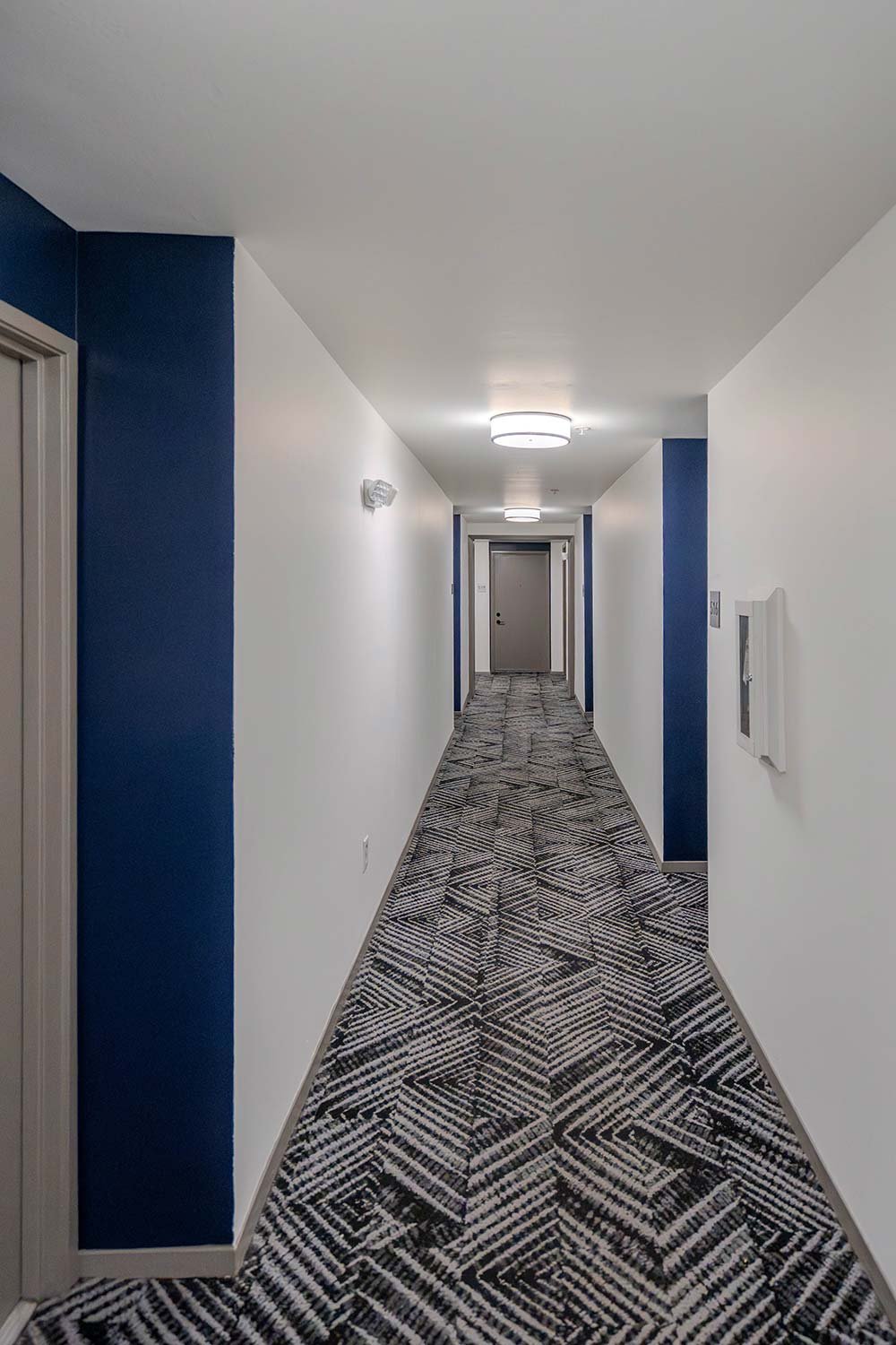
Unique apartment building design

We installed this visually complex carpet throughout the long apartment hallways to keep them from feeling bland or purely transitional. The pattern completely changes the dynamic of the space, creating visual interest and a subtle sense of intrigue as you move through it, turning an otherwise simple corridor into an engaging experience.
Mid-Century Modern Dreamscape

Mid-Century Modern Dreamscape

This sweet family had an incredible mid-century modern home in Raleigh Hills, but only one of their three bathrooms was functional. With their first baby on the way, they wanted to reimagine all three spaces to be fully functional, beautiful, and true to the home’s original mid-century character. Plus we converted a guest room into their nursery for their newest family member! Our goal was to honor the architecture and spirit of the house while bringing in fresh, livable updates that would serve their growing family for years to come.


Primary Bathroom

Midcentury Modern Interior Design Primary Bathroom

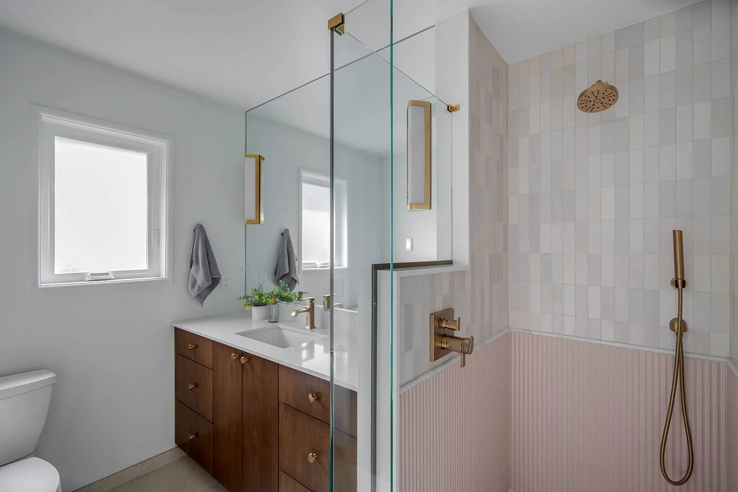
This primary bath originally had a pink theme that we chose to honor in the redesign! The shower was once cramped in the back corner and had outdated electrical, making it unsafe to use. We expanded the shower footprint and added a glass surround to open up the space and bring in more light.

Pink Tile on shower walls in walk in shower

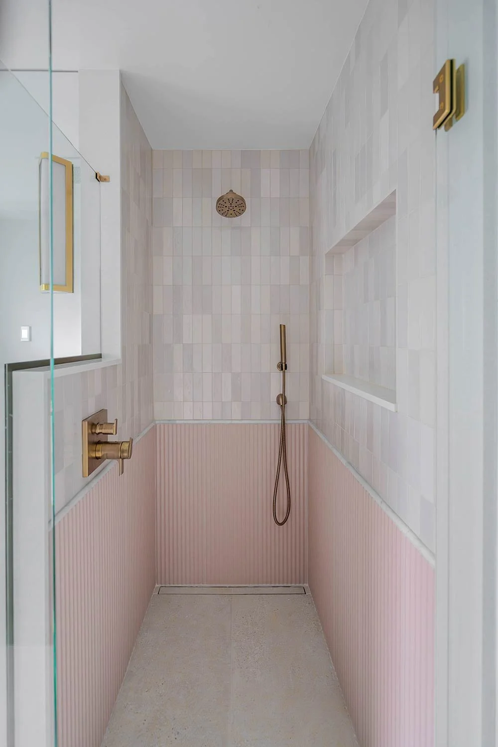
For this walk-in shower, we wanted to create something that felt both elevated and serene. We integrated the drain for minimal visual disruption, allowing the gorgeous floor tile to flow continuously from the main bathroom into the shower. This small detail helps the space feel larger and more cohesive. The textured blush wainscoting brings such warmth and personality to the space! The soft tone adds a subtle pop of color without feeling overwhelming, giving the bathroom a bit of charm and softness against the cooler marble and white tones.

Marble and unique tile choices How to make your shower interesting and unique

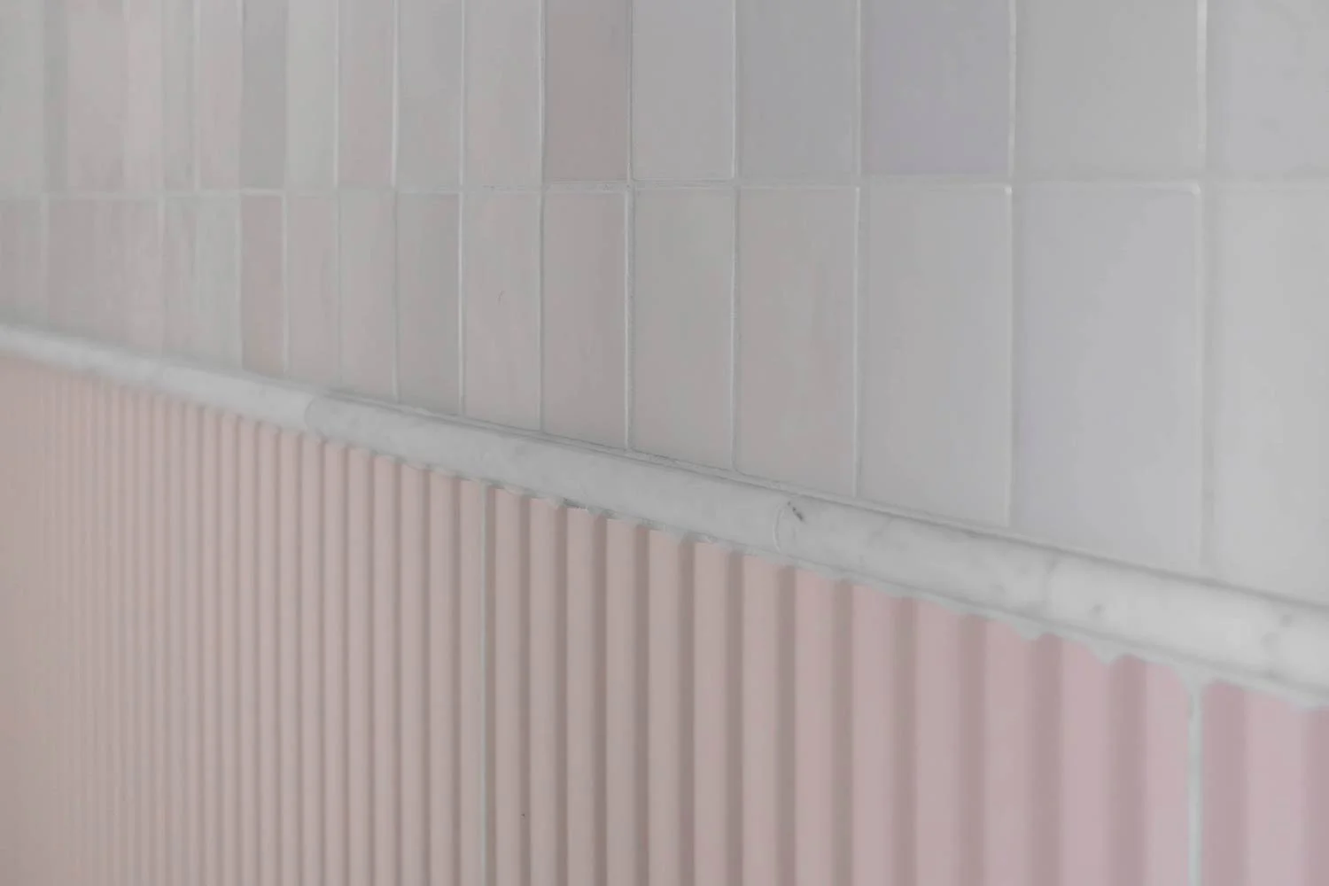
To tie everything together, we added a marble schluter detail that acts as a beautiful bridge between the pink wainscoting and the white zellige tile above. The zellige tiles each have their own slightly different finish and texture, which gives the walls movement and a handcrafted feel. Together, the combination of materials, textures, and tones creates a space that feels elegant without losing its sense of fun and individuality!

Primary bathroom design in small space

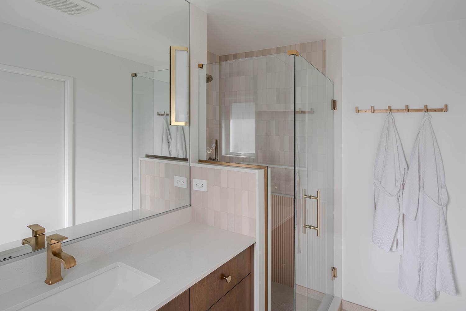
To enhance the sense of height and airiness, we carried the mirror wall to wall and all the way up to the ceiling. The vanity offers plenty of counter space for getting ready and features the same warm walnut tones carried throughout the home, creating a beautiful sense of cohesion. This space feels inviting, functional, and distinctly mid-century, honoring its charming original character while feeling fresh and timeless.

Interior design for modern day living

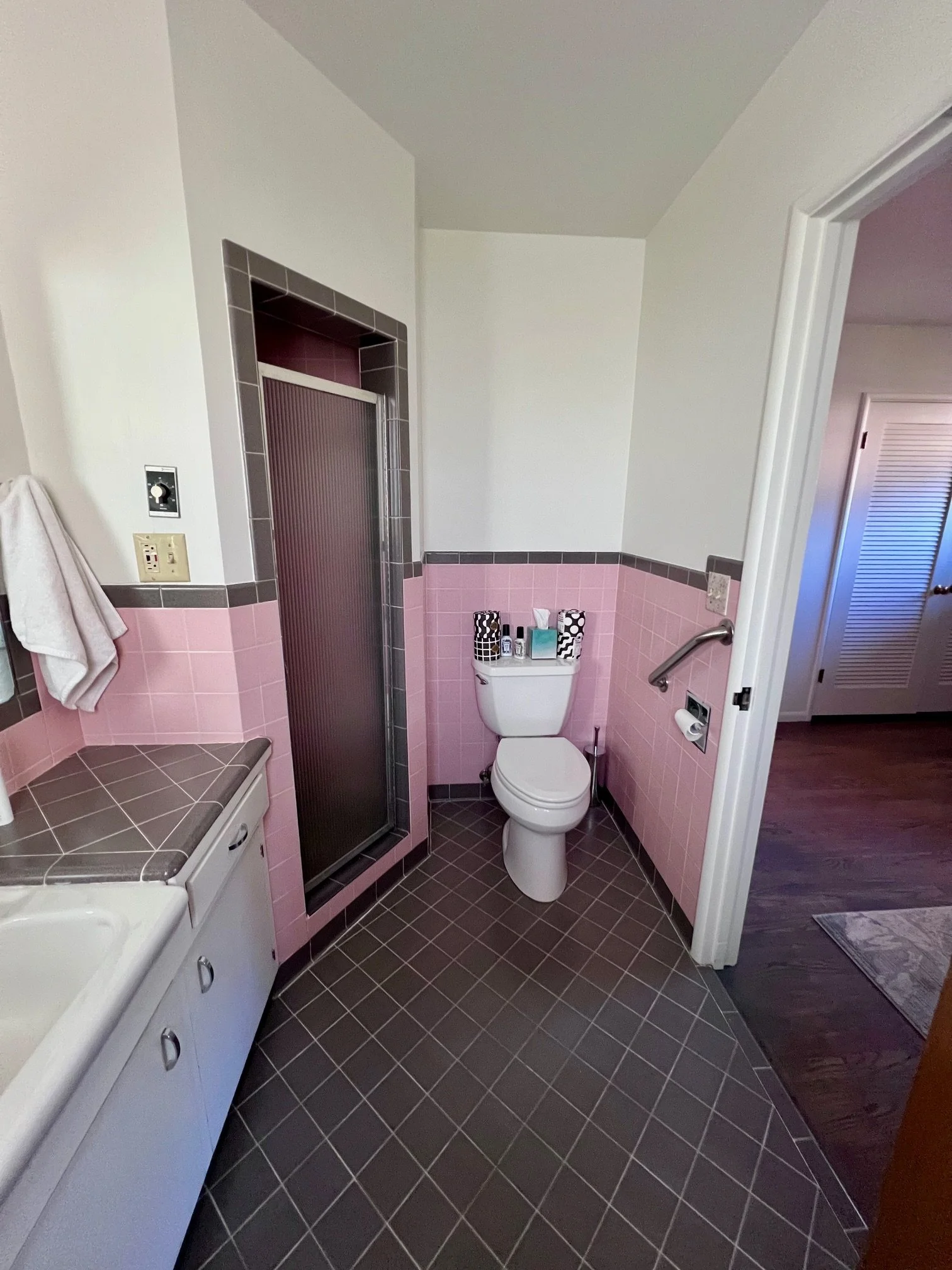
Before Photo: This primary bathroom featured an iconic color scheme rooted in classic mid-century modern style; however, the space was completely nonfunctional. The shower’s electrical work was not up to code, rendering it unusable, and the angled layout prevented the room from fully maximizing its footprint. With the shower drywalled in on all sides, the enclosure felt especially dark and cramped, further limiting the functionality and comfort of the space.
Home remodel design interior design

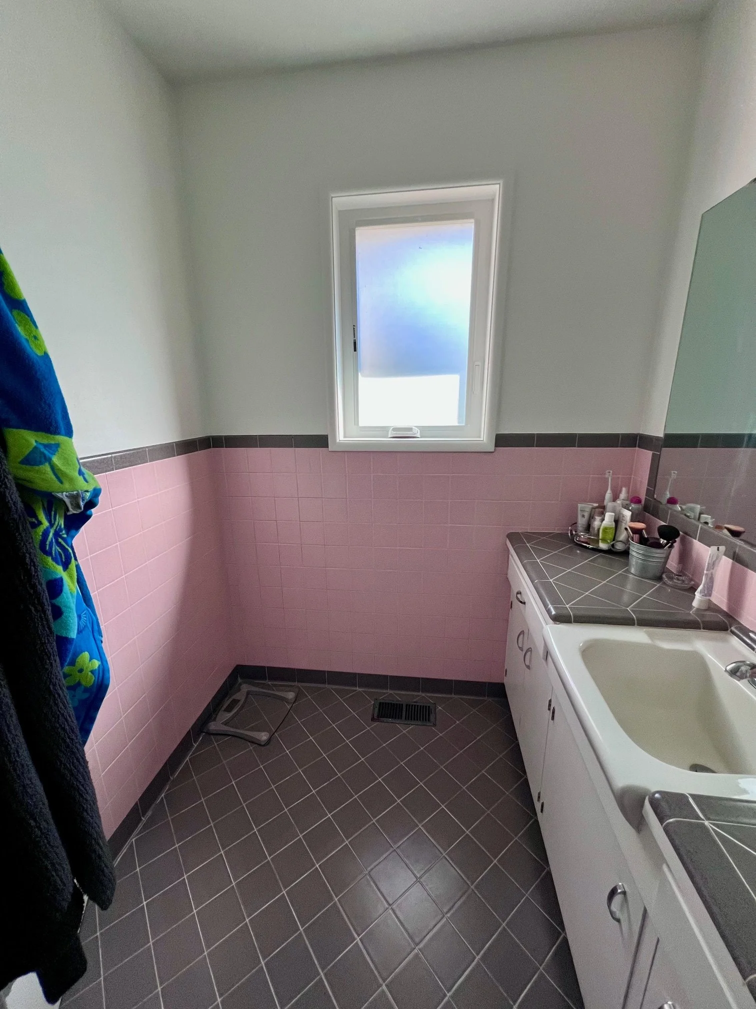
Before Photo: The vanity featured an oversized sink that unfortunately left very little usable counter space. Storage was also limited, and the mirror was mounted too low, making it difficult for the tall homeowner to comfortably see himself.

Powder Bathroom

Laundry powder bathroom interior design trends

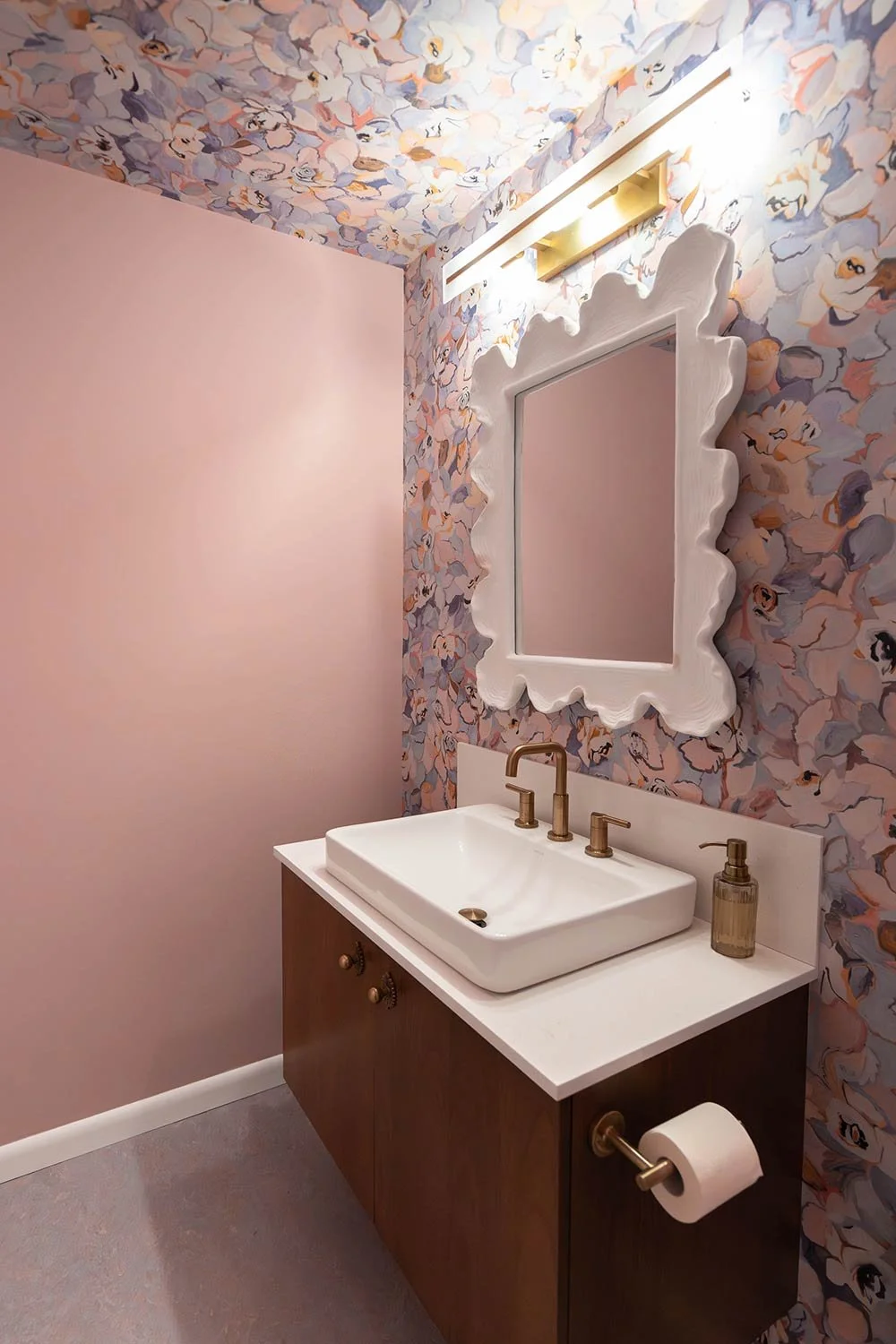
This powder bath was originally cramped, outdated, and neglected. The clients wanted a true pop of fun and funk, so we transformed it with a floral-inspired wallpaper that wraps up onto the ceiling and painted the remaining walls a soft pink to tie it all together. We installed a lilac Marmoleum floor that extends into the laundry room for durability and easy cleaning. The result is a one-of-a-kind, functional space that makes a bold mid-century modern statement that’s playful, practical, and full of personality.

Unique hardware and finished for your bathroom

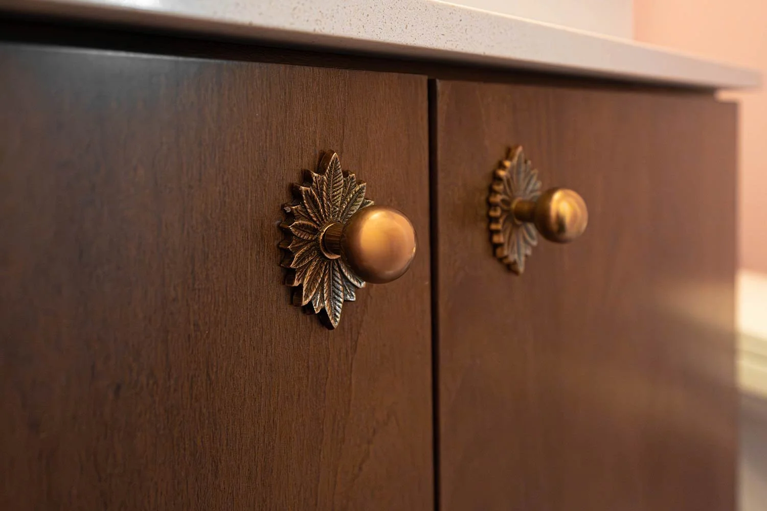
We sourced the knobs during some of our travels, and we love how they help to make this design truly one of a kind!

home renovation for old homes

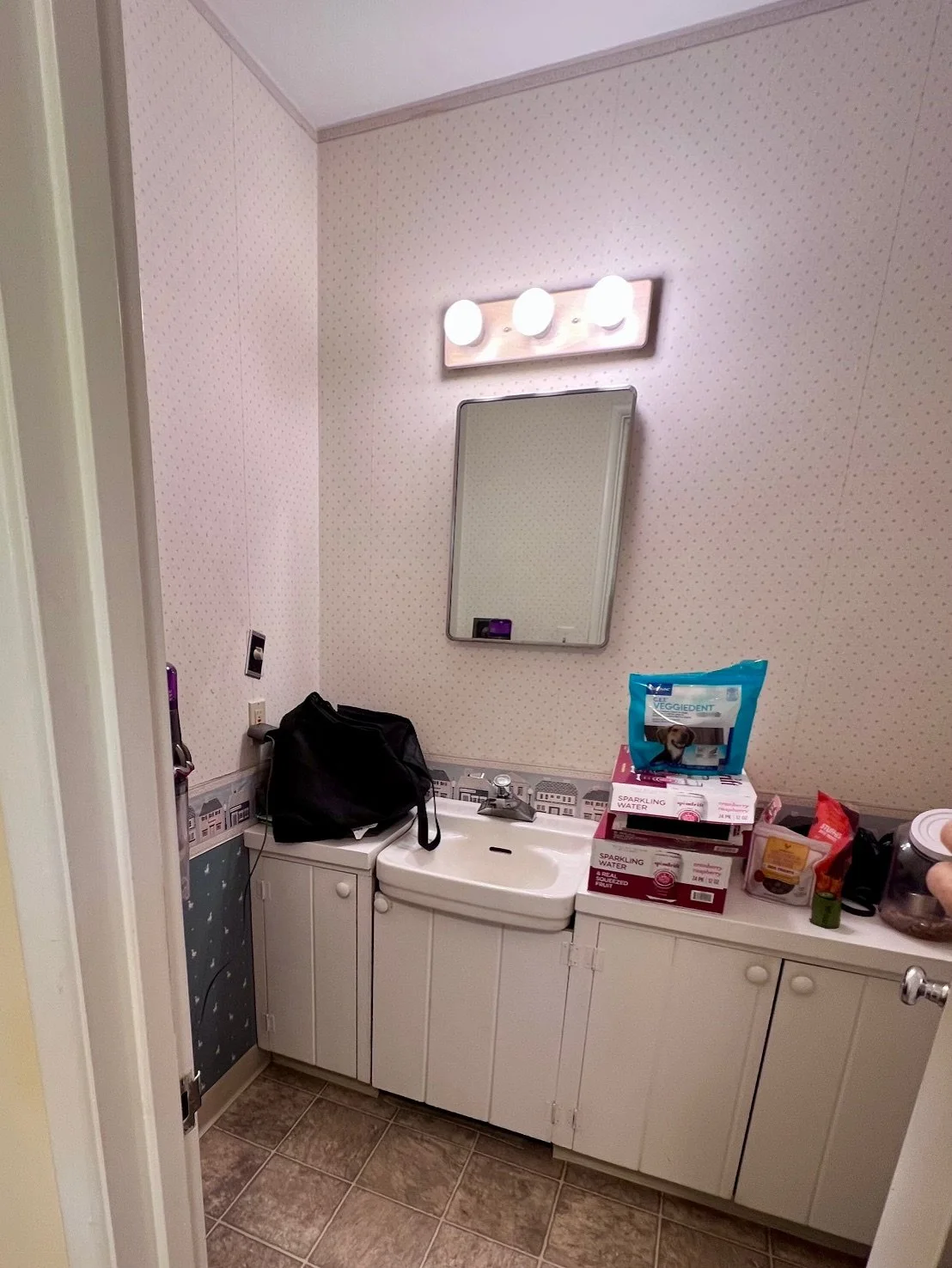
Before Photo: At first glance, this bathroom appeared to offer plenty of storage, but the layout told a different story. Because of the door placement and the tight spacing between the door and the cabinetry, the cabinets were difficult to open and awkward to access while moving in and out of the room. While the location could have been ideal for a guest water closet, the cramped configuration, dated appearance, and non-functional toilet ultimately made the space unusable.

full home renovation in pnw

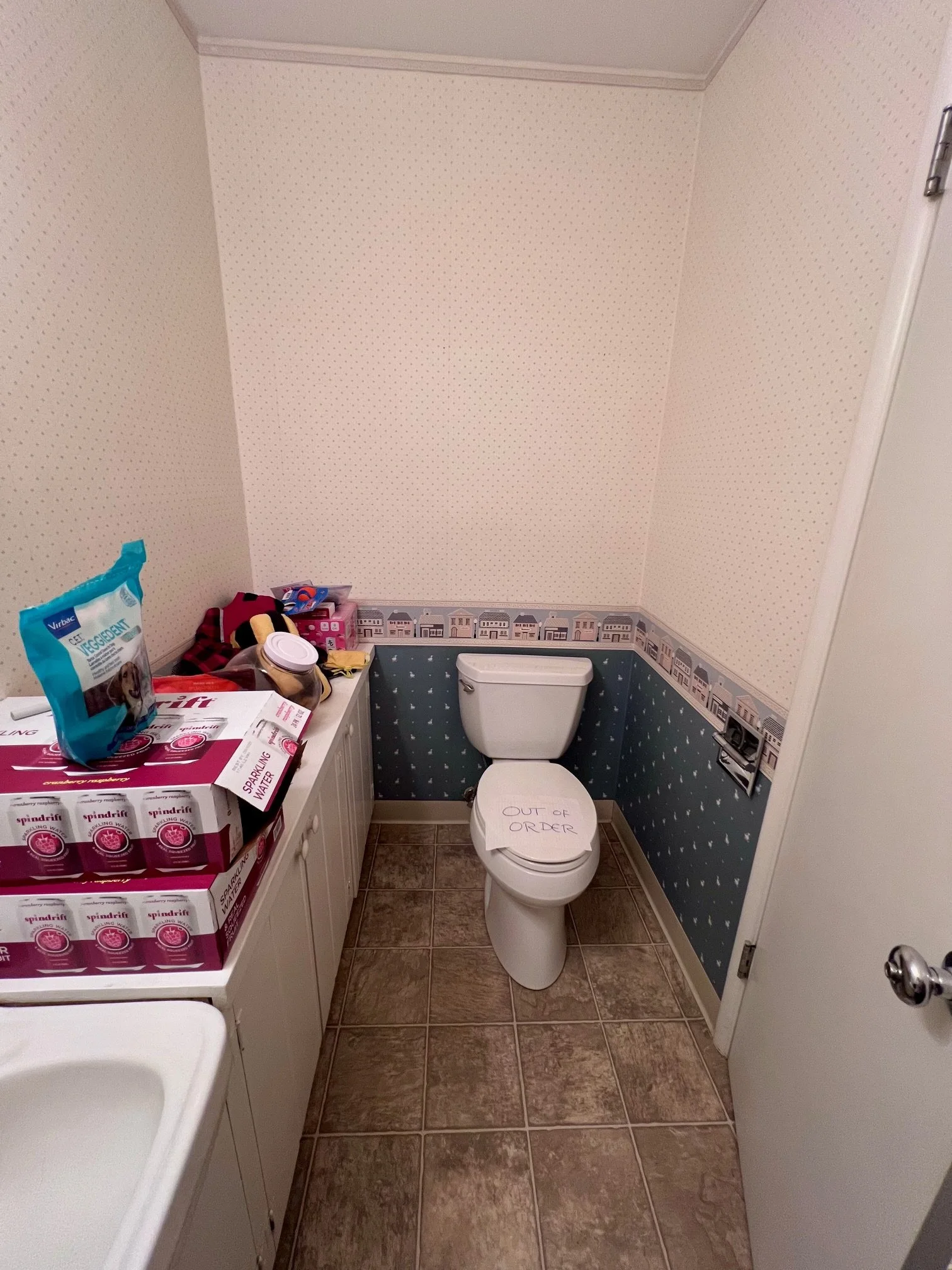
Before Photo: This bathroom didn’t function at all. The toilet was non-operational, and the layout made extremely inefficient use of the space. Positioned directly behind the door, the toilet was hit every time the door fully opened, creating an awkward and impractical circulation path that made moving around the bathroom frustrating and dysfunctional.

Guest Bathroom

Walnut guest bathroom designs mid century modern design

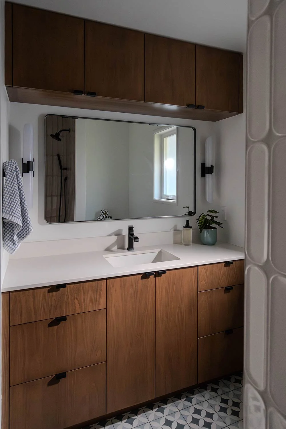
This guest bathroom will be the bathroom used by their children and overnight guests. Storage was a top priority, so we incorporated a clever over-mirror cabinet to maximize space without sacrificing style. To bring in true mid-century modern character, we paired rich walnut cabinetry with a rounded mirror and minimal hardware pulls for a clean, timeless aesthetic.

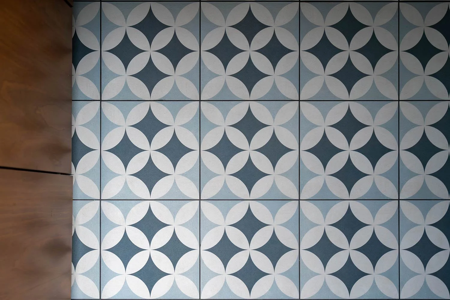
Unique tile flooring that hides dirt and grime

We chose this floor tile because its tone and texture are perfect for disguising the inevitable splashes, footprints, and daily wear that come with kids and frequent use.

Textured shower wall tile for guest bathroom

The shower tile is one of our favorite details in this bathroom! Its subtle beveled texture adds beautiful dimension and visual interest to the space. We chose to keep the tub for ease of use with young children, pairing it with both a hand shower and a rain shower to add flexibility and functionality for a growing family.

Mid century modern home updates.

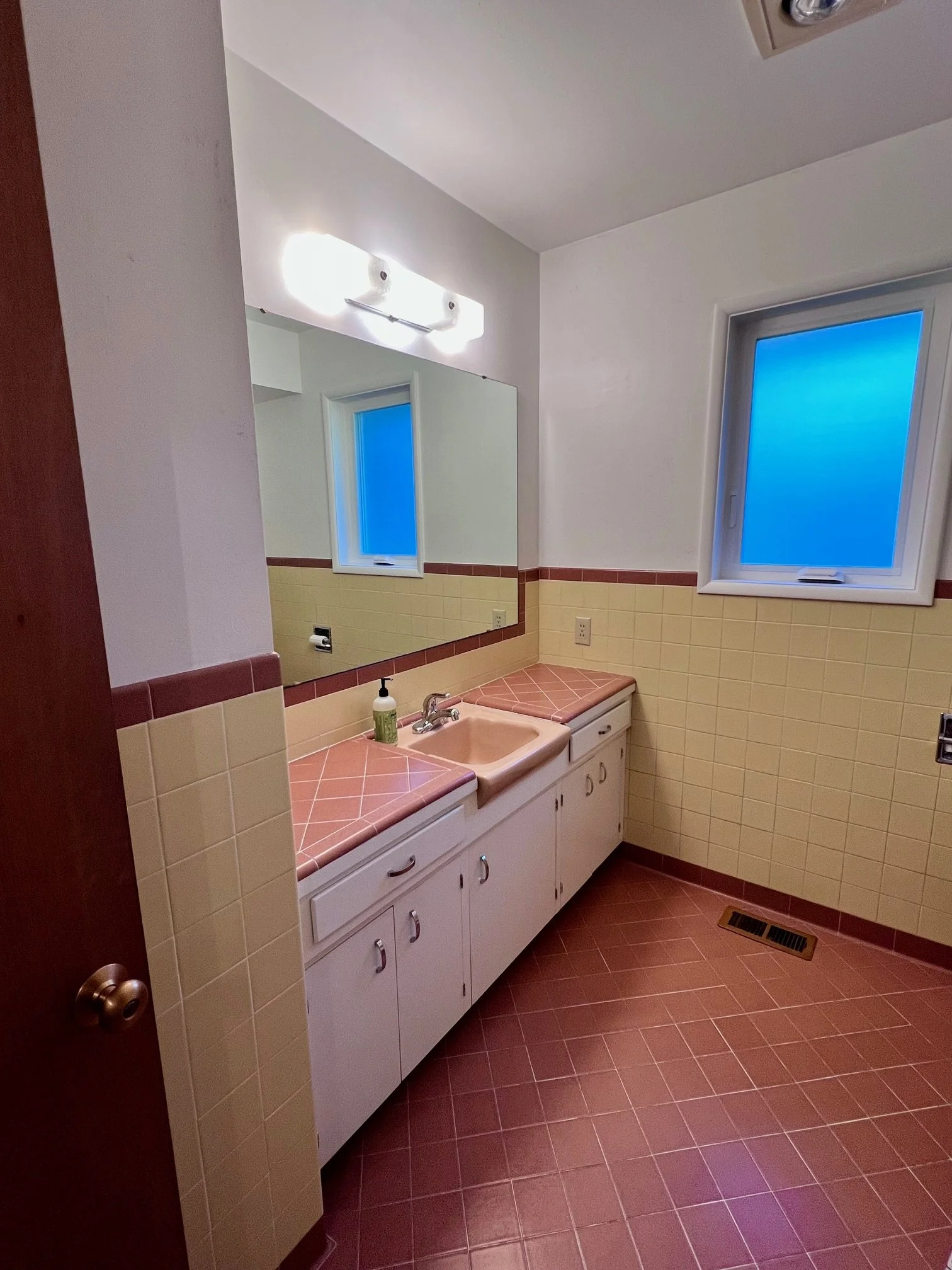
Before Photo: This bathroom featured an outdated color palette with mustard and red tile. While the mid-century modern style was iconic in its time, the space no longer met the needs of a growing family. The sink area felt crowded and inefficient, the tiled countertops with heavy grout lines easily trapped grime and messes, and the cabinetry offered limited, cramped storage that didn’t support everyday use.

Old photos of renovations in a home.

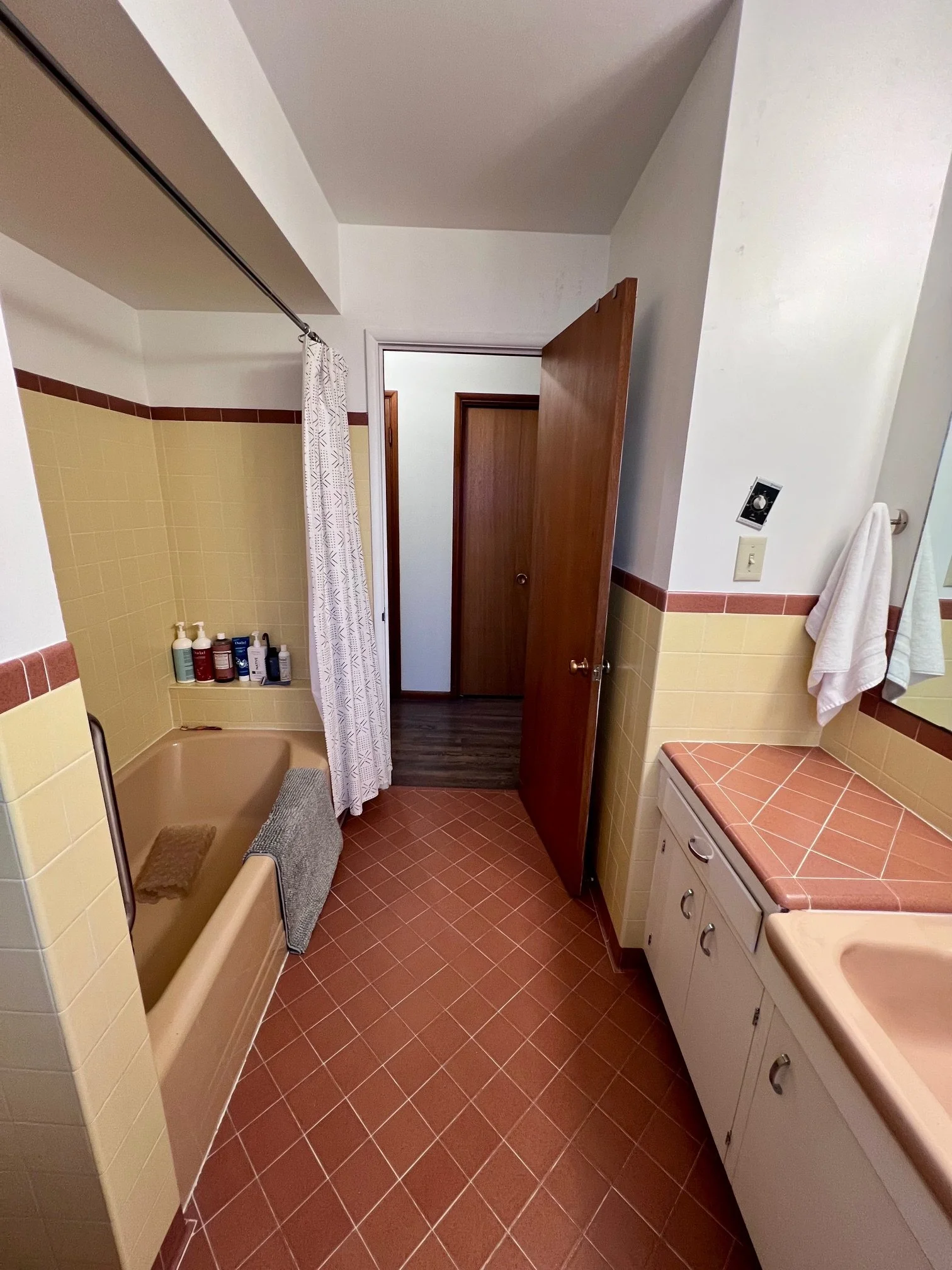
Before Photo: The acrylic tub in this bathroom was no longer a functional option. It felt outdated and, more importantly, posed a significant slipping hazard, making it an impractical and unsafe choice for a family-friendly space.

Nursery

nursery design mood board and inspo for kids room

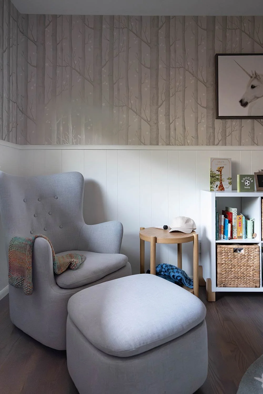
We created a darling nursery for their new baby, a cozy and neutral space inspired by the serenity of the woods. The subtle woodland theme adds a touch of whimsy without feeling overly themed, making it a space the baby can grow into.

Cute nursery design for gender neutral bedroom

Our favorite detail is the silvery stars scattered through the wallpaper, which catch the light just enough to bring a gentle, magical glow to the room, especially in the evening hours! Hope you enjoyed looking through this glorious Mid-Century modern remodel and that it inspires you to honor the character in your home!

What is the best grey paint color for your home?

Painting your home is a be decision. It’s often a color you will keep for a long time due to the expense. I get asked all the time, “what is the best [blank] color to paint in my home?” Well, today I want to try and answer the “what is the best grey color for my home.”

So what is the best grey?

It really depends on personal preference and the overall aesthetic of your home. Some popular shades of grey for home interiors include light grey, which can create a calming and spacious feel, and dark grey, which can add a touch of sophistication and drama to a space. In general, it's a good idea to consider the other colors and design elements in your space, and choose a shade of grey that complements and enhances those elements. It's also important to think about the amount of natural light in the space, as well as the intended function of the room, when choosing a shade of grey. Ultimately, the best color of grey for your home will be the one that makes you happy and enhances the overall look and feel of the space.

Warm Grey

Warm grey is a shade of grey that has undertones of warm colors such as yellow, red, or orange. This makes the grey appear less cool and neutral, and gives it a warmer, more inviting feel. Warm grey can be a great choice for a home interior, as it can add a cozy and comfortable atmosphere to a space. It is often used as a wall color or for larger furniture pieces, such as sofas or armchairs. When paired with other warm colors and natural materials, warm grey can create a welcoming and inviting space.

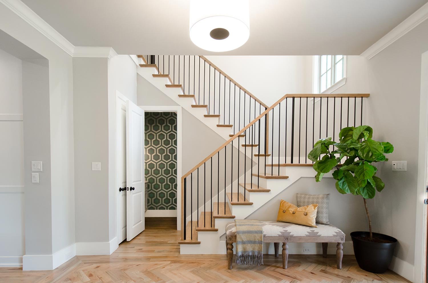
herringbone entry wood floors with warm grey wall paint

My favorite warm light gray paint colors are: Sherwin Williams Agreeable Grey 7029, Sherwin Williams Worldly Grey 7043, Sherwin Williams Amazing Grey 7044, Benjamin Moore Revere Pewter HC-172

My favorite warm dark gray paint colors are: Sherwin Williams Dovetail 7018, Sherwin Williams Urbane Bronze 7048, Benjamin Moore Rockport Gray HC-105, Benjamin Moore Chelsea Gray HC-168

Cool Grey

Cool grey is a shade of grey that has undertones of cool colors such as blue or green. This makes the grey appear less warm and neutral, and gives it a cooler, more modern feel. Cool grey can be a great choice for a home interior, as it can add a clean and contemporary atmosphere to a space. It is often used as a wall color or for larger furniture pieces, such as sofas or armchairs. When paired with other cool colors and sleek materials, cool grey can create a stylish and sophisticated space.

My favorite cool light grey paint colors: Sherwin Willams Passive 7064, Sherwin Williams Grey Screen 7071, Benjamin Moore Stonington Gray HC-170

My favorite cool dark grey paint colors: Sherwin Williams Cityscape 7067, Sherwin Williams Peppercorn SW 7674, Benjamin Moore Englewood Cliffs 1607, Benjamin Moore Cheating Heart 1617

Neutral Grey

Neutral grey is a shade of grey that does not have any noticeable undertones of other colors. This makes it a versatile and neutral color that can be used in a wide variety of settings and interior design styles. Neutral grey is often used for walls, floors, and large furniture pieces, as it provides a blank canvas that can be easily paired with other colors and design elements. Neutral grey is also a popular choice for smaller accents and accessories, such as throw pillows, rugs, and artwork. Overall, neutral grey is a timeless and classic color that can add a sense of calm and balance to a space.

My favorite neutral light grey colors are: Benjamin Moore Classic Grey OC-23, Benjamin Moore Light French Grey 0055, Sherwin Williams Repose Grey 7015, Benjamin Moore Gray Owl 2137-60, Sherwin Williams Mindful Grey 7016

My favorite neutral dark grey colors are: Sherwin Williams Gauntlet Grey 7019, Benjamin Moore Amherst Grey HC-167

What is your favorite grey?

Accent Walls: The Best Way to Add Depth to Your Design

Adding an accent wall can drastically elevate the design style in a space. Because it is just a single wall, it can be the easiest way to direct focus, create depth, and even take an "outside of the box" risk. Check out my favorite five accent wall ideas you can do!

1. Paint

This is by far the simplest and most cost effective. I am a huge fan of using highly saturated colors to create a statement when painting an accent wall. Challenge yourself to a bolder color and if you hate it, it's easy to change!

An accent wall doesn’t have to be those vertical spaces. Don’t forget about that fifth wall, the ceiling. By painting this kitchen’s ceiling, we were able to draw the eye all the way to the beautifully barrel vaulted feature.

I love how just the navy wall of this kid’s bedroom painted creates depth and allows lighter objects to pop.

2. Molding

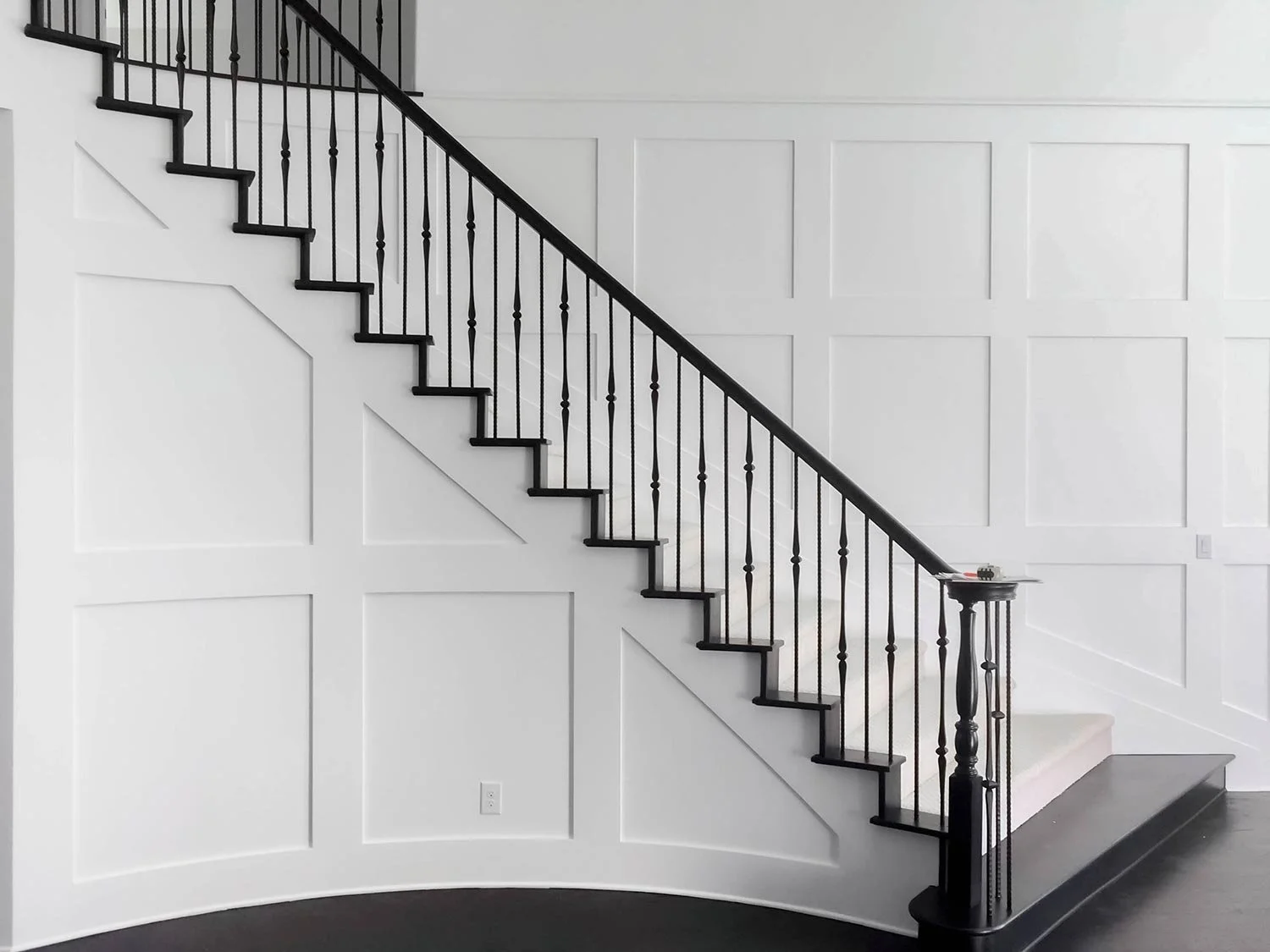
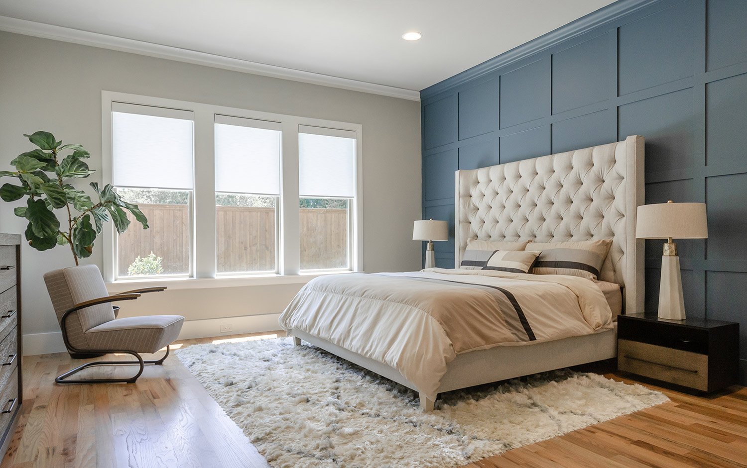
Putting molding walls got a bad reputation when so many builders decided to put a single piece of molding around the room called a chair rail (literally one of my least favorite things). However, molding on a wall can look super sophisticated. From the traditional picture frame molding to the more contemporary box molding. 

A staircase can be a forgotten space which is why it is the perfect place to add molding to really punch up the design.

tall tufted headboard against a wood paneled accent wall

Taking a traditional molding and turning it into something special with this square geometric designed wall using molding.

3. Wallpaper

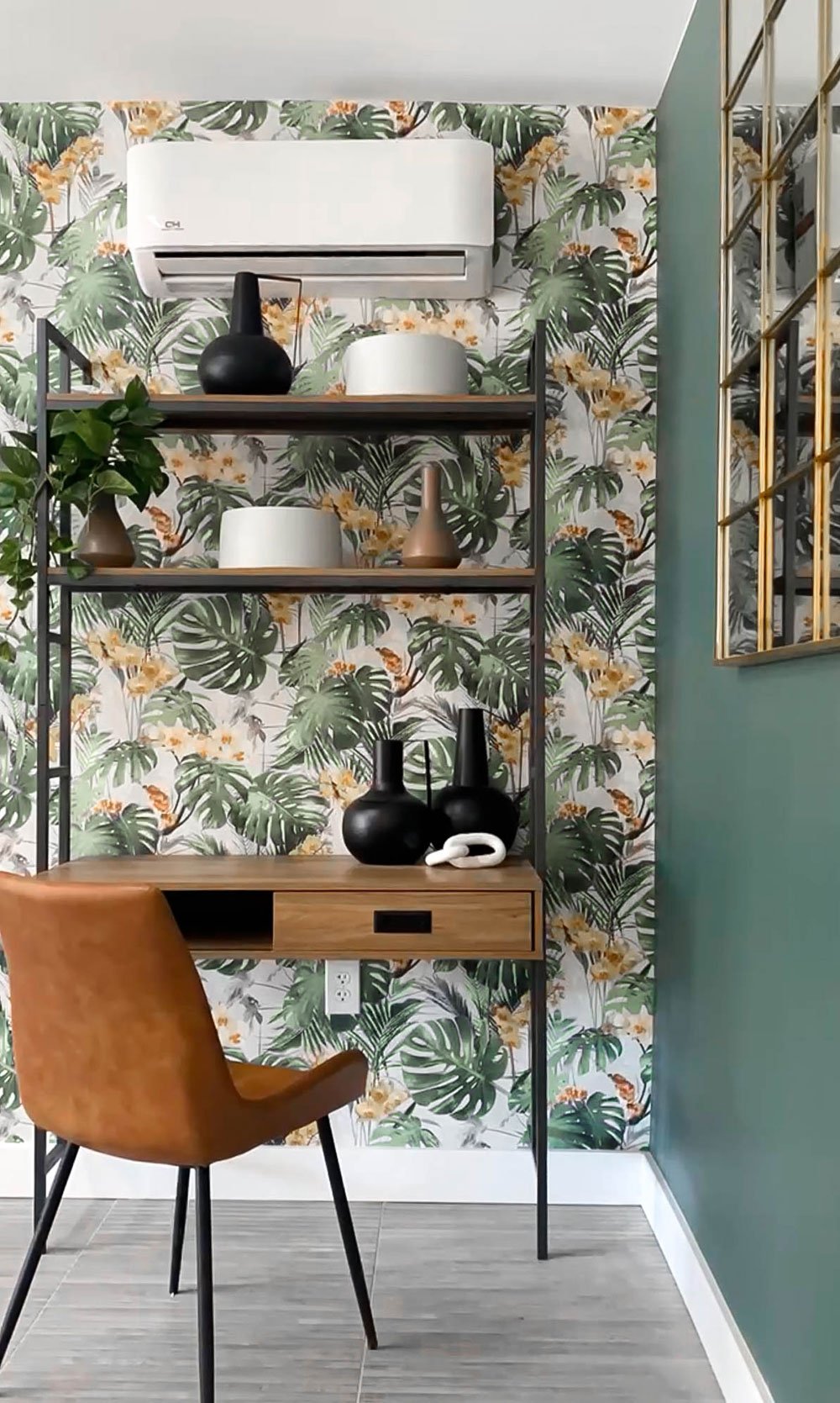
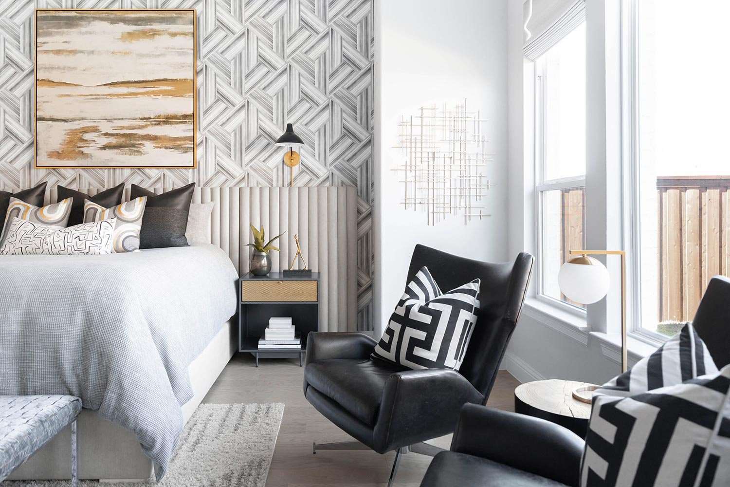
Yes, wallpaper is still in, in fact, it never left. I have used wallpaper in no less then 100% of my recent projects and with the endless possibilities of patterns and styles wallpaper can work for everyone. It really does make me overly excited. 

Sometimes just one wall is all you need for wallpaper. This creates the perfect layer for this grandmillennial office space.

The perfect teen girl’s wallpaper. It's bold and beautiful and it only needed on the feature wall.

4. Tile

I love a tile accent wall! I use them frequently in bathrooms, bars, and even in bedrooms and other spaces. There are some really amazing tiles that will wow you and create huge impacts in a home. 

blue floating bathroom vanity with under cabinet lighting

Having fun with a wall of accent tile in a bathroom can bring so much style to your home.

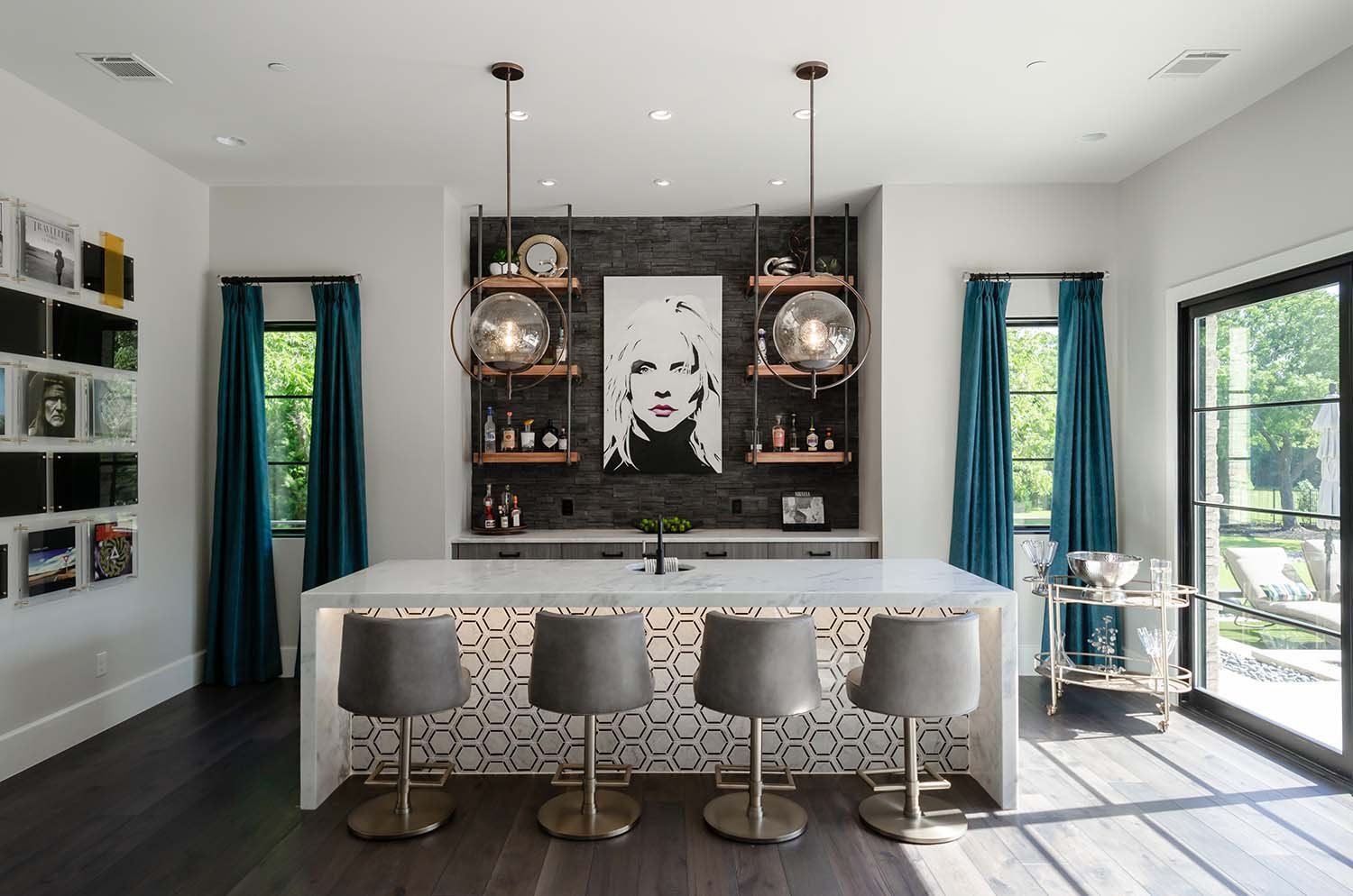
An accent wall tile doesn’t have to mean the entire wall. In this design, we decided to only do it in the nook behind the bar. It helps draw the eye in and layers in the sex appeal.

Using tile that starts in a shower and continues beyond the normal boundaries makes this small bathroom feel grand. Use this to trick your eye and make your tighter spaces truly expand.

5. Wood

I tend to lean more towards the modern use of wood as an accent wall, but for clients who love that "farmhouse" style, you can also use reclaimed wood. 

using wood modern slats as an accent wall

Wood used in a more contemporary fashion to define this TV wall. This decorative wall with evenly spaced wooden slats for a sleek and contemporary look.

For this covered outdoor design, we wanted to add texture with a shou sugi ban accent wall. Shou sugi ban is a traditional Japanese method of preserving and weatherproofing wood by charring it with fire. The charred surface is then brushed and oiled to create a durable and attractive finish.

6. Living Wall

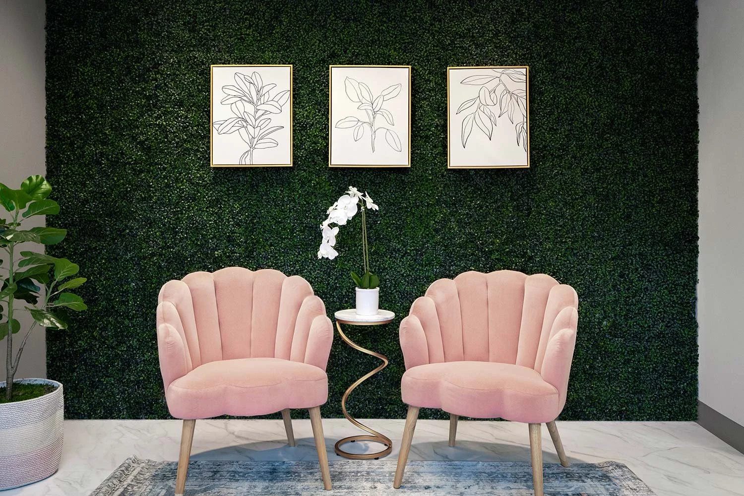
Creating a living wall as an accent is a unique and beautiful way to bring nature into your home. The result is a stunning and sustainable accent wall that adds life and color to any space.

Bringing Mid Century Modern Style into Your Home

With the popularity of the Mid Century Modern many people want to add elements into their homes. I personally love taking elements from different styles and showing them off throughout designs.

Mid-century modern furniture is a style of furniture that originated in the mid-20th century, roughly between the 1930s and 1960s. This style of furniture is known for its clean lines, organic shapes, and sleek, minimalist design. Mid-century modern furniture was influenced by the Bauhaus and De Stijl art movements, which emphasized function and simplicity in design.

One of the most notable characteristics of mid-century modern furniture is its focus on form over function. This means that the design of the furniture is just as important, if not more important, than its practicality. Mid-century modern furniture often features bold, geometric shapes and bold, solid colors. An easy way to bring this into your home is through the use of wallpaper and tile.

The use of natural materials such as wood, leather, and wool is also common in mid-century modern furniture.

Mid-century modern furniture is highly sought after by collectors and design enthusiasts alike. Its clean lines and timeless aesthetic make it a versatile choice for any space. Whether you are looking to furnish your entire home with mid-century modern pieces or just add a few key pieces to your existing decor, this style of furniture is a great way to add a touch of sophistication and elegance to your space.

Some of the most iconic mid-century modern furniture pieces include the Eames Lounge Chair and Ottoman, designed by Charles and Ray Eames, and the Tulip Chair, designed by Eero Saarinen. These pieces are known for their elegant, sculptural forms and their use of innovative materials and manufacturing techniques.

In addition to its aesthetic appeal, mid-century modern furniture is also known for its durability and longevity. Many pieces of mid-century modern furniture are still in use today, decades after they were first designed. This is due in part to the high-quality materials and construction used in their manufacture, as well as the timelessness of their designs. My advise is to save for quality pieces that will stand the test of time rather than cheaper imitations that you will not get to enjoy very long.

If you are interested in incorporating mid-century modern furniture into your home, there are many ways to do so. You can find authentic mid-century modern pieces at vintage shops, online marketplaces, and auctions. Alternatively, you can purchase new furniture that is inspired by the mid-century modern style. No matter what approach you take, adding some mid-century modern pieces to your home is a great way to add a touch of sophistication and elegance to your space.

mod furniture design portland oregon