Portland based Interior Designer

Sophisticated Home Bar and Wine Cellar

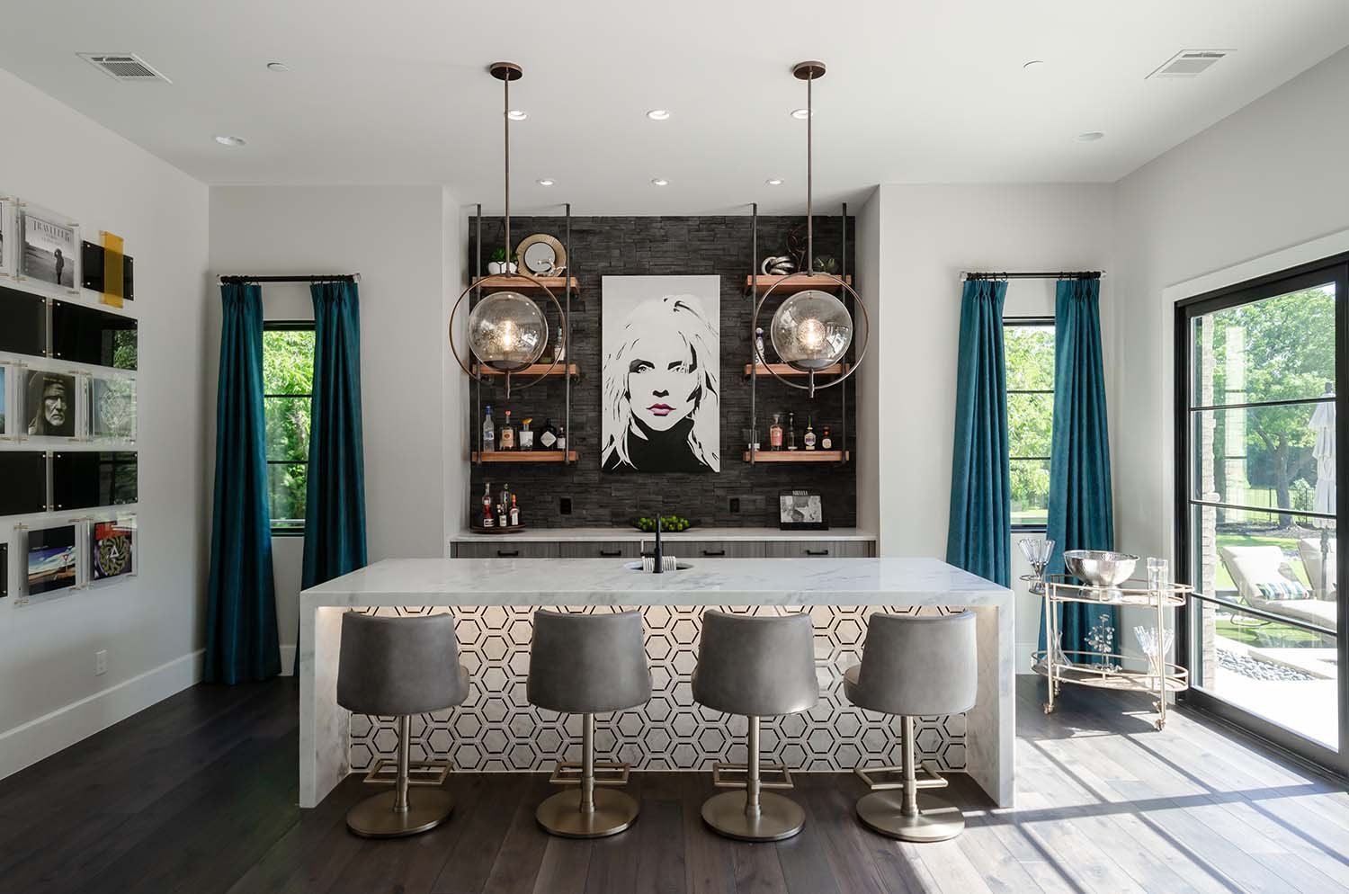
This project started with a clear goal in mind from an email I received, saying, “I want my game room bar to say I am a sleek, modern, sexy individual sipping on Lakoya cabernet or Blanton’s bourbon, listening to Fleetwood Mac, Eagles or maybe even The Cure on any given day. Someone who enjoys entertaining and appreciates finer modern-day amenities while also longing for a sense of nostalgia that connects them with their industrious roots.” With this vision, it was clear how important it was for the homeowners to have a dedicated high-style space to entertain while showing their relaxed way of life.

When thinking about a room in the house for sipping wine or bourbon while listening to rock-n-roll, an industrial wine bar with an underground speakeasy in need of a secret password came to mind. The client’s loved the vision.

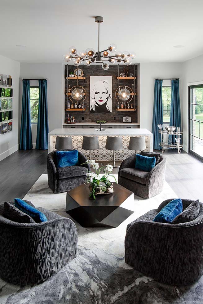
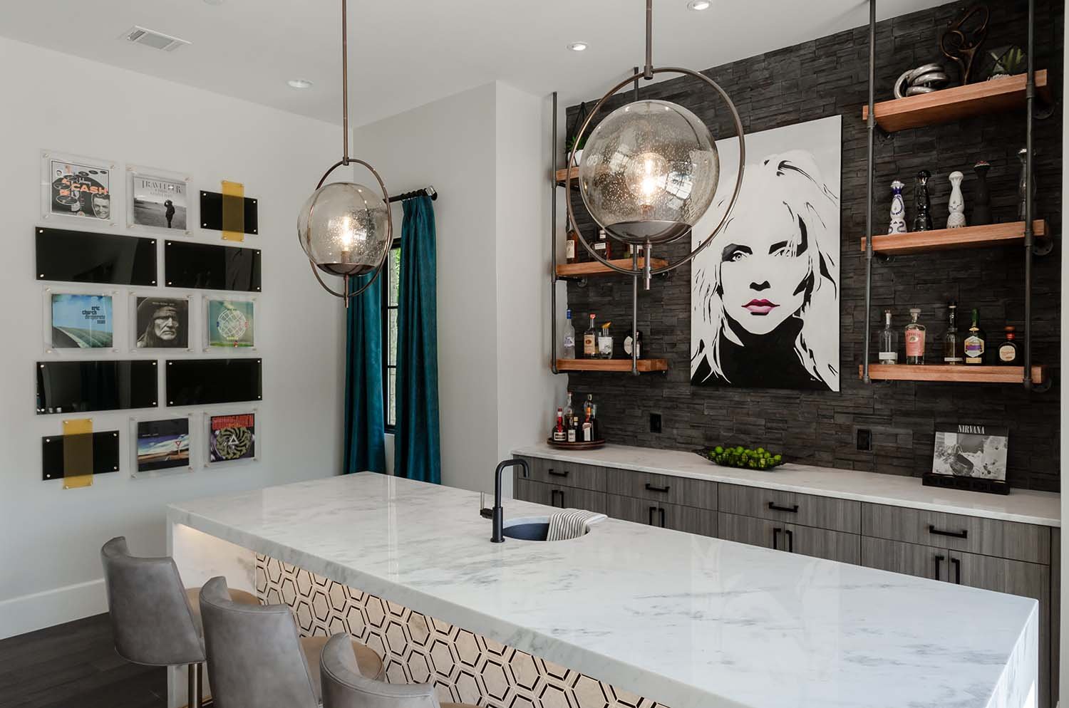
To keep things organic yet dramatic, charcoal stacked stone was used as natural textured backdrop, layered next by ceiling mounted industrial pipes with reclaimed oak barrel shelving, all set off by modern grey wood cabinetry. Juxtaposition at it’s finest.

To add an air of playfulness to this adult-only hang out area, we commissioned a pop-art inspired Debby Harry to watch over the bar. We considered Stevie Nicks or Ann Wilson, but in the battle royale of amazing female music pioneers, Debby was victorious.

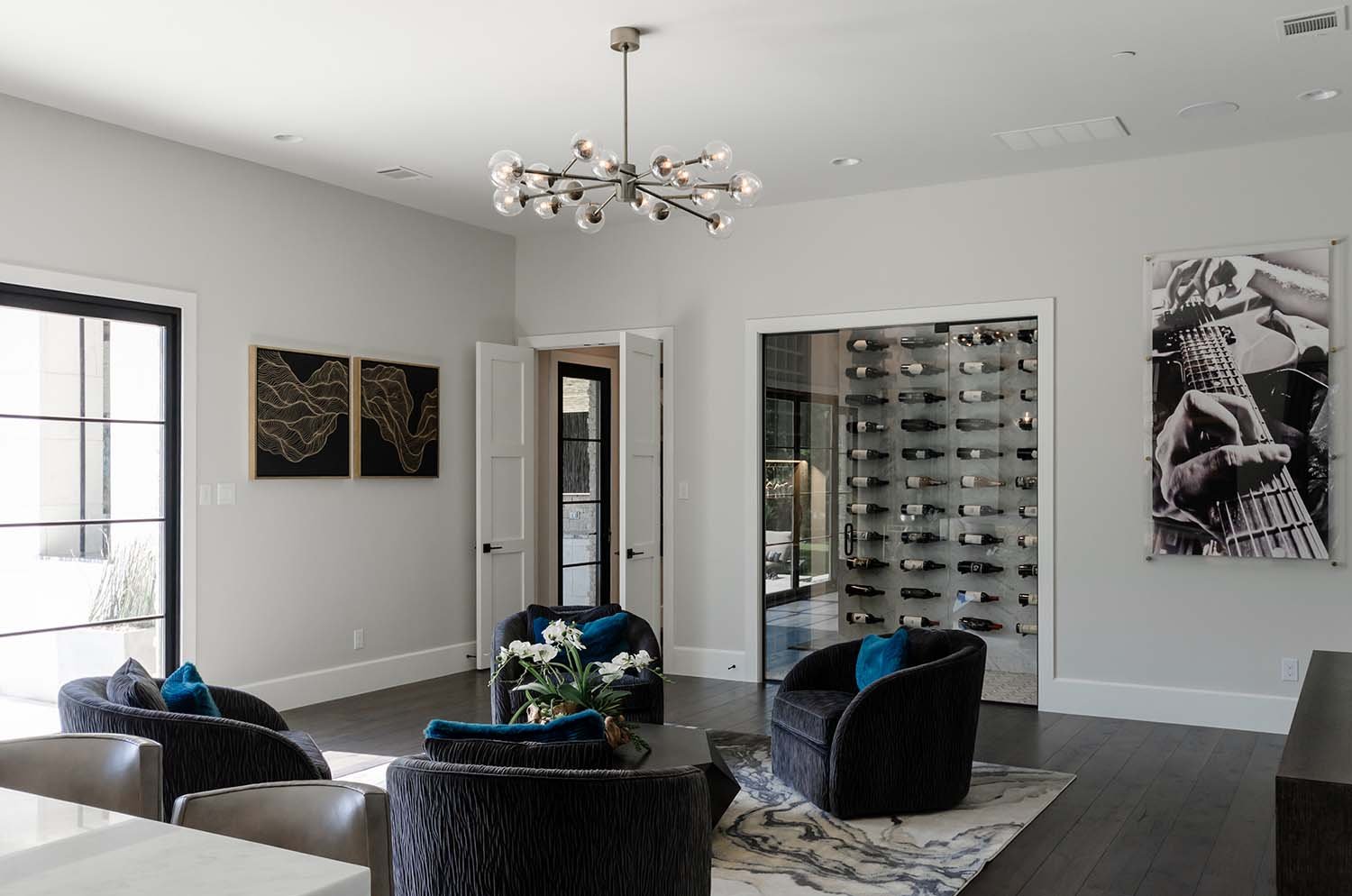
From this view you can get a true appreciation for the various lighting touches throughout. Ambient undercabinet lights create a beautiful evening mood while the to the dramatic sputnik-inspired chandelier over the seating area and sculptural pendants over the island make a wow-statement.

To take advantage of the views and natural light, we installed a pair of telescoping doors allowing for additional usable space both indoors and outdoors.

It’s important to create special moments throughout a design. We achieved this in the island with classically handsome black and white marble hexagon tile underneath and a sleek waterfall counter top edge. We were thrilled with the the perfect play of pattern.

Fun fact, this area of the home was originally slated to be a large home theatre accompanied by a large four-piece bathroom. Due to the fact that this was new construction, we were able to make the decisions from the ground up rather than having to change them after the fact. My proposal was to reclaim the space from this dark, outdated concept of a dedicated home theatre, into an after-dinner speakeasy lounge perfect for an affluent crowd to talk current events. We mae the right decision.

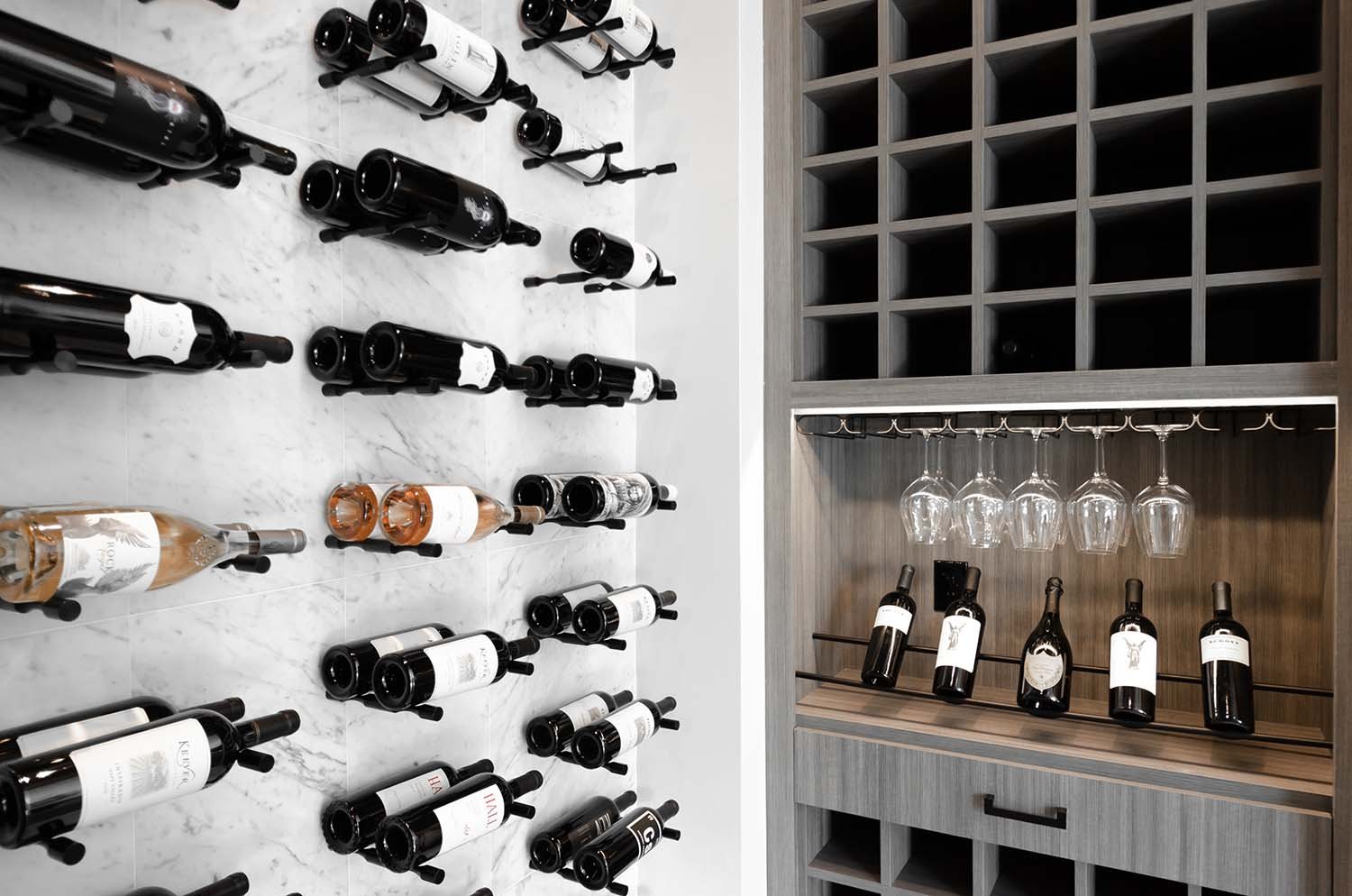
One important decision made during the construction process was to reallocate space from the four-piece bathroom on the other side of this room into a climatized walk-in wine closet. We all felt it was worth losing a shower for the added ambiance of a dedicated area was to show off the client’s love for wine.

In order to create creating rhythm and movement between the bar and climatized wine room, we used the same hexagon tile and cabinetry wood.

As with any home building journey, changes are made for style purposes as well as budgetary ones. For the wine cellar, we originally proposed a large marble slab for the wall. However, we ended up going with 12”x24” marble tile in order to save on cost. The end result did not compromise on the overall aesthetic of the space and we were able to grab a few more bottles of wine to start filling up the cellar.

Through a collaborative effort the homeowners and myself created a bar that reflected their personal sensibilities while encouraging them to step outside of their comfort zone to take chances on material and texture combinations.

This Brizo faucet features a beautiful two-tone blend of matte black and brushed gold. It’s warm and inviting with a connection to the industrial piping we used for the floating shelves.

Industrial piping and reclaimed oak from wine barrels were used to create this bar’s floating shelf feature. The warmth and character from the from the reclaimed wood blends beautifully with the everyday commercial feel of the piping. What is great about this is the piping can be found at nearly any hardware store and layers in a level of approachability to the project.

Strong use of lines, texture, and pattern are used throughout to guide the eye around the room.

Accent Walls: The Best Way to Add Depth to Your Design

Adding an accent wall can drastically elevate the design style in a space. Because it is just a single wall, it can be the easiest way to direct focus, create depth, and even take an "outside of the box" risk. Check out my favorite five accent wall ideas you can do!

1. Paint

This is by far the simplest and most cost effective. I am a huge fan of using highly saturated colors to create a statement when painting an accent wall. Challenge yourself to a bolder color and if you hate it, it's easy to change!

An accent wall doesn’t have to be those vertical spaces. Don’t forget about that fifth wall, the ceiling. By painting this kitchen’s ceiling, we were able to draw the eye all the way to the beautifully barrel vaulted feature.

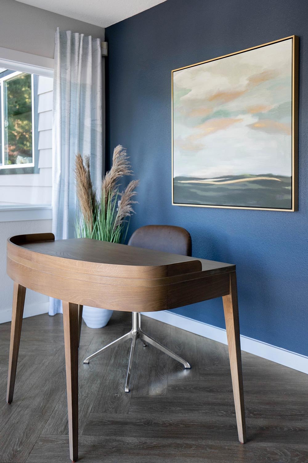
I love how just the navy wall of this kid’s bedroom painted creates depth and allows lighter objects to pop.

2. Molding

Putting molding walls got a bad reputation when so many builders decided to put a single piece of molding around the room called a chair rail (literally one of my least favorite things). However, molding on a wall can look super sophisticated. From the traditional picture frame molding to the more contemporary box molding. 

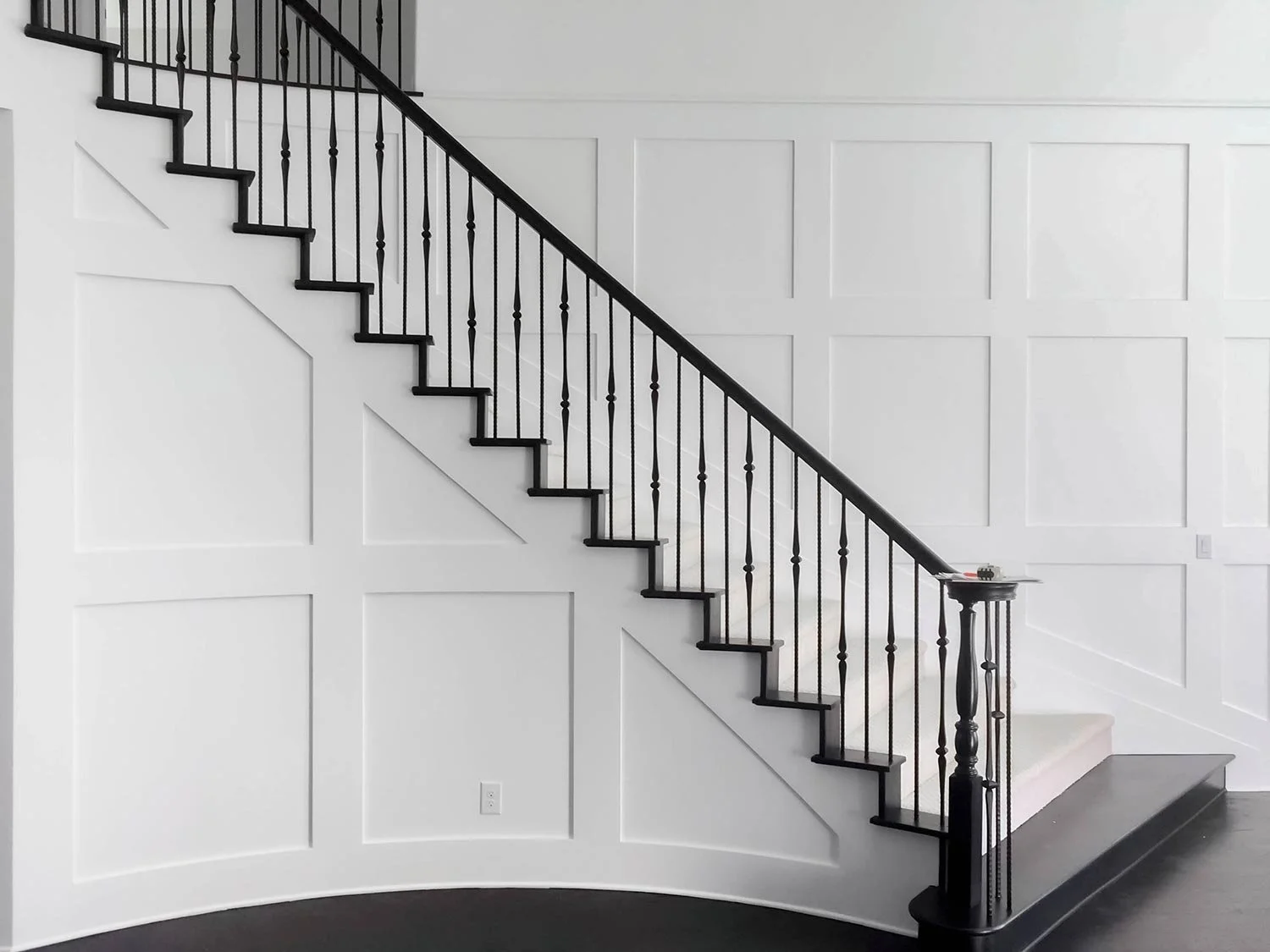
A staircase can be a forgotten space which is why it is the perfect place to add molding to really punch up the design.

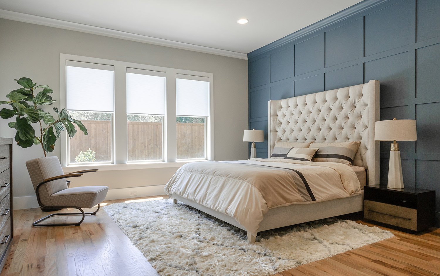
tall tufted headboard against a wood paneled accent wall

Taking a traditional molding and turning it into something special with this square geometric designed wall using molding.

3. Wallpaper

Yes, wallpaper is still in, in fact, it never left. I have used wallpaper in no less then 100% of my recent projects and with the endless possibilities of patterns and styles wallpaper can work for everyone. It really does make me overly excited. 

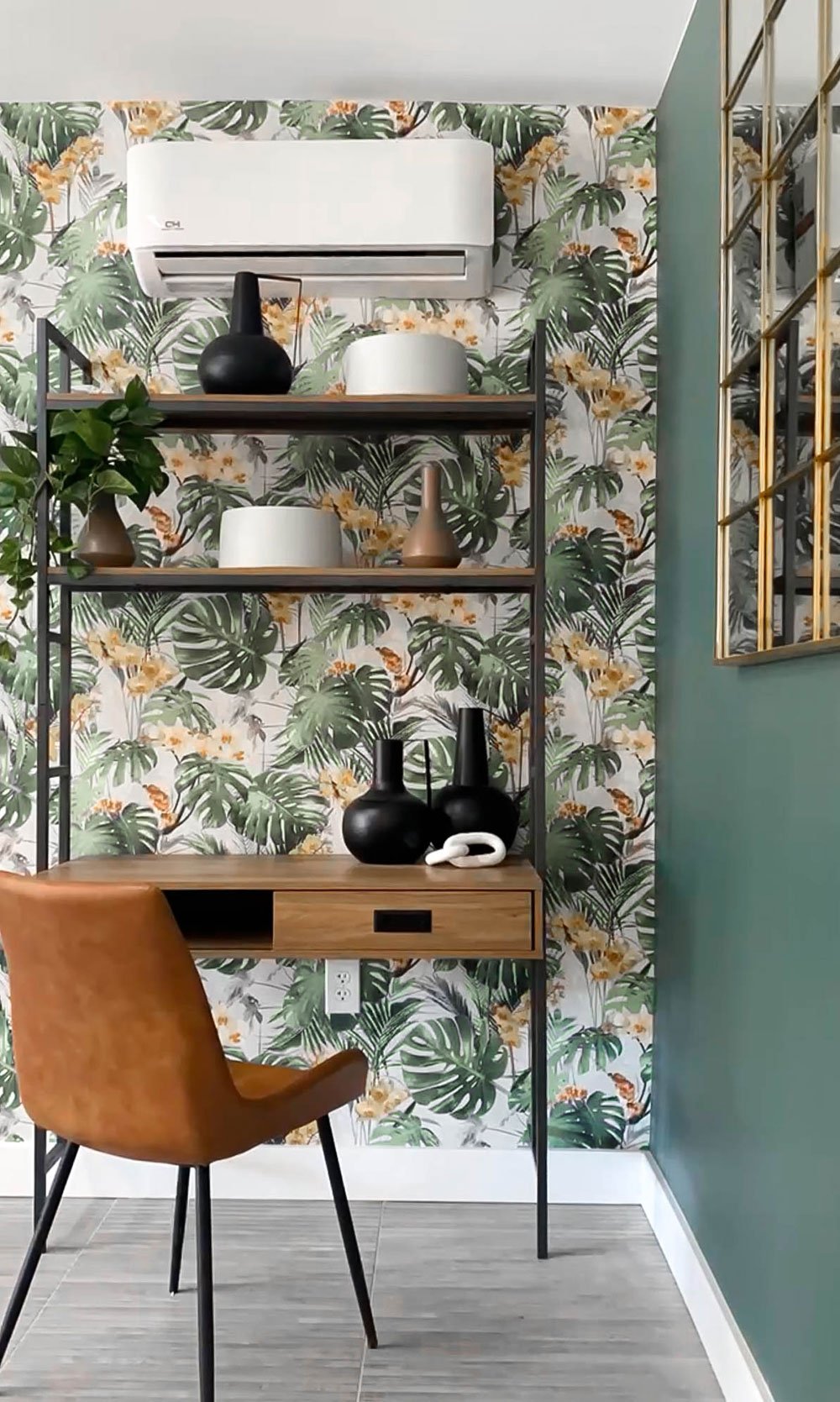
Sometimes just one wall is all you need for wallpaper. This creates the perfect layer for this grandmillennial office space.

The perfect teen girl’s wallpaper. It's bold and beautiful and it only needed on the feature wall.

4. Tile

I love a tile accent wall! I use them frequently in bathrooms, bars, and even in bedrooms and other spaces. There are some really amazing tiles that will wow you and create huge impacts in a home. 

blue floating bathroom vanity with under cabinet lighting

Having fun with a wall of accent tile in a bathroom can bring so much style to your home.

An accent wall tile doesn’t have to mean the entire wall. In this design, we decided to only do it in the nook behind the bar. It helps draw the eye in and layers in the sex appeal.

Using tile that starts in a shower and continues beyond the normal boundaries makes this small bathroom feel grand. Use this to trick your eye and make your tighter spaces truly expand.

5. Wood

I tend to lean more towards the modern use of wood as an accent wall, but for clients who love that "farmhouse" style, you can also use reclaimed wood. 

using wood modern slats as an accent wall

Wood used in a more contemporary fashion to define this TV wall. This decorative wall with evenly spaced wooden slats for a sleek and contemporary look.

For this covered outdoor design, we wanted to add texture with a shou sugi ban accent wall. Shou sugi ban is a traditional Japanese method of preserving and weatherproofing wood by charring it with fire. The charred surface is then brushed and oiled to create a durable and attractive finish.

6. Living Wall

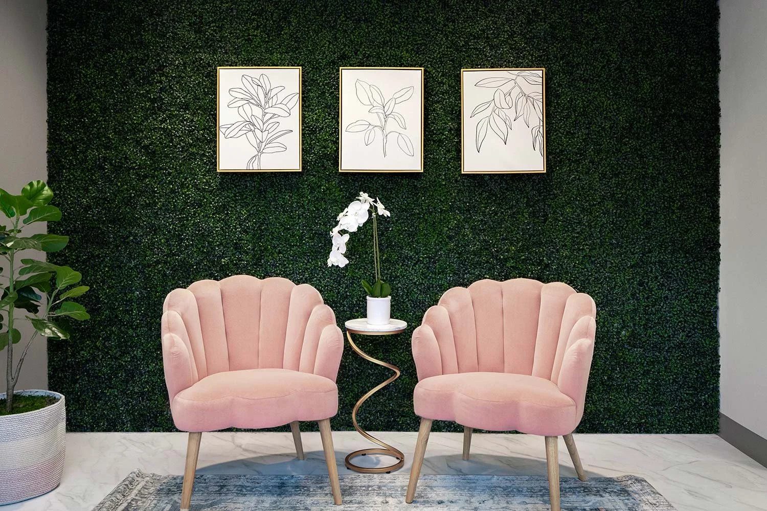
Creating a living wall as an accent is a unique and beautiful way to bring nature into your home. The result is a stunning and sustainable accent wall that adds life and color to any space.

5 Easy DIY Projects to Deck out your Dwelling

We are all spending more time on…well..having more time on our hands. Meaning, this is the perfect opportunity for us all to tackle those easy DIY projects in our home. The greatest part about it all is it won’t cost you much money and will make a huge impact on your emotional well being. Check out my suggestions on what you can do to make the time go by a little faster while beautifying your surrounding.

1. Paint!

A can of paint costs next-to-nothing for the huge impact it will make. Not to mention, some of us have left over paint cans hanging around; so why not use them? Adding a pop of color to your front door showcases your personality and painting an accent wall in your home creates visual interest and depth.

Bold painted blue craftsman style front door in Lake Oswego, Oregon.

2. Tidy up and declutter!

While some of us have a junk drawer in our homes (most of us) and others may have a junk room, now is the time to clean out and organize. A cleaner space will help us be more productive, organized, and happier!

pantry-storage-solutions Portland, Oregon decoration

3. Deep Clean

You may be thinking, “Duh, Kevin, of course I should clean.” I am not talking about the every-day cleaning, i’m talking about that cleaning you do every now and then; grout in kitchens and bathroom, baseboards, windows, and furniture vacuuming (you read that right). Did you know that vacuuming your furniture will get all of the years of dust, skin cells, and dirt off of it? It instantly breathes new life into furnishings and will help extend the life. Don’t forget to unzip those cushions and vacuum inside the casings as well!

37_MasterBath_02_DSC_7811.jpg

4. Art projects!

Add a bit of you into your home with custom arts ant crafts! Some of us have transitioned from CEO to stay-at-home and are now having to juggle entertaining out little ones. A great project is allowing your family to create something special for the home. From rock painting to framing a painting you created, this will add that pop of personal!

Displaying homemade art projects in a downtown Portland, Oregon condo

5. Change out your light bulb

Lighting is so important. We have all been in that zoom meeting where someone has terrible lighting and they look like that are giving an anonymous witness testimony or live in a yellow covered world. Lighting has different warmths that give off a yellow, white, or blue tint. My recommendation is 3000 kelvin, perfect balance of warmth and white. Uniform light temperature through your home will create the perfect ambience for you to enjoy!

Portland, Oregon home decorator presenting proper lighting design.


Learn to hand render like the pros!

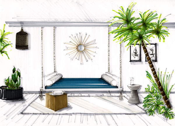
Have you ever seen a hand rendered design and thought, "WOW, how do they do that?" or, "I'll never be able to hand render like that." I am an interior designer and I also have those same thoughts. In college I had to learn the skills of hand rendering, however, with such a fast paced world, it was one of the skills I let slip. 

I recently reconnected with a friend from university, Shannin Williams, and she absolutely  amazed me. Shannin has fine tuned her hand rendering skills since our time as Lumberjacks at SFA in Nacogdoches, TX.  "My goal is to help you learn the basic techniques of hand rendering and sketching and apply those to your client presentation boards in a creative way so you can sell your design proposal." Shannin says. I love how she inspired me to get back to the basics by putting pen to paper and immerse myself into my designs on another level. Here are some of the tips she gave me for sharpening my hand rendering skills that will help you too.

Sannin Williams hand rendering interior design

Tip 1 - Use good quality paper.

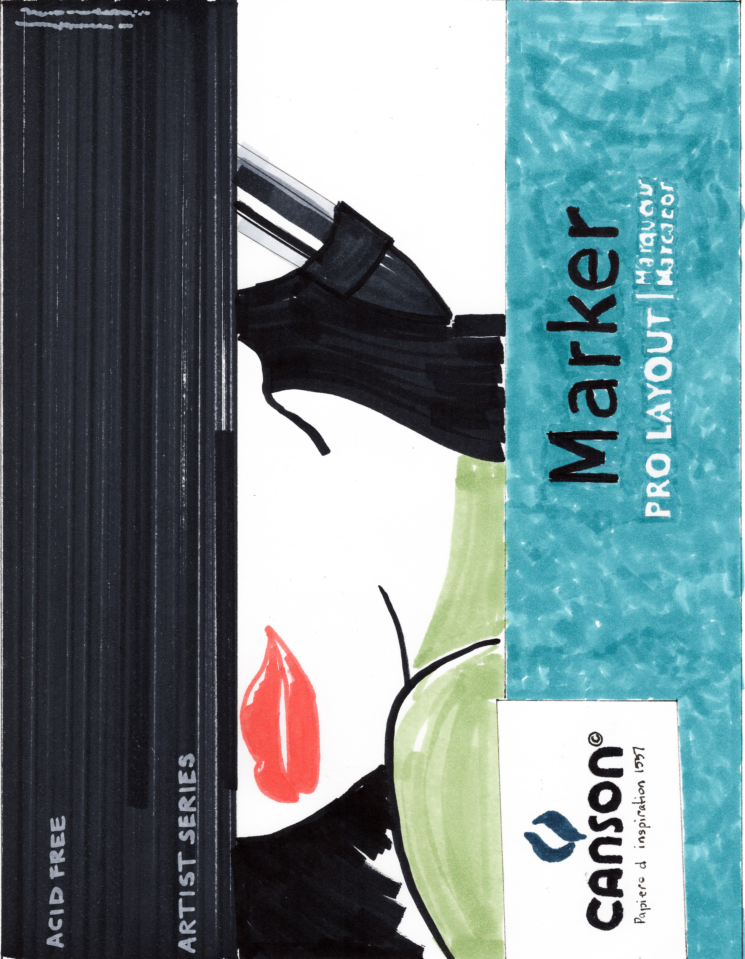
Using good quality paper can change the way the final rendering can look. I’ve used several types of marker paper and I discovered the ones I like the most. If I want my hand rendering to have a softer look I use Bienfang Lightweight drawing paper. This paper allows the marker to bleed perfectly for me. If I want a sharper look with defined strokes and marks and no bleeding I use x-press it blending card. Others I use are Canson pro layout marker paper, and Borden& Riley #234 bleedproof paper. I suggest trying a variety of papers until you find the one you like and achieve the look your aiming for. See more of my favorite tools in the link here

Canson marker pro rendering

Tip 2- Use a straight edge when you hand render or draw. 

I always use a triangle that has an inking edge when I draft floor plans or hand render. The purpose is to keep your marker lines straight. I like seeing crisp, straight lines in my illustrations. A crooked line makes me nuts which is why I own several adjustable triangles in different sizes. My favorite is the Staedtler Mars 8” adjustable triangle. I even keep a smaller one in my purse when I travel along with a sketchbook, pen, and pencil. 

Sketches of architectural and design rendering tools

Tip 3 - Use good quality markers. 

I use Copic Sketch markers due to the 380 + colors they offer. I also like Copic Sketch markers because you can refill them and change the tips when they get bad. Buying a $6 marker seems outrageous but I look at it as an investment since I have the ability to refill them when needed. That beats buying a whole new marker like you would with other brands. If you want to start with a set of markers I recommend purchasing any of the Copic Sketch cool, toner, neutral, and warm gray markers first. You can achieve a lot of colors with a range of grays. And don’t be afraid to layer and mix your marker colors to create a new color. 

Markers and Ink rendering


Tip 4 - Define your own style of hand rendering. 

There are several architectural illustrators out there that have different hand rendering techniques. I have learned from them all and developed my own rendering style that portrays the look I want to achieve. My style includes a loose and quick mark that is not perfect allowing my final hand rendering to be natural and not forced. It took me months of practice to achieve the style I wanted and I recommend you doing the same. Your style of hand rendering needs to stand out amongst others to get gain attention. 

Hand rendered interior design. Tropical boho style design.
Hand rendered entry design by Shannin Williams
Hand rendering interior architecture and design

To see more of my work visit my website at www.shanninwilliams.com or follow me on instagram @shannin_williams. If you want to practice hand rendering jump on my website and sign up for my mailing list and download your free line drawing or you can see try out my hand rendering course here.

Shannin Williams Interior Designer

"Local" Artists on my Radar

“Abstraction allows man to see with his mind what he cannot see physically with his eyes....Abstract art enables the artist to perceive beyond the tangible, to extract the infinite out of the finite. It is the emancipation of the mind. It is an exploration into unknown areas.” ― Arshile Gorky

I have always had a love for abstract art. I feel like it can completely bring a design together by tearing down the normal expectations of what art should be. Sometimes it is a beautifully seamless canvas that ties in all of the colors from the designed surroundings and other times it is the contrast in the room. 

Since starting my design business and moving to an artsy city like Portland, Oregon, I have been keeping an eye out on local artists from around the country. I loving having a resource to go to in order to infuse some personal pieces into my client's homes which will afford their homes to have a more personal touch with a commissioned work of art. 

Here are some fantastic artists I have been following recently that are giving me so much life! I have even had the joy to work with a few of them and the ones I haven't, keep an eye out for me using in future projects.

Lana Nguyen

Originally from Kiev, Ukrane, she now travels around the United States drawing inspiration from her fascination with nature. Her current works us the medium of Alcohol ink on Yupo. The movement makes me want to get up and dance! She is currently in Phoenix, AZ and has had a studio in Austin, TX. [Get to know Lana more]

Lana working on a commissioned piece for a project

Lana working on a commissioned piece for a project

Paulette Insall

A southern gal living in Portland, Oregon, Paulette is a a contemporary abstract painter expressing her visual language through pure color and an expert eye. She creates one-of-a-kind original works and commissions.  [Get to know Paulette more]

Paulette Insall

Paulette Insall

Current original work of art "Joyous Beginnings"

Current original work of art "Joyous Beginnings"

Lisa Jensen

Lisa is a stay at home mom in Portland OR who found her voice in art. She is drawn to calming and relaxing landscapes and reimagines them in a modern way. There is a true freshness to her work and I am in love. Exciting news for Lisa is that she is going to be a new WEST ELM artist starting August 2018. [Get to know Lisa more]

Lisa Jensen

Lisa Jensen

Collection of works bu Lisa Jensen

Collection of works bu Lisa Jensen

Jose Trujillo

Jose is a self-taught artist originally from Guadalajara, Mexico, now living in Tucson, Arizona. Heavily influenced by impressionist artist. He blurs reality with saturated colors, movement, and uses his artists sight to take liberties on out view of the world around us. [Get to know Jose more]

Josa Trujillo

Josa Trujillo

Couple under and umbrella

Couple under and umbrella

Kyra Kendall

Base in Toronto, Kyra does all affordable original works of art and commissions. She has made a name for herself with her superb water color skills which trail outside of the lines in the most beautiful way. My cousin has one of her pieces and it it one of my favorite things. [Get to know Kyra more]

Kyra Kendall

Kyra Kendall

Rainbow of Lips

Rainbow of Lips

Original Portrait

Original Portrait