Interior Design Inspiration

Mid-Century Modern Dreamscape

Mid-Century Modern Dreamscape

This sweet family had an incredible mid-century modern home in Raleigh Hills, but only one of their three bathrooms was functional. With their first baby on the way, they wanted to reimagine all three spaces to be fully functional, beautiful, and true to the home’s original mid-century character. Plus we converted a guest room into their nursery for their newest family member! Our goal was to honor the architecture and spirit of the house while bringing in fresh, livable updates that would serve their growing family for years to come.


Primary Bathroom

Midcentury Modern Interior Design Primary Bathroom

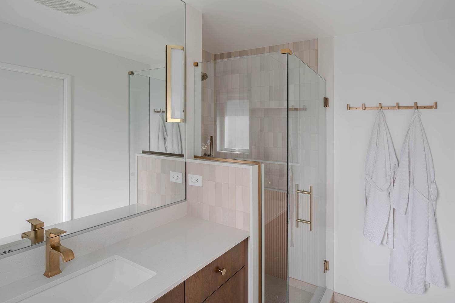
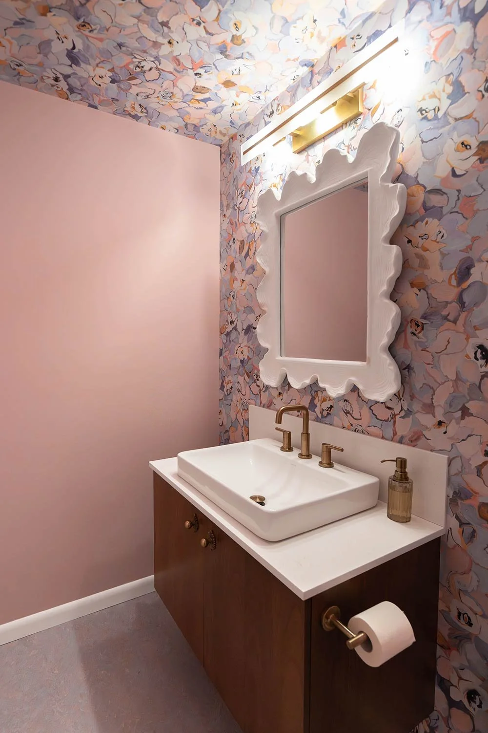
This primary bath originally had a pink theme that we chose to honor in the redesign! The shower was once cramped in the back corner and had outdated electrical, making it unsafe to use. We expanded the shower footprint and added a glass surround to open up the space and bring in more light.

Pink Tile on shower walls in walk in shower

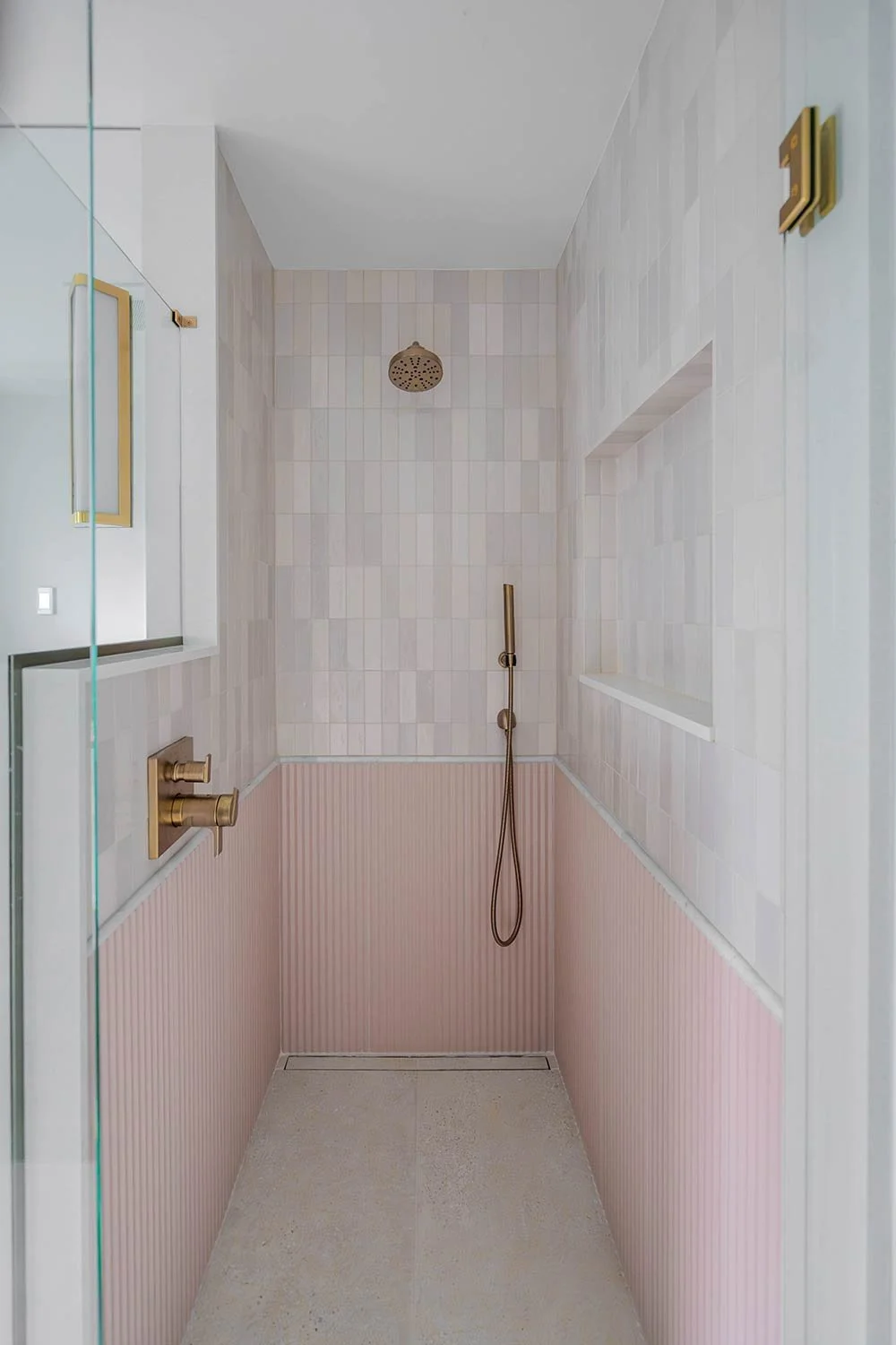
For this walk-in shower, we wanted to create something that felt both elevated and serene. We integrated the drain for minimal visual disruption, allowing the gorgeous floor tile to flow continuously from the main bathroom into the shower. This small detail helps the space feel larger and more cohesive. The textured blush wainscoting brings such warmth and personality to the space! The soft tone adds a subtle pop of color without feeling overwhelming, giving the bathroom a bit of charm and softness against the cooler marble and white tones.

Marble and unique tile choices How to make your shower interesting and unique

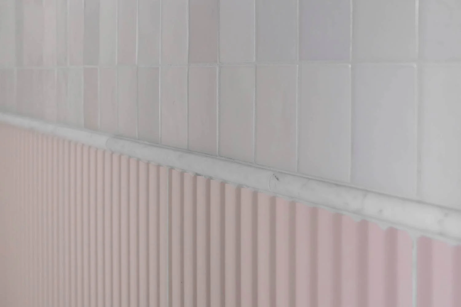
To tie everything together, we added a marble schluter detail that acts as a beautiful bridge between the pink wainscoting and the white zellige tile above. The zellige tiles each have their own slightly different finish and texture, which gives the walls movement and a handcrafted feel. Together, the combination of materials, textures, and tones creates a space that feels elegant without losing its sense of fun and individuality!

Primary bathroom design in small space

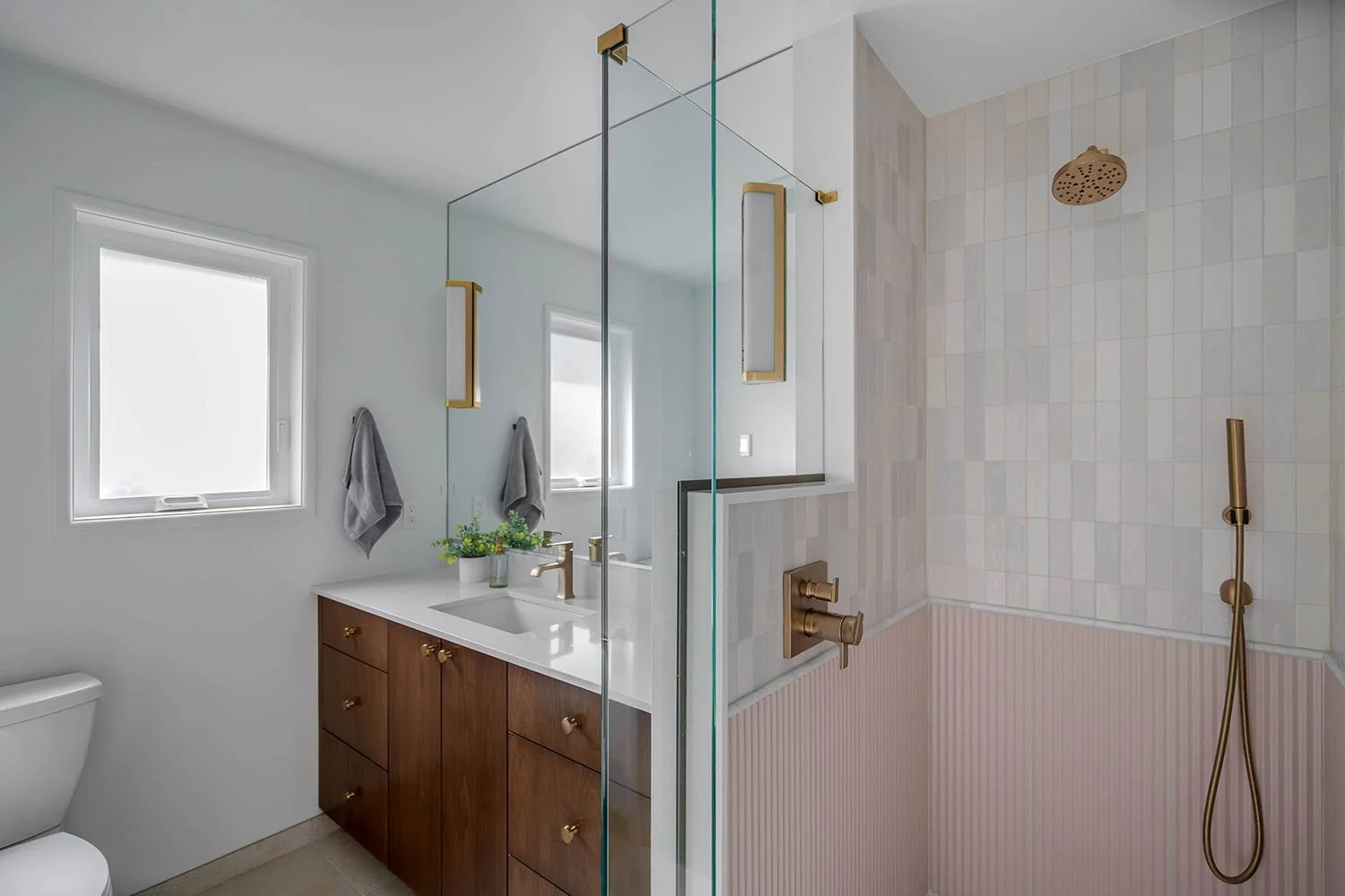
To enhance the sense of height and airiness, we carried the mirror wall to wall and all the way up to the ceiling. The vanity offers plenty of counter space for getting ready and features the same warm walnut tones carried throughout the home, creating a beautiful sense of cohesion. This space feels inviting, functional, and distinctly mid-century, honoring its charming original character while feeling fresh and timeless.

Interior design for modern day living

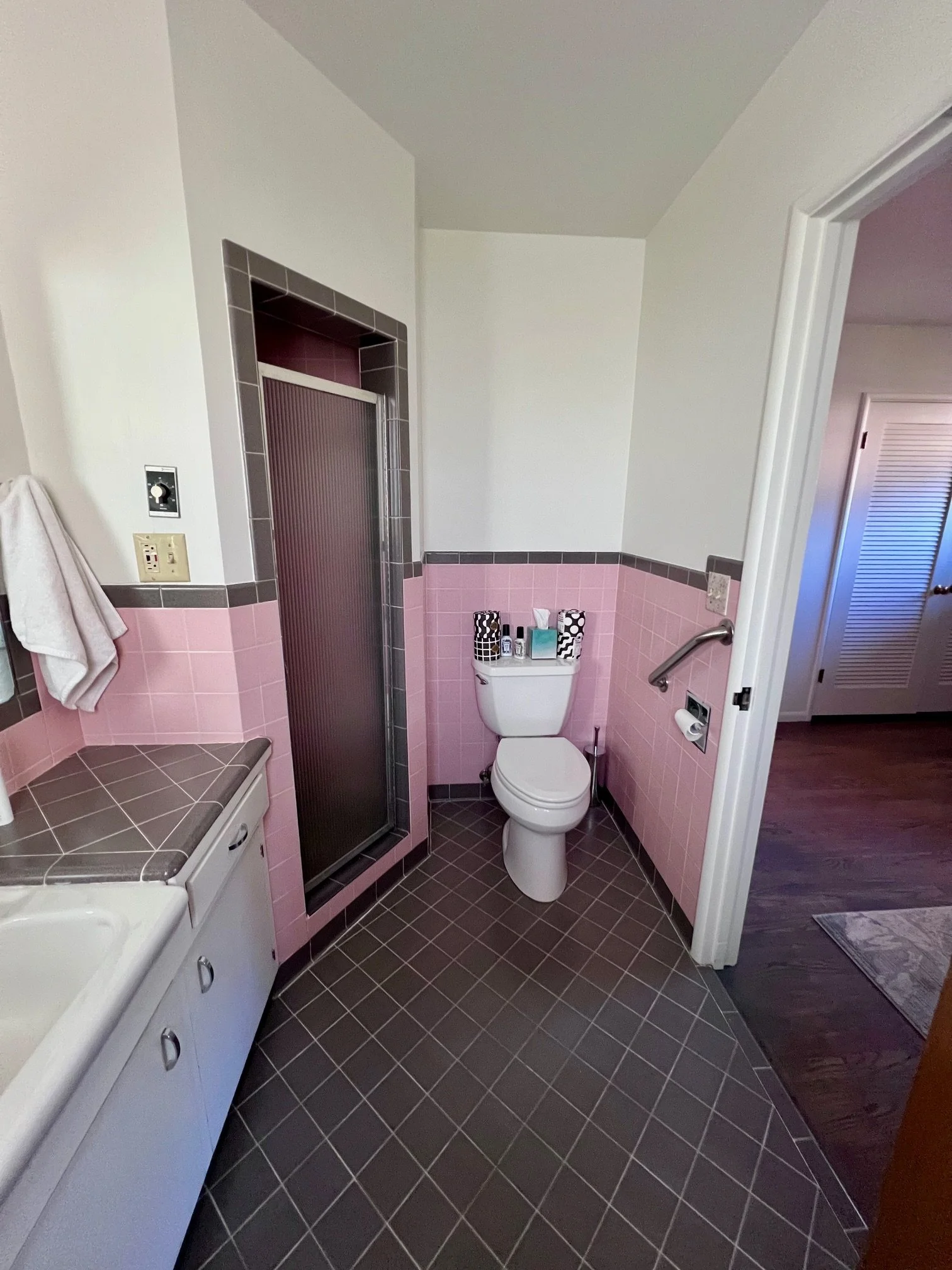
Before Photo: This primary bathroom featured an iconic color scheme rooted in classic mid-century modern style; however, the space was completely nonfunctional. The shower’s electrical work was not up to code, rendering it unusable, and the angled layout prevented the room from fully maximizing its footprint. With the shower drywalled in on all sides, the enclosure felt especially dark and cramped, further limiting the functionality and comfort of the space.

Home remodel design interior design

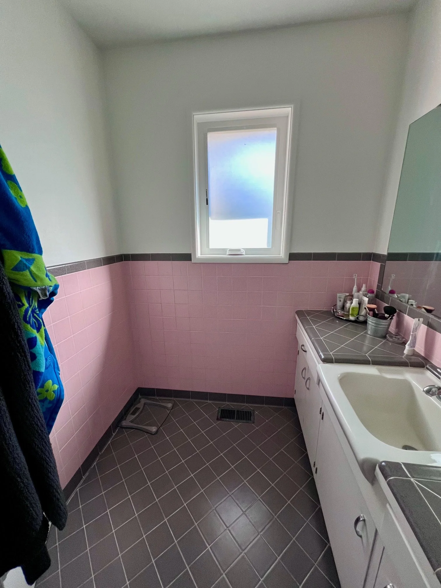
Before Photo: The vanity featured an oversized sink that unfortunately left very little usable counter space. Storage was also limited, and the mirror was mounted too low, making it difficult for the tall homeowner to comfortably see himself.

Powder Bathroom

Laundry powder bathroom interior design trends

This powder bath was originally cramped, outdated, and neglected. The clients wanted a true pop of fun and funk, so we transformed it with a floral-inspired wallpaper that wraps up onto the ceiling and painted the remaining walls a soft pink to tie it all together. We installed a lilac Marmoleum floor that extends into the laundry room for durability and easy cleaning. The result is a one-of-a-kind, functional space that makes a bold mid-century modern statement that’s playful, practical, and full of personality.

Unique hardware and finished for your bathroom

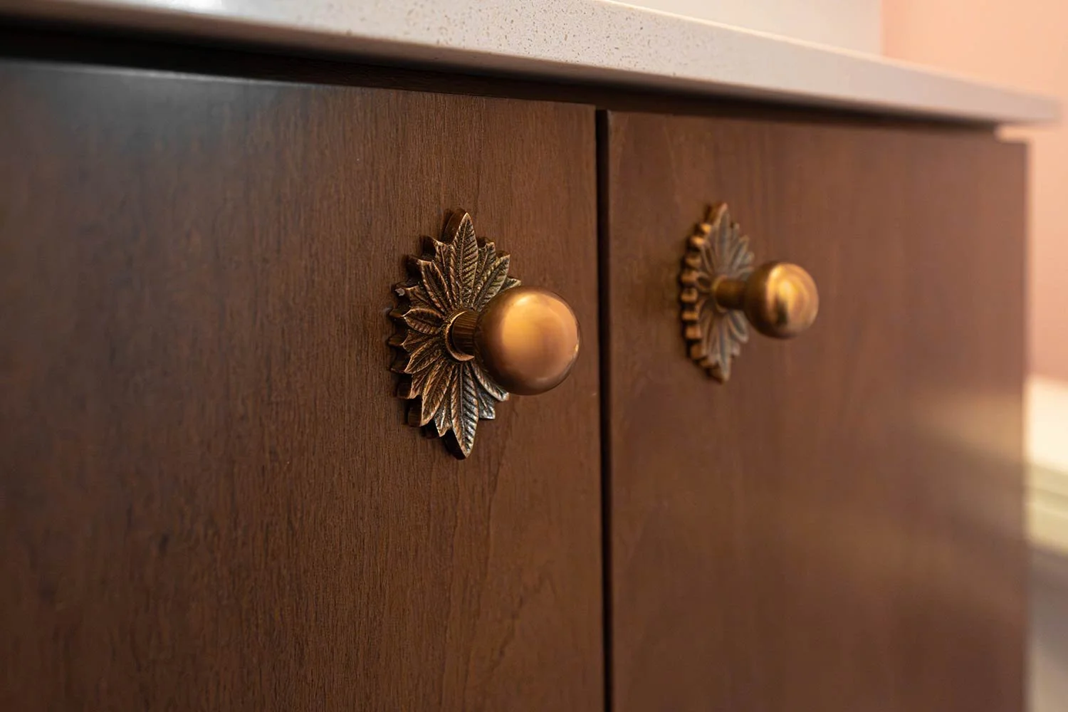
We sourced the knobs during some of our travels, and we love how they help to make this design truly one of a kind!

home renovation for old homes

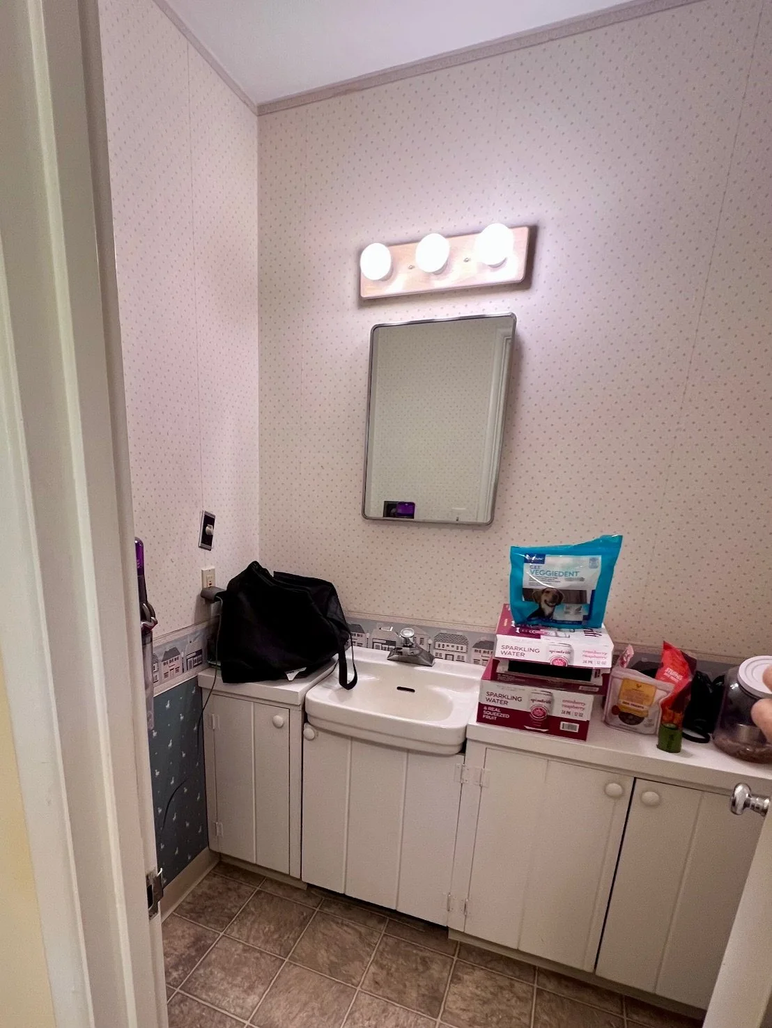
Before Photo: At first glance, this bathroom appeared to offer plenty of storage, but the layout told a different story. Because of the door placement and the tight spacing between the door and the cabinetry, the cabinets were difficult to open and awkward to access while moving in and out of the room. While the location could have been ideal for a guest water closet, the cramped configuration, dated appearance, and non-functional toilet ultimately made the space unusable.

full home renovation in pnw

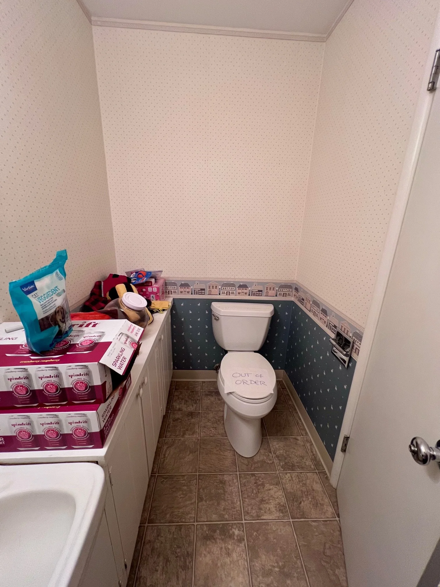
Before Photo: This bathroom didn’t function at all. The toilet was non-operational, and the layout made extremely inefficient use of the space. Positioned directly behind the door, the toilet was hit every time the door fully opened, creating an awkward and impractical circulation path that made moving around the bathroom frustrating and dysfunctional.

Guest Bathroom

Walnut guest bathroom designs mid century modern design

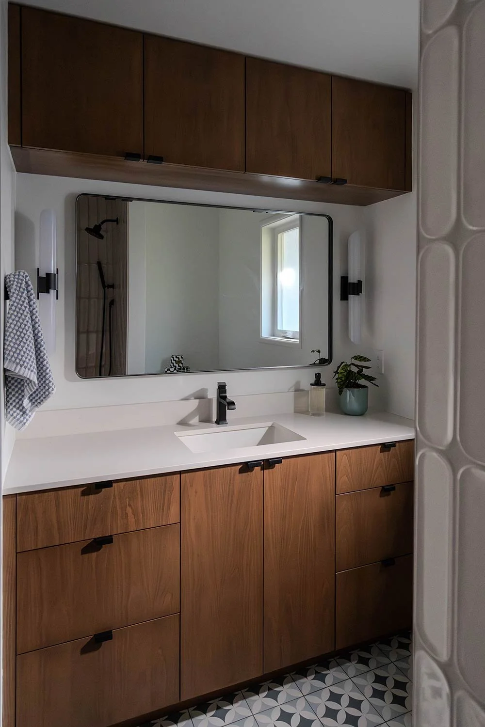
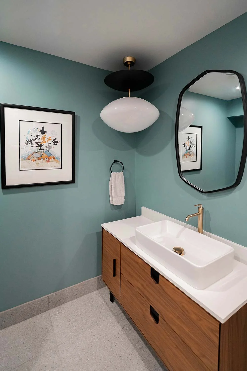
This guest bathroom will be the bathroom used by their children and overnight guests. Storage was a top priority, so we incorporated a clever over-mirror cabinet to maximize space without sacrificing style. To bring in true mid-century modern character, we paired rich walnut cabinetry with a rounded mirror and minimal hardware pulls for a clean, timeless aesthetic.

Unique tile flooring that hides dirt and grime

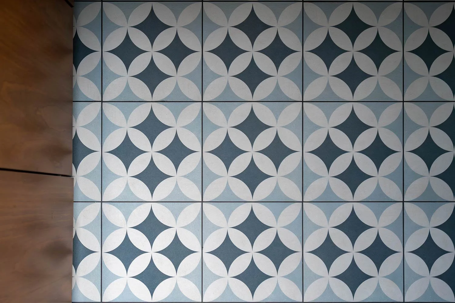
We chose this floor tile because its tone and texture are perfect for disguising the inevitable splashes, footprints, and daily wear that come with kids and frequent use.

Textured shower wall tile for guest bathroom

The shower tile is one of our favorite details in this bathroom! Its subtle beveled texture adds beautiful dimension and visual interest to the space. We chose to keep the tub for ease of use with young children, pairing it with both a hand shower and a rain shower to add flexibility and functionality for a growing family.

Mid century modern home updates.

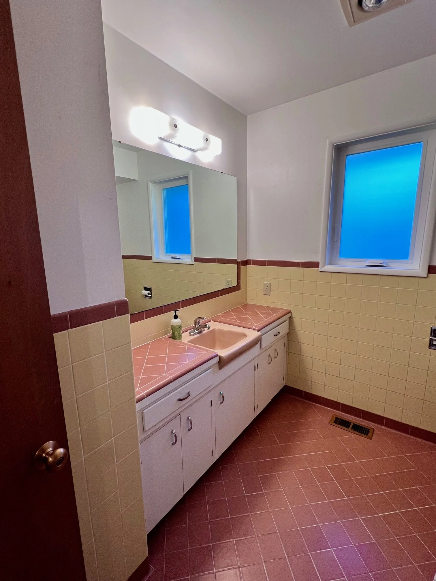
Before Photo: This bathroom featured an outdated color palette with mustard and red tile. While the mid-century modern style was iconic in its time, the space no longer met the needs of a growing family. The sink area felt crowded and inefficient, the tiled countertops with heavy grout lines easily trapped grime and messes, and the cabinetry offered limited, cramped storage that didn’t support everyday use.

Old photos of renovations in a home.

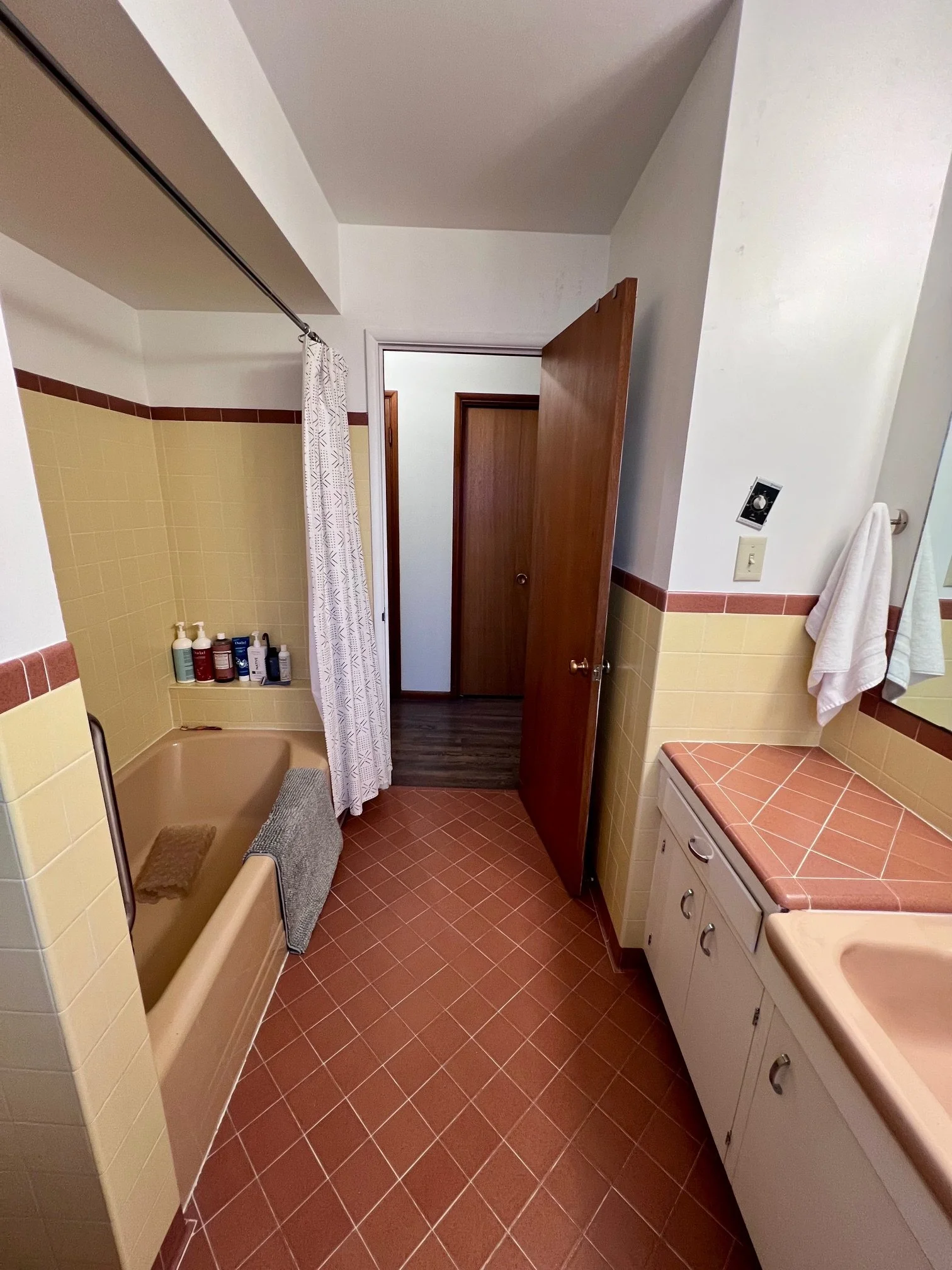
Before Photo: The acrylic tub in this bathroom was no longer a functional option. It felt outdated and, more importantly, posed a significant slipping hazard, making it an impractical and unsafe choice for a family-friendly space.

Nursery

nursery design mood board and inspo for kids room

We created a darling nursery for their new baby, a cozy and neutral space inspired by the serenity of the woods. The subtle woodland theme adds a touch of whimsy without feeling overly themed, making it a space the baby can grow into.

Cute nursery design for gender neutral bedroom

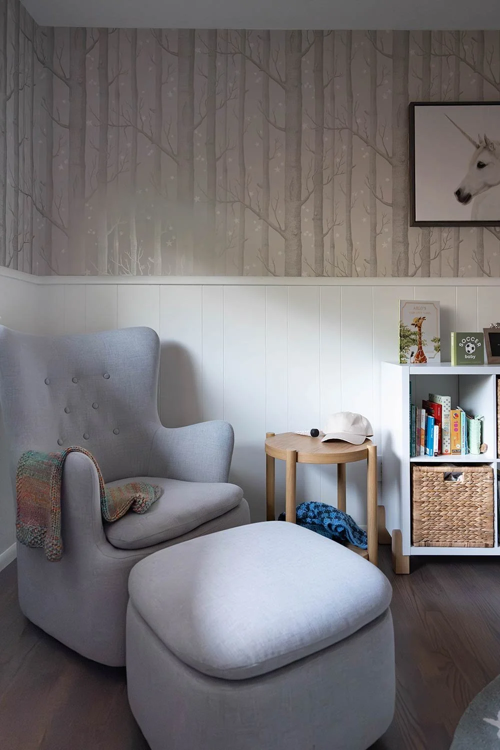
Our favorite detail is the silvery stars scattered through the wallpaper, which catch the light just enough to bring a gentle, magical glow to the room, especially in the evening hours! Hope you enjoyed looking through this glorious Mid-Century modern remodel and that it inspires you to honor the character in your home!

Mid-Century Modern Aesthetic

For this project, the homeowners needed a few bathrooms in their home updated. During our conversation, it was made clear the importance of preserving the mid-century modern identity they fell in love with when they purchased the home while introducing layout changes and modern updates in order for the bathrooms to meet the needs of today. I hope you enjoy the blend that was created in this home.

Designer: Kevin Twitty
Contractor: Delta Services Construction

Mid century modern designers in Portland Oregon

Modernizing this bathroom while keeping Mid-Century character was important for this homeowner. We decided to keep the vaulted wood ceiling and refinish it to make it feel new again. By adding a modern floating walnut vanity with under cabinet lighting, we elevated the space for the modern needs of today’s homeowners.

wabi sabi primary bedroom and bathroom with cool light

One feature of this house that I knew we had to keep was the original floor to ceiling stone fireplaces. I used this as the inspiration for the floor to ceiling modern tiles on the back wall of the shower. The homeowners and I loved how this design language transcended the decades of time between both designs.

exposed beams and tile wall

We took out the old enclosed shower to expose the vaulted ceiling. It created a grand and airy vibe fro the bathroom. We then decided to wrap the shower in glass to allow natural light to pour in with a beautiful tree-top view.

shower with exposed wood open air shower

The half wall was kept for a few reasons. One was for a little separation from the toilet and the shower and the other, more important reason, was to have a place to put a toilet paper holder.

hanging black lighting over vanity

The previous bathroom layout did not have a door from the bedroom into the bathroom. Instead, you entered through a set of doors that led into the closet. We ended up taking the original closet doors and moving them three feet to the side to provide a more functional entrance. The decisions meant sacrificing five inches of cabinet space. Well worth it.

In order to have the illusion of a larger vanity, we decided to place a walnut framed oversized single mirror above the sinks. This large mirror helps reflect the natural lite around the room. Above the mirror we places three milk glass orb pendants for design style and task lighting.

modern frameless glass shower surround with matte black plumbing fixtures

When walking into this bathroom through the new doors, you are greeted with wall-to-wall and floor-to-ceiling stone tiles. This is the wow moment. By taking the tiles across the entire wall and up to the ceiling, this bathroom feels wider and taller. This was an important accomplishment since we could not change the size of the room.

mix of boho and modern rug with black tile flooring

We used angled charcoal tile set in a 50% offset patter to achieve this unique patter on the floor. The subtle details set this design apart from the rest. By layering in a traditional oriental rug, we were able to play with that mid-century homeyness of the time.

restored ceiling with exposed beams

When we removed the old shower enclosure, the vaulted ceiling we exposed needed a good sanding and a fresh finish to bring it back to it’s original glory.

Portland Oregon plumbing fixtures

Clean, modern matte black shower head and hand wand suites the homeowners modern needs.

chain hanging bulb lighting in black finish

A set of three pendant lights above the vanity provides light and unique design details.

modern floating bathroom vanity best Portland Oregon interior designers

The ceiling line from the bedroom continues into and through the bathroom, connecting the two space seamlessly.

floating double vanity with quartz countertop

This is one of the best blends of modern design with mid-century aesthetics.

sputnik light fixture in black with exposed beam wall

Outside of the bedroom we added a new entry light fixture to provide some much-needed illumination and statement as gusts walk in.

mid century modern bathroom with teal

The second bathroom in the house we updated was the powder bath. Before there was a small enclosed shower. bulkheads, and no lighting. We expanded the shower, took out the drop ceiling, and brightened the space with white tiles and bright lights.

teal painted bathroom walls terrazzo floors

We took out the old linoleum floors and replaced them with a terrazzo tile to stay true to that mid-century aesthetic. To crown the space, we decided to put an architectural light fixture in the corner. I love the touch of uniqueness and out-of-the-box style.

best mid century modern bathroom designer Portland Oregon

We embraced the asymmetrical design of this mid-century modern walnut vanity with vessel sink. The shaped mirror connects with the unique frosted glass shade of the artistic light fixture.

kate spade light fixture in teal powder bathroom cool space

This sculptural MCM hanging pendant boasts a big impact with it’s unique shape and mixed metal combination.

white subway tile shower

We love the design detail of the exposed pipe rain shower system in gold. It’s classic yet modern.

How to Create the Perfect Ralph Lauren Inspired Nursery

Creating a baby's room with a Ralph Lauren-inspired design is a beautiful and timeless way to welcome a new addition to your family. Combining classic elegance with a touch of whimsy, a Ralph Lauren-style nursery is both stylish & practical.

When it comes to color, Ralph Lauren's signature palette is a perfect starting point. Soft shades of blue and green, paired with neutral tones, create a serene and soothing atmosphere. Punch it up with red accents and your room is ready to shine. If you're not sure where to start, consider using one of Ralph Lauren's classic bedding collections, such as the "Lullaby" or "Sweet Dreams" collections, as the basis for your color scheme.

In terms of furniture, choose pieces that are both functional and stylish. A crib is the centerpiece of any baby's room, and a classic white crib with elegant detailing, such as the "Princess" crib from the Ralph Lauren Baby collection, is a perfect choice. Complement the crib with a matching dresser and changing table, and add a cozy rocking chair for those late-night feedings.

When it comes to decor, mix and match patterns and textures to create a layered and inviting look. A plush white rug, such as the "Bear" rug from the Ralph Lauren Baby collection, provides a soft and comfortable place for baby to play. Or even a blue rug with a global inspired motif. Add throw pillows, blankets, and wall hangings in coordinating colors and patterns to create a warm and welcoming atmosphere.

Don't forget the finishing touches! A mobile featuring classic Ralph Lauren motifs, such as horses or polo players, adds a playful and whimsical touch. A soft and cuddly stuffed animal, such as the "Bear" from the Ralph Lauren Baby collection, provides comfort and companionship. And a collection of classic children's books, arranged on a bookshelf or in a basket, completes the look and encourages a love of reading.

luxury nursery room design

With a little effort, you can create a beautiful and timeless Ralph Lauren-style nursery that is both practical and stylish. Your baby will love spending time in this peaceful and inviting space, and you will enjoy the classic elegance and sophistication of the Ralph Lauren design aesthetic.

Outdoor Patio Design: Relaxing Tangerine

Being outdoors is on the top of my "list of loves" in life. It makes me so happy to breath in the fresh air and take a pause from the four walls that envelope most of my day. Over the past few years this sentiment towards being outdoors has been shared by more and more people and because of this, indoor/outdoor living spaces in homes have been raising in popularity and manufactures of outdoor safe furnishings have kept up with the pace. In honor of the summer season coming to an end and beautiful Autumn weather rolling in, here is a design you could easily do for your own outdoors. I call it, Relaxing Tangerine: A relaxing casual style with clean lines and natural textures.

CasualTangerineOutdoor.jpg
  1. Arrow Accent Pillow - Pillows are some of my favorite ways to update a space. This charcoal arrow on a cream background has a fantastic modern casual vibe. $60

  2. Tone on Tone Striped Pillow - These contrast against the charcoal, of the other pillow and add structure to the space. - $79

  3. Natural Trellis Pillow - I love how these bring in the mid-tone of all of the neutrals. $98

  4. Tangerine Bohemian Style Rug - Adding just a touch of color is perfect to give your outdoor patio just enough color without overwhelming. $629

  5. Woven Natural Stools - These wicker stools add visual texture and an extra place for guests to sit when you are entertaining. $250

  6. Copper Bowl Planter - Adding a little bit of shine plays well against the softer tones of the design. I love the warmth in the metal. $175

  7. Copper Cylinder Planter - This is the sister planter. It has all of the same material elements, but allows for something a little different. $175

  8. Outdoor Safe Table Lamp - Electric lamp outside? What! That is awesome. This outdoor lamp will keep the mood casual. $279

  9. Antiqued Side Table - Everyone needs a place to put a drink down, and this small antiqued side table is perfect for that. It also connects well with the planters and cocktail table. $199

  10. Gray Sofa/Chaise with Casual Washed Wood - Upholster is where you splurge! These well constructed pieces are going to last you a lifetime. They are the perfect classic high end look for your outdoors. $3579

  11. Gray Chair with Casual Washed Wood - A perfect compliment to the sectional above. I love how this chair is oversized. Makes me want to curl up with a cup of coffee and a good book. $1125

  12. Rusted Top Round Coffee Table - A show-stopper of a cocktail table. The simplicity in the shape is lovely and the rusty top is a worry-free way to live outdoors. $855


Learn to hand render like the pros!

Have you ever seen a hand rendered design and thought, "WOW, how do they do that?" or, "I'll never be able to hand render like that." I am an interior designer and I also have those same thoughts. In college I had to learn the skills of hand rendering, however, with such a fast paced world, it was one of the skills I let slip. 

I recently reconnected with a friend from university, Shannin Williams, and she absolutely  amazed me. Shannin has fine tuned her hand rendering skills since our time as Lumberjacks at SFA in Nacogdoches, TX.  "My goal is to help you learn the basic techniques of hand rendering and sketching and apply those to your client presentation boards in a creative way so you can sell your design proposal." Shannin says. I love how she inspired me to get back to the basics by putting pen to paper and immerse myself into my designs on another level. Here are some of the tips she gave me for sharpening my hand rendering skills that will help you too.

Sannin Williams hand rendering interior design

Tip 1 - Use good quality paper.

Using good quality paper can change the way the final rendering can look. I’ve used several types of marker paper and I discovered the ones I like the most. If I want my hand rendering to have a softer look I use Bienfang Lightweight drawing paper. This paper allows the marker to bleed perfectly for me. If I want a sharper look with defined strokes and marks and no bleeding I use x-press it blending card. Others I use are Canson pro layout marker paper, and Borden& Riley #234 bleedproof paper. I suggest trying a variety of papers until you find the one you like and achieve the look your aiming for. See more of my favorite tools in the link here

Canson marker pro rendering

Tip 2- Use a straight edge when you hand render or draw. 

I always use a triangle that has an inking edge when I draft floor plans or hand render. The purpose is to keep your marker lines straight. I like seeing crisp, straight lines in my illustrations. A crooked line makes me nuts which is why I own several adjustable triangles in different sizes. My favorite is the Staedtler Mars 8” adjustable triangle. I even keep a smaller one in my purse when I travel along with a sketchbook, pen, and pencil. 

Sketches of architectural and design rendering tools

Tip 3 - Use good quality markers. 

I use Copic Sketch markers due to the 380 + colors they offer. I also like Copic Sketch markers because you can refill them and change the tips when they get bad. Buying a $6 marker seems outrageous but I look at it as an investment since I have the ability to refill them when needed. That beats buying a whole new marker like you would with other brands. If you want to start with a set of markers I recommend purchasing any of the Copic Sketch cool, toner, neutral, and warm gray markers first. You can achieve a lot of colors with a range of grays. And don’t be afraid to layer and mix your marker colors to create a new color. 

Markers and Ink rendering


Tip 4 - Define your own style of hand rendering. 

There are several architectural illustrators out there that have different hand rendering techniques. I have learned from them all and developed my own rendering style that portrays the look I want to achieve. My style includes a loose and quick mark that is not perfect allowing my final hand rendering to be natural and not forced. It took me months of practice to achieve the style I wanted and I recommend you doing the same. Your style of hand rendering needs to stand out amongst others to get gain attention. 

Hand rendered interior design. Tropical boho style design.
Hand rendered entry design by Shannin Williams
Hand rendering interior architecture and design

To see more of my work visit my website at www.shanninwilliams.com or follow me on instagram @shannin_williams. If you want to practice hand rendering jump on my website and sign up for my mailing list and download your free line drawing or you can see try out my hand rendering course here.

Shannin Williams Interior Designer