What comes to mind when you think of Taiwan? Maybe it is the Taipei 101 Tower, night market foods such as stinky tofu, lantern festivals, or even their famous pineapple cakes. Tiles are not something that is typically on the top of that list. However, during my recent trip to Taiwan, I was struck by the beauty and intricacy of the tiles I saw throughout the island. From the ornate roof tiles of ancient temples to the colorful mosaic tiles in modern buildings, there was an endless array of patterns and textures to admire.
Med Spa Makeover
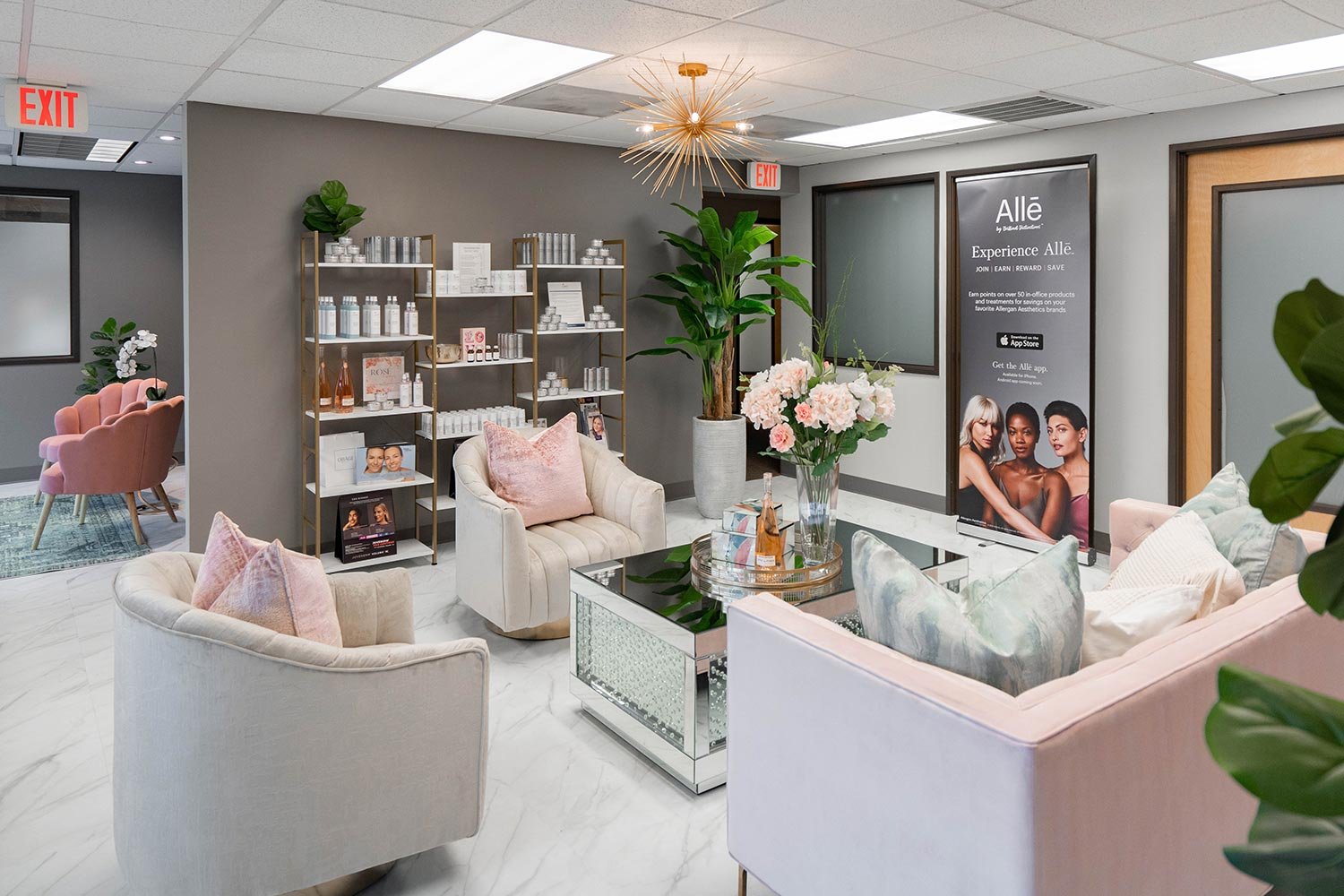
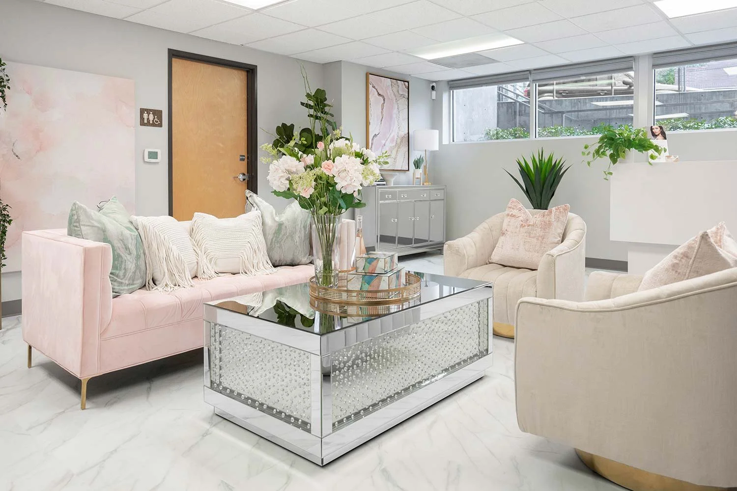
Previously, this space was occupied by and insurance agency. As you can imagine it was not up to med spa standards for aesthetics. At LOVE Medical Spa, they believe that every person deserves a luxurious escape from their daily routine and it was KTI’s job to make everyone feel fabulous as they walked through the door. With a fresh coat of pain, green leafy accent wall, new marble style commercial flooring, and new contract grade furnishings with a touch of glam, we accomplished a true transformation.
Designing the perfect med spa takes careful planning and attention to detail, but the end result will be a luxurious and relaxing environment where your clients can escape from the hustle and bustle of daily life and receive the best possible care.
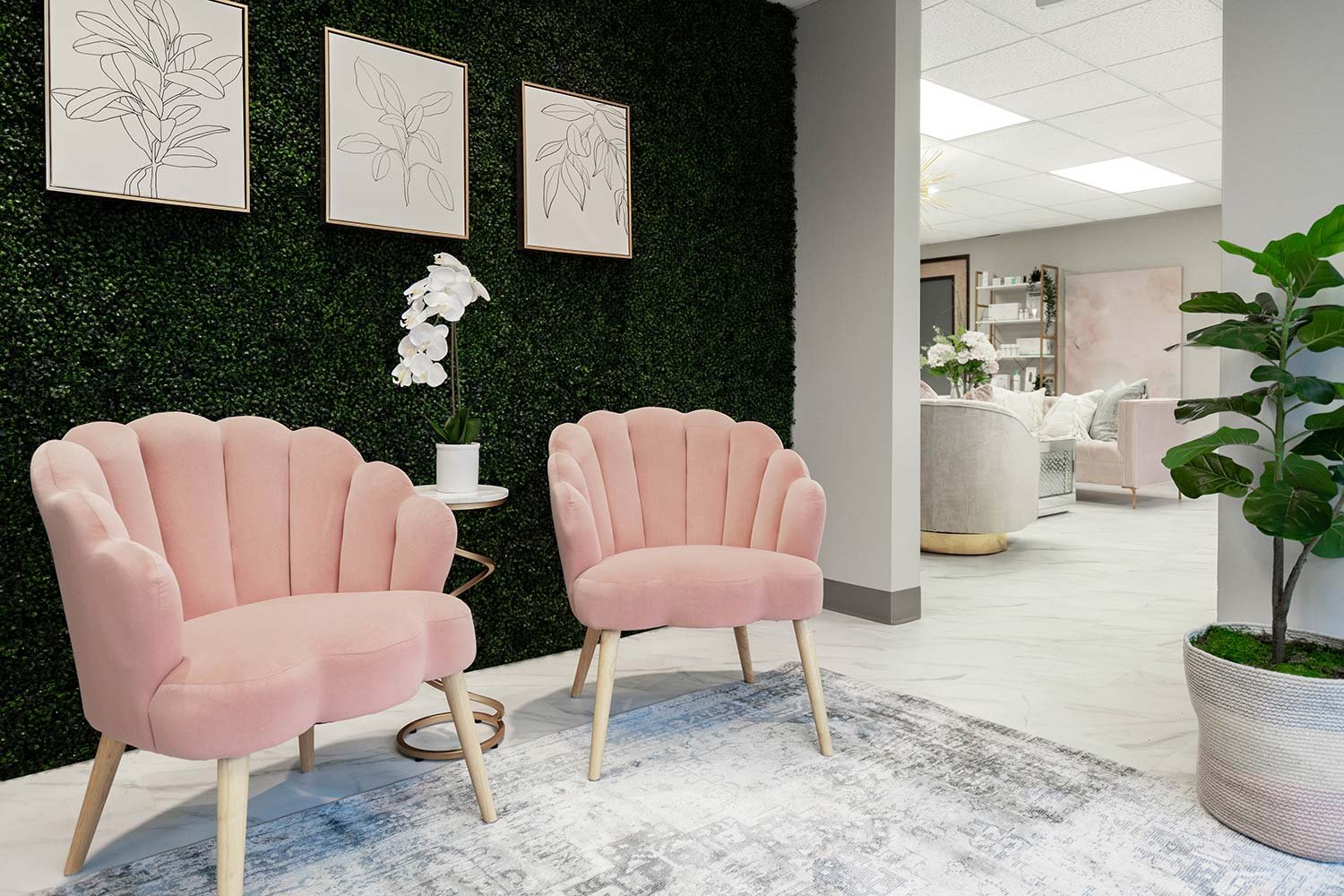
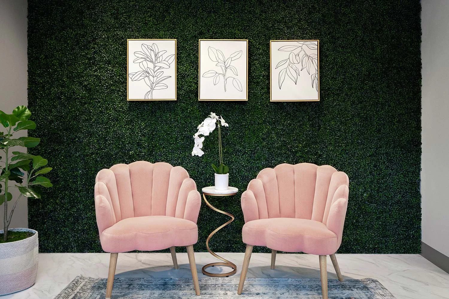
The entry waiting area is a true oasis of calm and relaxation. The first thing that catches your eye as you enter the space is the stunning green plant wall, which is a beautiful backdrop to the cozy pink chairs.
The wall is filled with lush and vibrant foliage, creating a serene and natural atmosphere. The pink chairs, with their soft and comfortable cushions, invite you to sit and unwind, surrounded by the beauty of nature.
The color combination of green and pink creates a warm and inviting ambiance, making you feel at ease from the moment you step into the room. This waiting area is not just a place to wait, but a true escape from the outside world, where you can relax, recharge, and prepare for your spa experience.
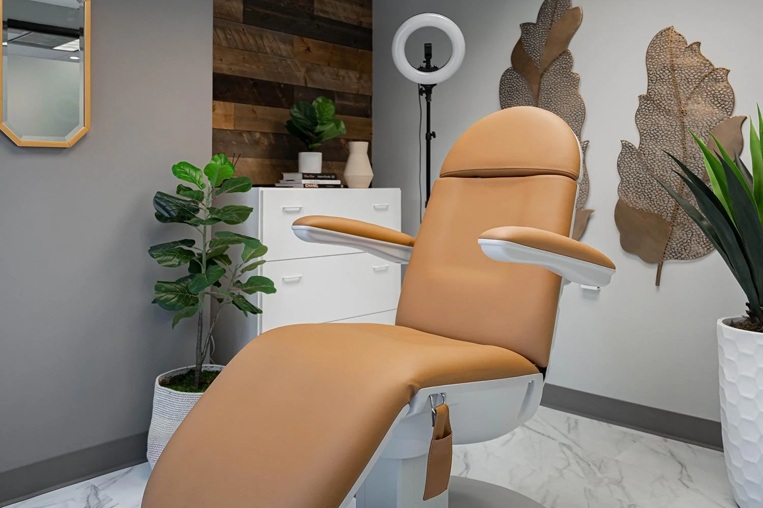
This private treatment room is the ultimate in relaxation and comfort, offering the perfect environment for your spa experience. The combination of warm wood tones, luxurious leather, and gleaming gold creates a cozy, yet sophisticated atmosphere that will leave you feeling pampered and rejuvenated.
The modern office bathroom in this med spa is a bright and inviting space, featuring a bold blush pink color palette that adds a pop of energy to the room.
We created a relaxing and inviting atmosphere with warm lighting, comfortable furnishings, and a cheerful color palette.
This console is usually where the coffee machine and office snacks for guests go, however, those tend to not look at great for beauty shots. So instead, enjoy Dior & Chanel books.
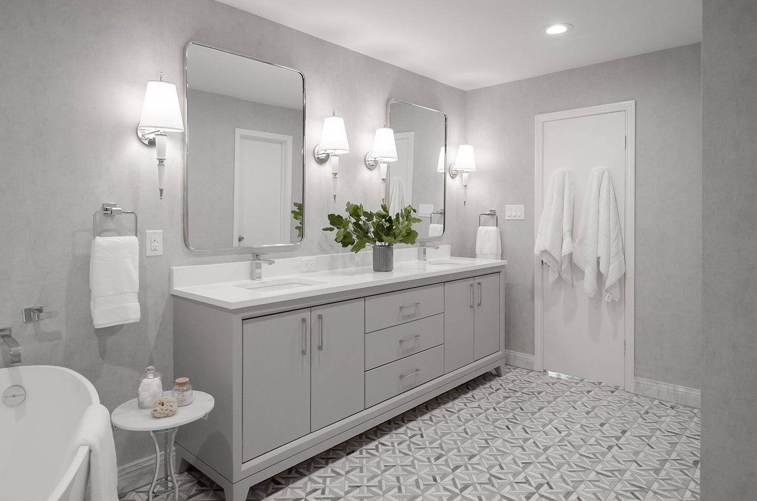
We played with movement in this space. Barrel swivel chairs soften the space. The movement in the marble pattern LVP floors feels effortlessly stylish, fresh, and bright.
A fantastic floral arrangement and a bootle of wine sets the tone for the spa day experience you deserve. Cheers!
What is the best grey paint color for your home?
Painting your home is a be decision. It’s often a color you will keep for a long time due to the expense. I get asked all the time, “what is the best [blank] color to paint in my home?” Well, today I want to try and answer the “what is the best grey color for my home.”
So what is the best grey?
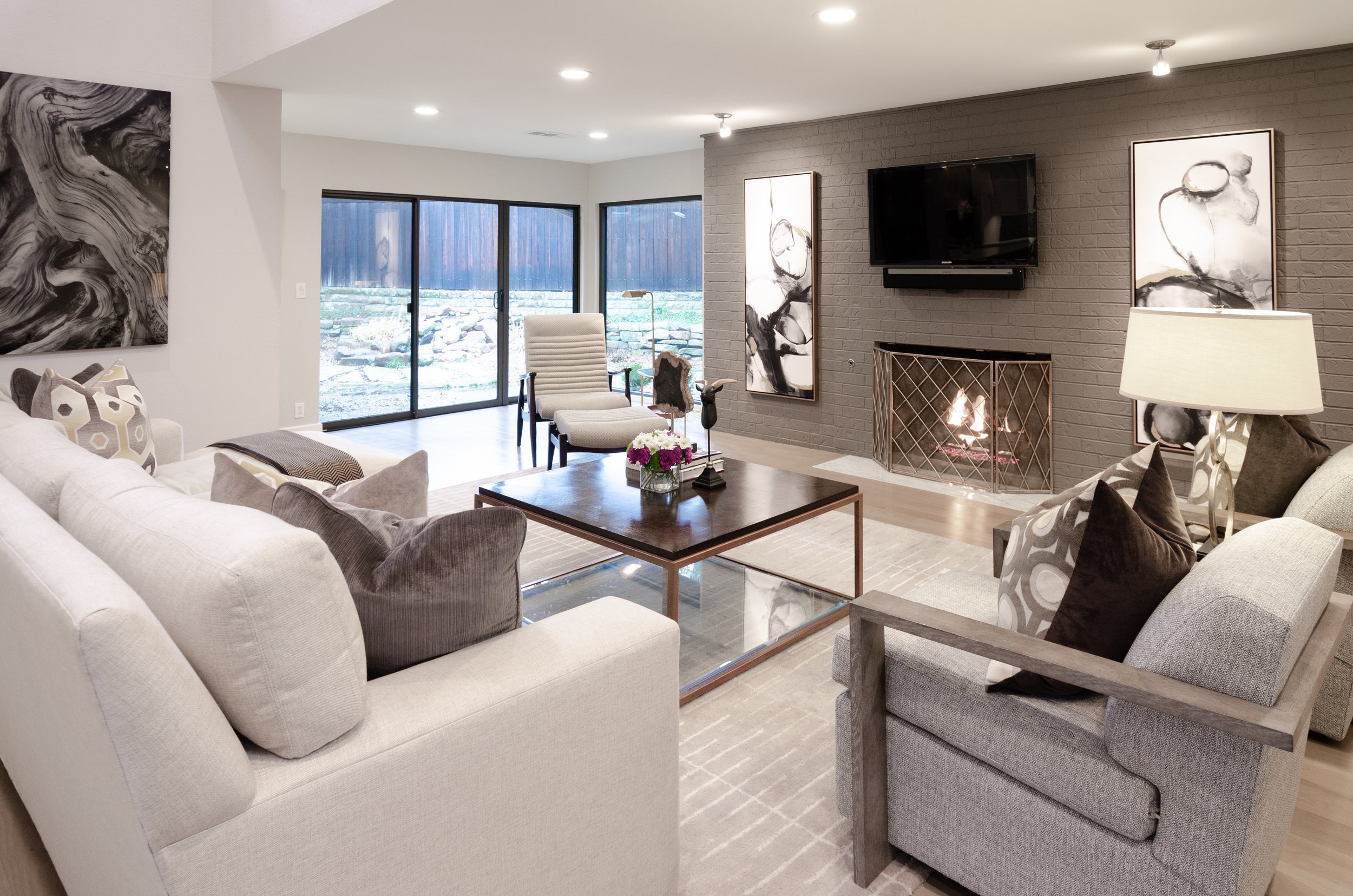
It really depends on personal preference and the overall aesthetic of your home. Some popular shades of grey for home interiors include light grey, which can create a calming and spacious feel, and dark grey, which can add a touch of sophistication and drama to a space. In general, it's a good idea to consider the other colors and design elements in your space, and choose a shade of grey that complements and enhances those elements. It's also important to think about the amount of natural light in the space, as well as the intended function of the room, when choosing a shade of grey. Ultimately, the best color of grey for your home will be the one that makes you happy and enhances the overall look and feel of the space.
Warm Grey
Warm grey is a shade of grey that has undertones of warm colors such as yellow, red, or orange. This makes the grey appear less cool and neutral, and gives it a warmer, more inviting feel. Warm grey can be a great choice for a home interior, as it can add a cozy and comfortable atmosphere to a space. It is often used as a wall color or for larger furniture pieces, such as sofas or armchairs. When paired with other warm colors and natural materials, warm grey can create a welcoming and inviting space.
My favorite warm light gray paint colors are: Sherwin Williams Agreeable Grey 7029, Sherwin Williams Worldly Grey 7043, Sherwin Williams Amazing Grey 7044, Benjamin Moore Revere Pewter HC-172
My favorite warm dark gray paint colors are: Sherwin Williams Dovetail 7018, Sherwin Williams Urbane Bronze 7048, Benjamin Moore Rockport Gray HC-105, Benjamin Moore Chelsea Gray HC-168
Cool Grey
Cool grey is a shade of grey that has undertones of cool colors such as blue or green. This makes the grey appear less warm and neutral, and gives it a cooler, more modern feel. Cool grey can be a great choice for a home interior, as it can add a clean and contemporary atmosphere to a space. It is often used as a wall color or for larger furniture pieces, such as sofas or armchairs. When paired with other cool colors and sleek materials, cool grey can create a stylish and sophisticated space.
My favorite cool light grey paint colors: Sherwin Willams Passive 7064, Sherwin Williams Grey Screen 7071, Benjamin Moore Stonington Gray HC-170
My favorite cool dark grey paint colors: Sherwin Williams Cityscape 7067, Sherwin Williams Peppercorn SW 7674, Benjamin Moore Englewood Cliffs 1607, Benjamin Moore Cheating Heart 1617
Neutral Grey
Neutral grey is a shade of grey that does not have any noticeable undertones of other colors. This makes it a versatile and neutral color that can be used in a wide variety of settings and interior design styles. Neutral grey is often used for walls, floors, and large furniture pieces, as it provides a blank canvas that can be easily paired with other colors and design elements. Neutral grey is also a popular choice for smaller accents and accessories, such as throw pillows, rugs, and artwork. Overall, neutral grey is a timeless and classic color that can add a sense of calm and balance to a space.
My favorite neutral light grey colors are: Benjamin Moore Classic Grey OC-23, Benjamin Moore Light French Grey 0055, Sherwin Williams Repose Grey 7015, Benjamin Moore Gray Owl 2137-60, Sherwin Williams Mindful Grey 7016
My favorite neutral dark grey colors are: Sherwin Williams Gauntlet Grey 7019, Benjamin Moore Amherst Grey HC-167
What is your favorite grey?
Accent Walls: The Best Way to Add Depth to Your Design
Adding an accent wall can drastically elevate the design style in a space. Because it is just a single wall, it can be the easiest way to direct focus, create depth, and even take an "outside of the box" risk. Check out my favorite five accent wall ideas you can do!
1. Paint
This is by far the simplest and most cost effective. I am a huge fan of using highly saturated colors to create a statement when painting an accent wall. Challenge yourself to a bolder color and if you hate it, it's easy to change!
An accent wall doesn’t have to be those vertical spaces. Don’t forget about that fifth wall, the ceiling. By painting this kitchen’s ceiling, we were able to draw the eye all the way to the beautifully barrel vaulted feature.
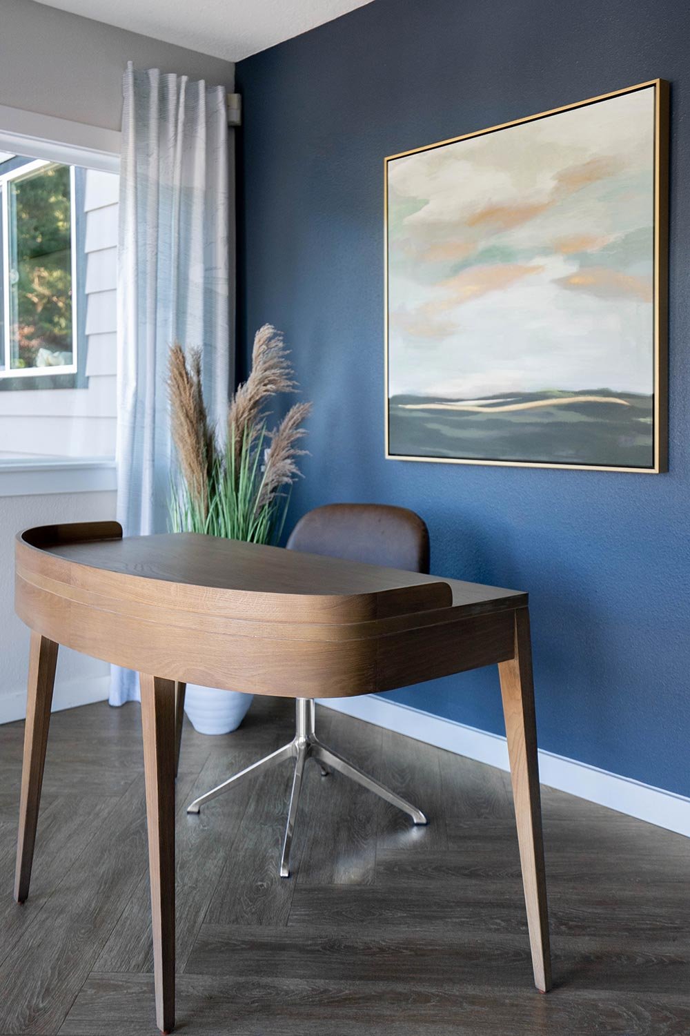
I love how just the navy wall of this kid’s bedroom painted creates depth and allows lighter objects to pop.
2. Molding
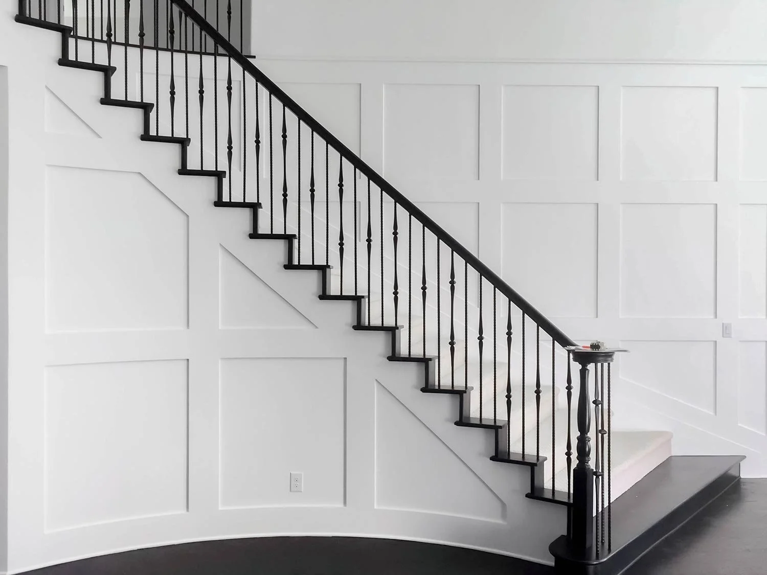
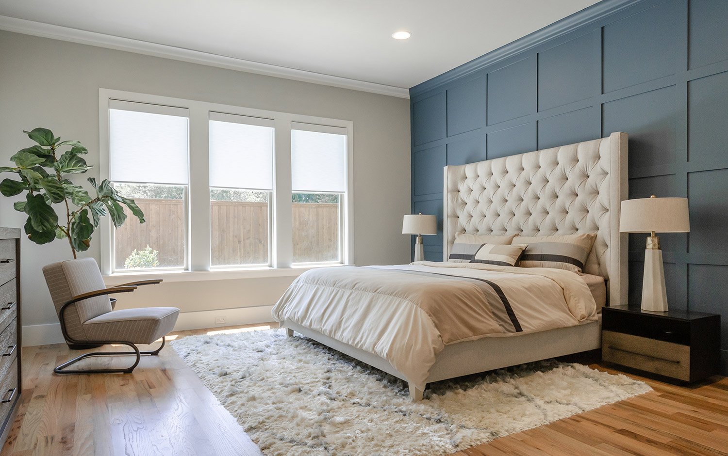
Putting molding walls got a bad reputation when so many builders decided to put a single piece of molding around the room called a chair rail (literally one of my least favorite things). However, molding on a wall can look super sophisticated. From the traditional picture frame molding to the more contemporary box molding.
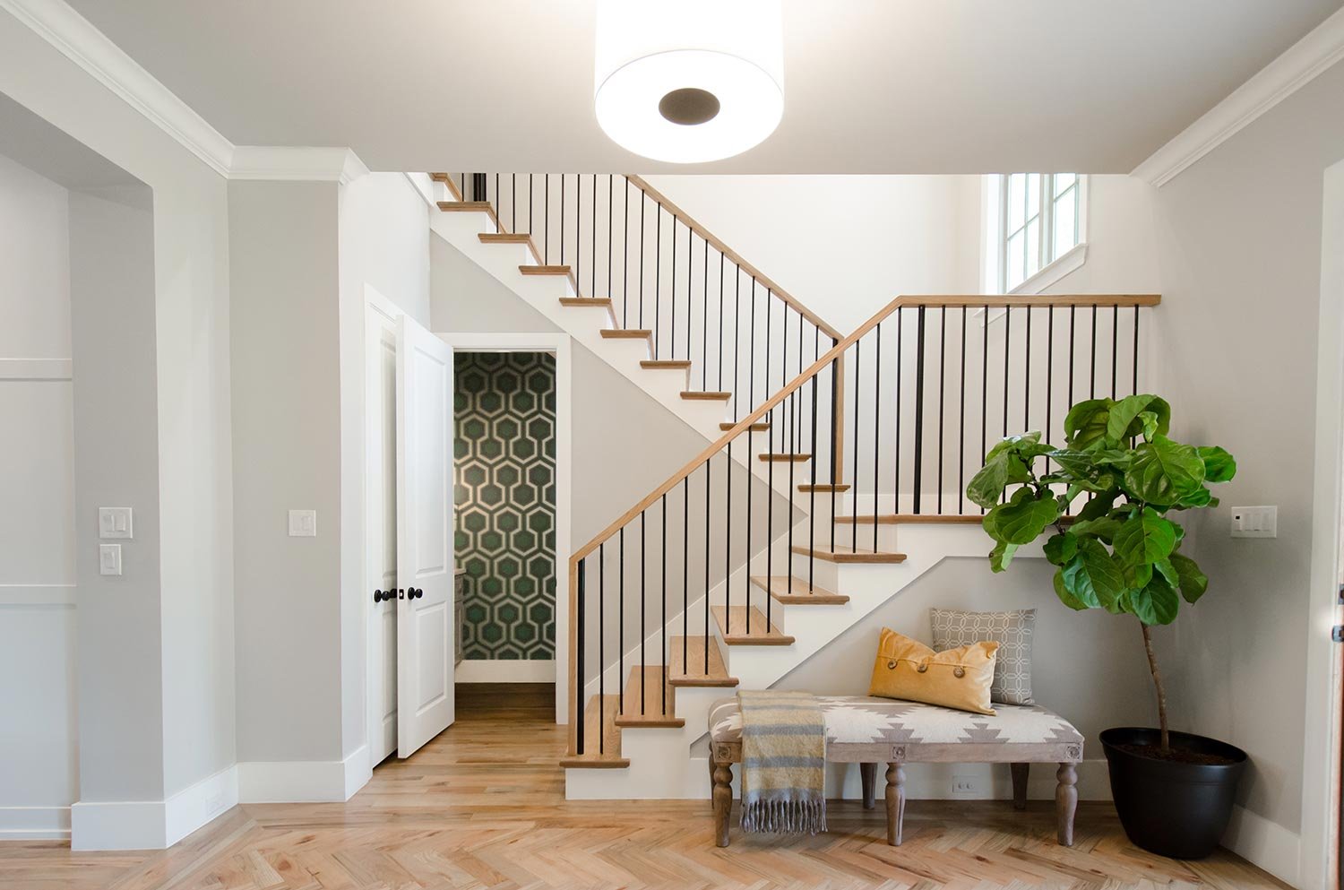
A staircase can be a forgotten space which is why it is the perfect place to add molding to really punch up the design.
Taking a traditional molding and turning it into something special with this square geometric designed wall using molding.
3. Wallpaper
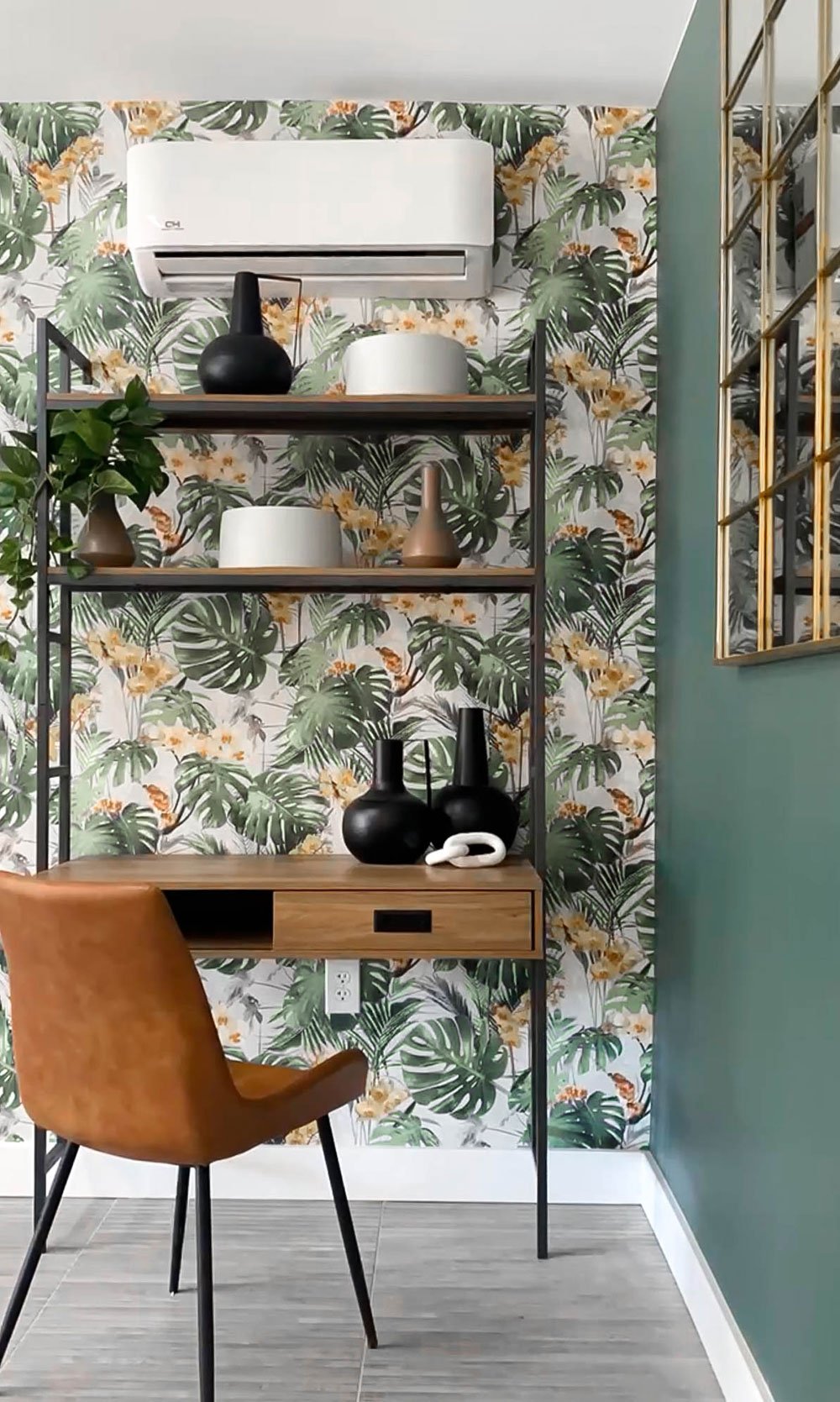
Yes, wallpaper is still in, in fact, it never left. I have used wallpaper in no less then 100% of my recent projects and with the endless possibilities of patterns and styles wallpaper can work for everyone. It really does make me overly excited.
Sometimes just one wall is all you need for wallpaper. This creates the perfect layer for this grandmillennial office space.
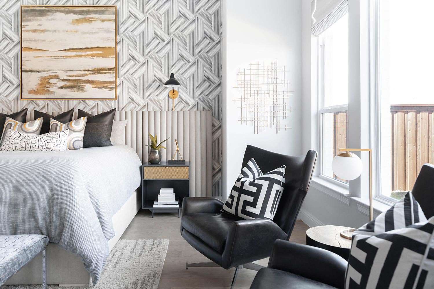
The perfect teen girl’s wallpaper. It's bold and beautiful and it only needed on the feature wall.
4. Tile
I love a tile accent wall! I use them frequently in bathrooms, bars, and even in bedrooms and other spaces. There are some really amazing tiles that will wow you and create huge impacts in a home.
Having fun with a wall of accent tile in a bathroom can bring so much style to your home.
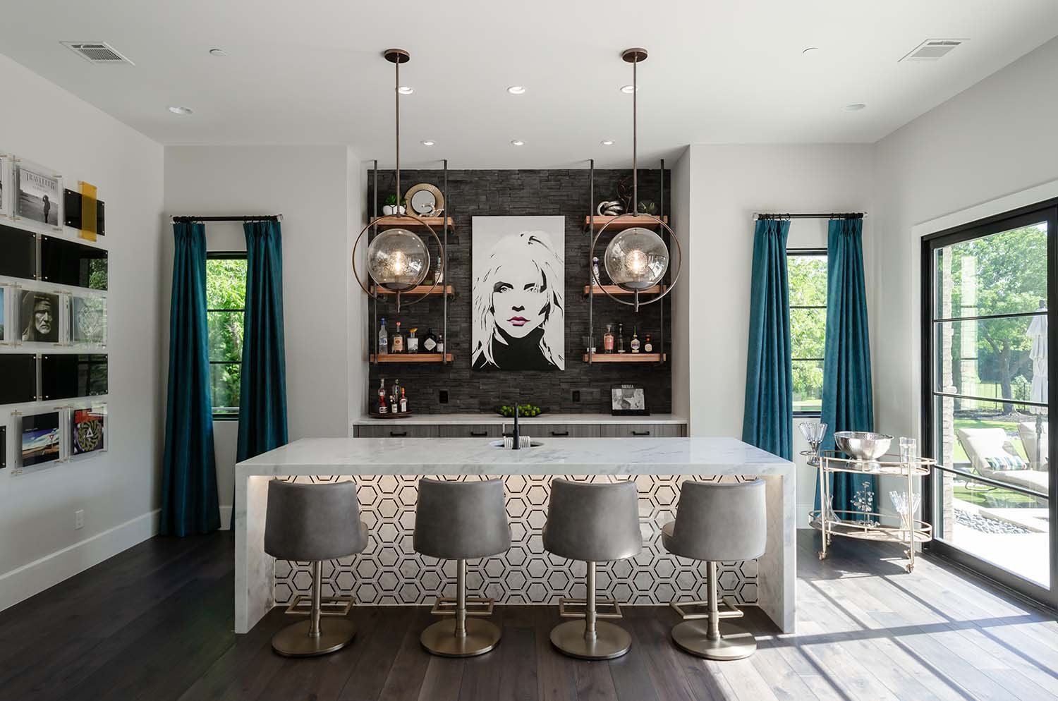
An accent wall tile doesn’t have to mean the entire wall. In this design, we decided to only do it in the nook behind the bar. It helps draw the eye in and layers in the sex appeal.
Using tile that starts in a shower and continues beyond the normal boundaries makes this small bathroom feel grand. Use this to trick your eye and make your tighter spaces truly expand.
5. Wood
I tend to lean more towards the modern use of wood as an accent wall, but for clients who love that "farmhouse" style, you can also use reclaimed wood.
Wood used in a more contemporary fashion to define this TV wall. This decorative wall with evenly spaced wooden slats for a sleek and contemporary look.
For this covered outdoor design, we wanted to add texture with a shou sugi ban accent wall. Shou sugi ban is a traditional Japanese method of preserving and weatherproofing wood by charring it with fire. The charred surface is then brushed and oiled to create a durable and attractive finish.
6. Living Wall
Creating a living wall as an accent is a unique and beautiful way to bring nature into your home. The result is a stunning and sustainable accent wall that adds life and color to any space.
Bringing Mid Century Modern Style into Your Home
With the popularity of the Mid Century Modern many people want to add elements into their homes. I personally love taking elements from different styles and showing them off throughout designs.
Mid-century modern furniture is a style of furniture that originated in the mid-20th century, roughly between the 1930s and 1960s. This style of furniture is known for its clean lines, organic shapes, and sleek, minimalist design. Mid-century modern furniture was influenced by the Bauhaus and De Stijl art movements, which emphasized function and simplicity in design.
One of the most notable characteristics of mid-century modern furniture is its focus on form over function. This means that the design of the furniture is just as important, if not more important, than its practicality. Mid-century modern furniture often features bold, geometric shapes and bold, solid colors. An easy way to bring this into your home is through the use of wallpaper and tile.
The use of natural materials such as wood, leather, and wool is also common in mid-century modern furniture.
Mid-century modern furniture is highly sought after by collectors and design enthusiasts alike. Its clean lines and timeless aesthetic make it a versatile choice for any space. Whether you are looking to furnish your entire home with mid-century modern pieces or just add a few key pieces to your existing decor, this style of furniture is a great way to add a touch of sophistication and elegance to your space.
Some of the most iconic mid-century modern furniture pieces include the Eames Lounge Chair and Ottoman, designed by Charles and Ray Eames, and the Tulip Chair, designed by Eero Saarinen. These pieces are known for their elegant, sculptural forms and their use of innovative materials and manufacturing techniques.
In addition to its aesthetic appeal, mid-century modern furniture is also known for its durability and longevity. Many pieces of mid-century modern furniture are still in use today, decades after they were first designed. This is due in part to the high-quality materials and construction used in their manufacture, as well as the timelessness of their designs. My advise is to save for quality pieces that will stand the test of time rather than cheaper imitations that you will not get to enjoy very long.
If you are interested in incorporating mid-century modern furniture into your home, there are many ways to do so. You can find authentic mid-century modern pieces at vintage shops, online marketplaces, and auctions. Alternatively, you can purchase new furniture that is inspired by the mid-century modern style. No matter what approach you take, adding some mid-century modern pieces to your home is a great way to add a touch of sophistication and elegance to your space.


