Enjoy this video walk-through of a "Pretty in Pink" master bedroom where I have layered soft textures and colors of pink, grey, and cream. An added touch of metallic gold and silver elevate this bedroom and bring it to the next level of high end interior design.
Mirror Mirror on the Wall
I am known for my belief that every room needs three things; furniture to use, art for beauty, and a reflective surface for depth. For me, the go-to reflective surface of choice is a wall or floor mirror that adds something special to the design. A huge bonus for me is you can put a mirror almost anywhere and it be a success in the design. Don't believe me? Check these ways a mirror can be just the thing needed!
How to update your interiors when your home is traditional
Not every home design project has the budget to completely gut and remodel the entire space. More likely than not, when designing an interior for a client, I have to keep in mind the style of the house itself and when a home is traditional and the client wants a more updated style, what are you to do? Here is a walk through of a client project where we updated their interior design while keeping in mind what the home already had in place.
Outdoor Patio Design: Relaxing Tangerine
Being outdoors is on the top of my "list of loves" in life. It makes me so happy to breath in the fresh air and take a pause from the four walls that envelope most of my day. Over the past few years this sentiment towards being outdoors has been shared by more and more people and because of this, indoor/outdoor living spaces in homes have been raising in popularity and manufactures of outdoor safe furnishings have kept up with the pace. In honor of the summer season coming to an end and beautiful Autumn weather rolling in, here is a design you could easily do for your own outdoors. I call it, Relaxing Tangerine: A relaxing casual style with clean lines and natural textures.
Arrow Accent Pillow - Pillows are some of my favorite ways to update a space. This charcoal arrow on a cream background has a fantastic modern casual vibe. $60
Tone on Tone Striped Pillow - These contrast against the charcoal, of the other pillow and add structure to the space. - $79
Natural Trellis Pillow - I love how these bring in the mid-tone of all of the neutrals. $98
Tangerine Bohemian Style Rug - Adding just a touch of color is perfect to give your outdoor patio just enough color without overwhelming. $629
Woven Natural Stools - These wicker stools add visual texture and an extra place for guests to sit when you are entertaining. $250
Copper Bowl Planter - Adding a little bit of shine plays well against the softer tones of the design. I love the warmth in the metal. $175
Copper Cylinder Planter - This is the sister planter. It has all of the same material elements, but allows for something a little different. $175
Outdoor Safe Table Lamp - Electric lamp outside? What! That is awesome. This outdoor lamp will keep the mood casual. $279
Antiqued Side Table - Everyone needs a place to put a drink down, and this small antiqued side table is perfect for that. It also connects well with the planters and cocktail table. $199
Gray Sofa/Chaise with Casual Washed Wood - Upholster is where you splurge! These well constructed pieces are going to last you a lifetime. They are the perfect classic high end look for your outdoors. $3579
Gray Chair with Casual Washed Wood - A perfect compliment to the sectional above. I love how this chair is oversized. Makes me want to curl up with a cup of coffee and a good book. $1125
Rusted Top Round Coffee Table - A show-stopper of a cocktail table. The simplicity in the shape is lovely and the rusty top is a worry-free way to live outdoors. $855
Learn to hand render like the pros!
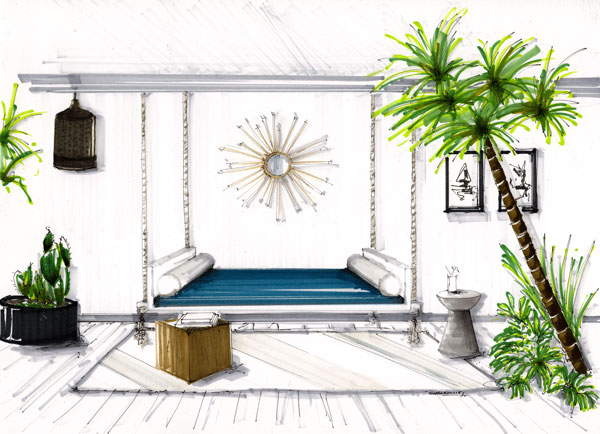
Have you ever seen a hand rendered design and thought, "WOW, how do they do that?" or, "I'll never be able to hand render like that." I am an interior designer and I also have those same thoughts. In college I had to learn the skills of hand rendering, however, with such a fast paced world, it was one of the skills I let slip.
I recently reconnected with a friend from university, Shannin Williams, and she absolutely amazed me. Shannin has fine tuned her hand rendering skills since our time as Lumberjacks at SFA in Nacogdoches, TX. "My goal is to help you learn the basic techniques of hand rendering and sketching and apply those to your client presentation boards in a creative way so you can sell your design proposal." Shannin says. I love how she inspired me to get back to the basics by putting pen to paper and immerse myself into my designs on another level. Here are some of the tips she gave me for sharpening my hand rendering skills that will help you too.
Tip 1 - Use good quality paper.
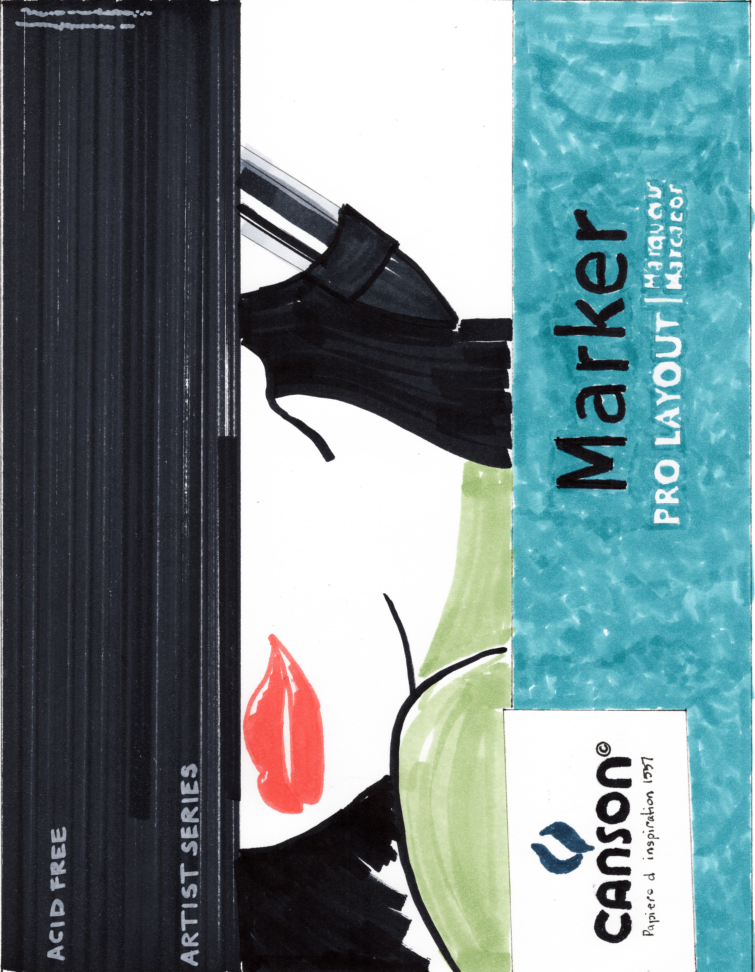
Using good quality paper can change the way the final rendering can look. I’ve used several types of marker paper and I discovered the ones I like the most. If I want my hand rendering to have a softer look I use Bienfang Lightweight drawing paper. This paper allows the marker to bleed perfectly for me. If I want a sharper look with defined strokes and marks and no bleeding I use x-press it blending card. Others I use are Canson pro layout marker paper, and Borden& Riley #234 bleedproof paper. I suggest trying a variety of papers until you find the one you like and achieve the look your aiming for. See more of my favorite tools in the link here.
Tip 2- Use a straight edge when you hand render or draw.
I always use a triangle that has an inking edge when I draft floor plans or hand render. The purpose is to keep your marker lines straight. I like seeing crisp, straight lines in my illustrations. A crooked line makes me nuts which is why I own several adjustable triangles in different sizes. My favorite is the Staedtler Mars 8” adjustable triangle. I even keep a smaller one in my purse when I travel along with a sketchbook, pen, and pencil.
Tip 3 - Use good quality markers.
I use Copic Sketch markers due to the 380 + colors they offer. I also like Copic Sketch markers because you can refill them and change the tips when they get bad. Buying a $6 marker seems outrageous but I look at it as an investment since I have the ability to refill them when needed. That beats buying a whole new marker like you would with other brands. If you want to start with a set of markers I recommend purchasing any of the Copic Sketch cool, toner, neutral, and warm gray markers first. You can achieve a lot of colors with a range of grays. And don’t be afraid to layer and mix your marker colors to create a new color.
Tip 4 - Define your own style of hand rendering.
There are several architectural illustrators out there that have different hand rendering techniques. I have learned from them all and developed my own rendering style that portrays the look I want to achieve. My style includes a loose and quick mark that is not perfect allowing my final hand rendering to be natural and not forced. It took me months of practice to achieve the style I wanted and I recommend you doing the same. Your style of hand rendering needs to stand out amongst others to get gain attention.
To see more of my work visit my website at www.shanninwilliams.com or follow me on instagram @shannin_williams. If you want to practice hand rendering jump on my website and sign up for my mailing list and download your free line drawing or you can see try out my hand rendering course here.


