CLASSIC, CHIC & SEXY RANCH STYLE HOME

Sexy is back in vogue and this house remodel proves it. The goal for this design was to keep it chic and keep it foxy. Other than enjoying each other's company and the cuddles of their dog kids, these clients love to entertain. We wanted to create a classic interior design that layered every neutral tone in the book. I hope you love walking through this stylish interior design as much as I loved pulling it all together.  

This is a grand formal living room dripping in style! Features a fantastic black painted wood fireplace with a deer head crowning it off. We used gold accents in a strong way to keep this space feeling classic and chic.

Painted pictures of their dogs flank the fireplace and peek over these sculptural gold lamps. A gold tone shad run connects the two sister sofa’s and plays nicely off the warm tone of the wall color.

The purpose of this space was to create an intimate space to hang out with an after dinner cocktail. Because of the soaring ceilings, we decided to set the room up with twin sofas facing each other to direct the conversation towards one another, allowing that feeling of intimacy.

Both sides of the room are also flanks with sets of large windows which allow fantastic natural light to flood in. This meant we were able to go deeper with the color choices in the room without making it feel dank and dreary.

By layer neutrals from across the spectrum, we were able to accomplish created a a dynamic space with a ton of visual interest.

The large windows allow so much natural light in lifting the vibe of the room. Having a glass top cocktail table also gave us a surface for that natural light to bounce off and great ambient glow.

The base of this cocktail table is amazing! The subtle shape of the stretchers provide just enough pattern to make this design sing.

The stark contrast from the natural tones in the trophy agains the black painted wood fireplace truly modernizes the use of taxidermy.

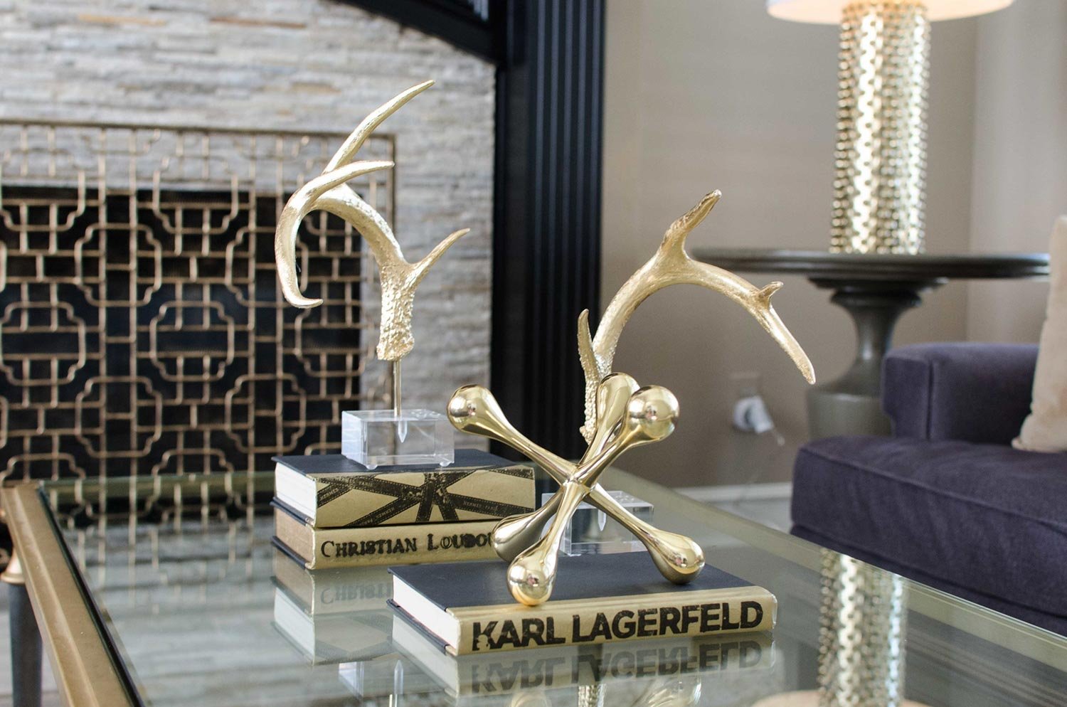
These gold antlers is a fun way of modernizing the use of deer in a Texas interior design. Other modern gold accents were used to bring it all together.

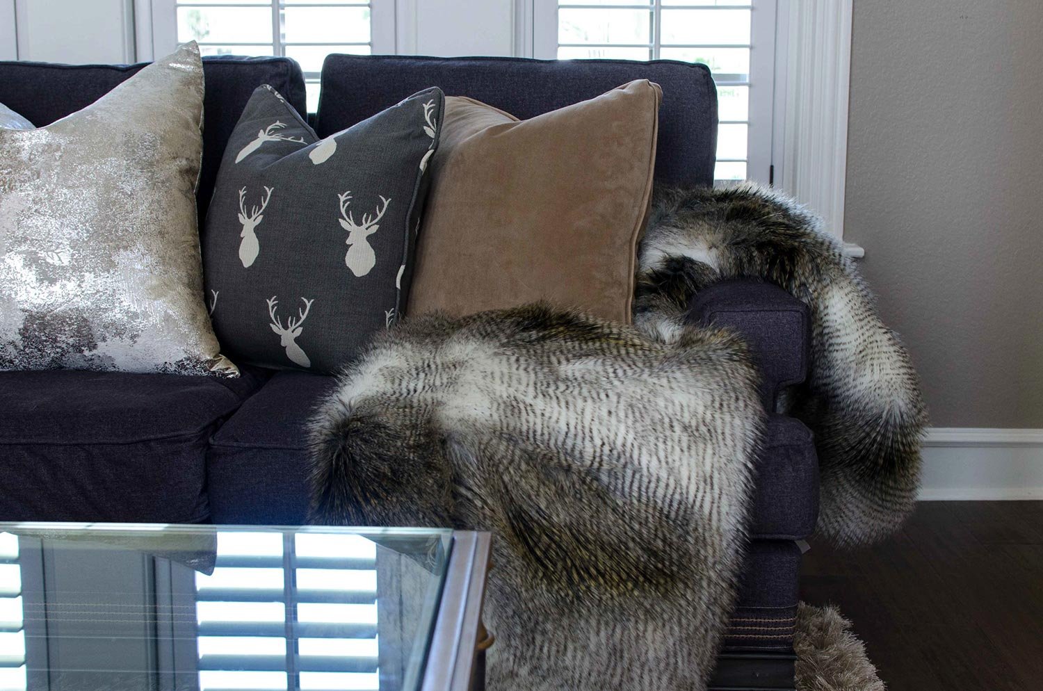
To connect with the deer head on the fireplace, we decided to use a modern silhouette of a deer on throw pillow.

I love the peek-a-boo of the detailing on the contrasting trim we did around the base of the sofa. Additionally, adding natural wood elements brings so much life into this design.

This fabulous updated stacked stone fireplace front was added to give a lot of texture and dimension. What I love most about it is the metallic flecks of copper throughout.

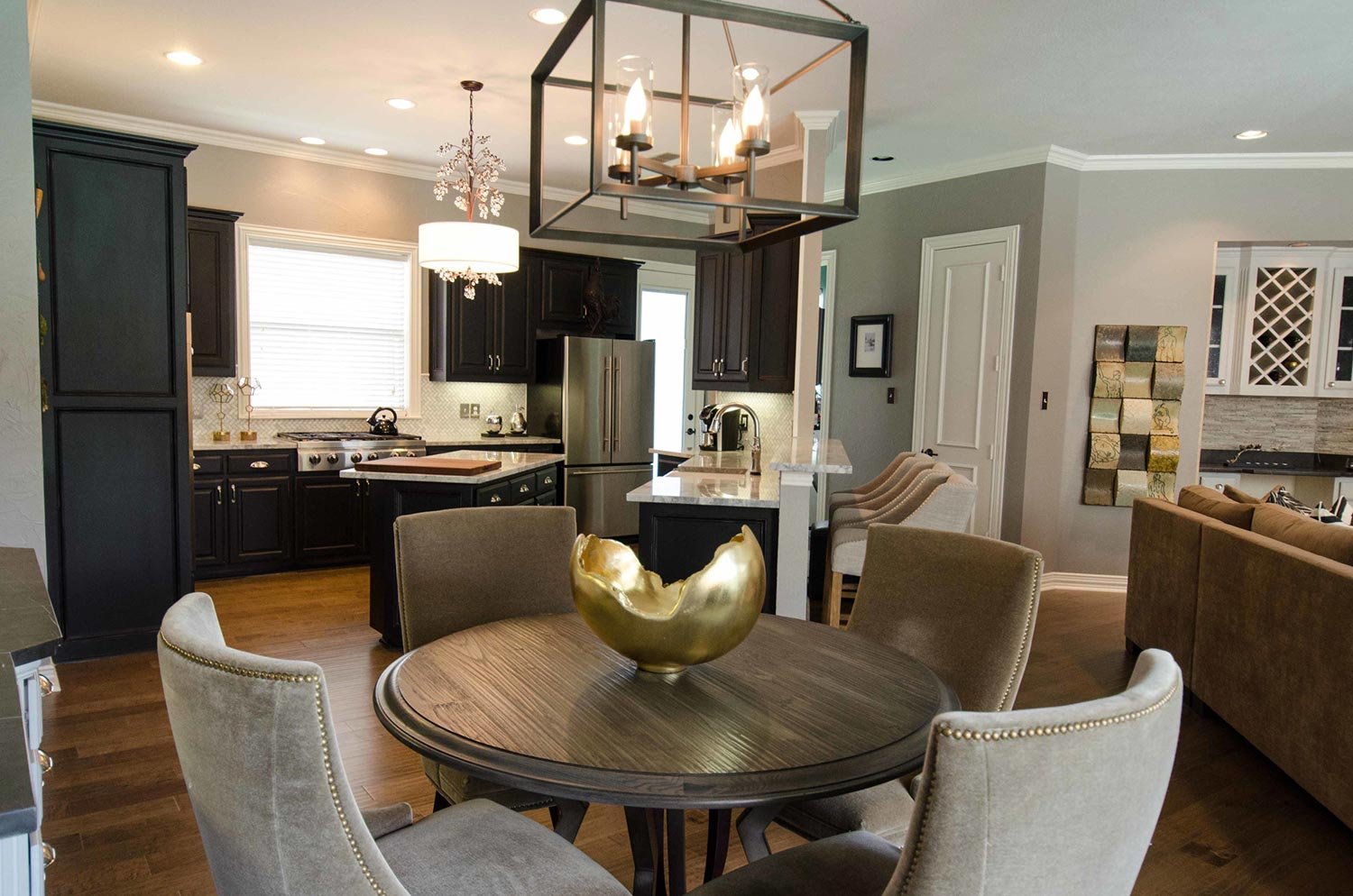
Walking into the main heart of the home is a treat for the eyes. We packed a lot into this open concept living dining, and kitchen area.

We wanted to use high end materials for this design project to make every square foot have impact. The dining chairs are made out of mohair bringing that sexy luxe flavor.

The caramel colored mohair dining chairs lined in antiqued brass nail heads in detail allow you to see how fantastic they are. The curved back is sheer perfection with this round top dining table.

The dining area has great storage with a custom build in cabinet. We highlighted the wood by painting the back black and using black marble for the counter tops.

We elevated the design of the dining rooms built in by adding a honed back marble counter top and continuing it up on to the backsplash. I also love how it allows gold accessories like this sculpture to make an impact!

Other elements in this space is the mixing of metals, which is very important when doing a layered neutral design. The dining table base and fixture are an industrial feeling oil rubbed bronze while you will see other accents in the space having gold and silver tones.

Natural colored barstools with caramel colored wood legs provide much needed extra seating for clients who love to entertain.

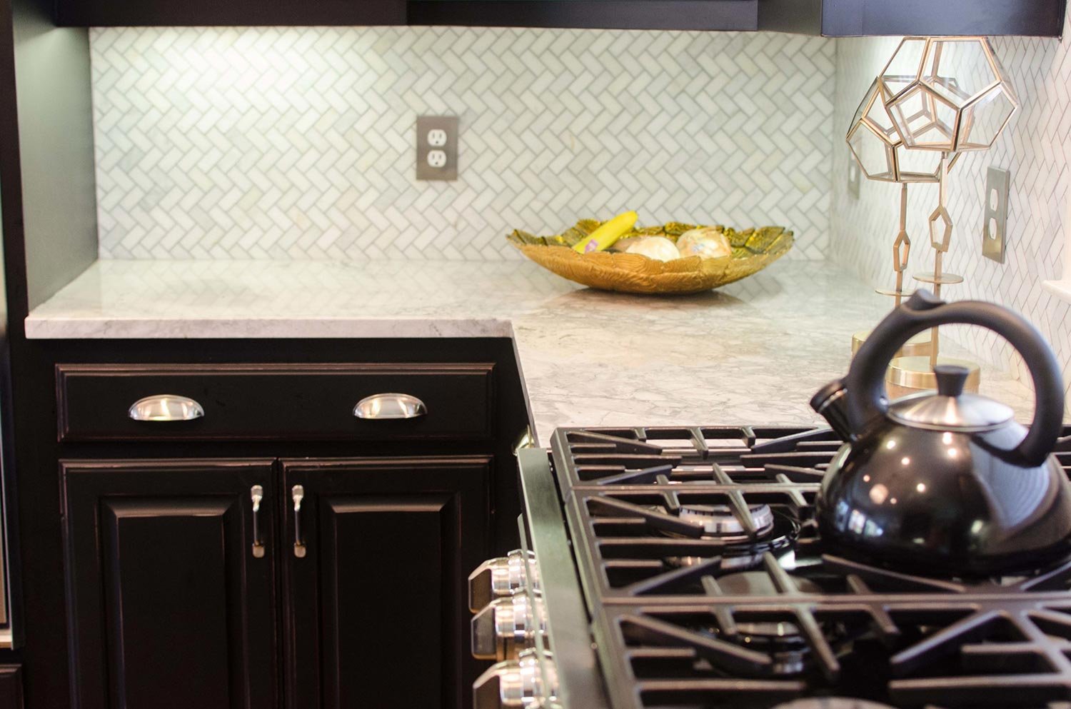
This is the epitome of a sexy classic kitchen design. We did a deep black kitchen cabinet color with classic marble for the countertops. The backsplash is chevron marble creating texture and style. An angled center island was added for extra workspace and to define the space.

Having a window above the sink lets in a lot of natural light which helps this kitchen not feel so dark. The other way we lightened the kitchen was with the contrasting white marble throughout.

This view lets us see how much of a chefs kitchen this truly is. It' was very important to be able to have a high end gas range for all of the fantastic meals that would be cooked.

Another classic element infused into this interior design was the white porcelain farmhouse apron front sink.

To create something different and unexpected, we used a chevron marble backsplash and turned it on it’s side. This helped visually raise the backsplash area and draw the eye up.

One final way we decided to help the cabinets not feel so dark was with nickel hardware. This not only contrasts well with the kitchen cabinets, it adds a classic design element.

One last look into this fabulous kitchen for appreciation. I love a good classic traditional black and white kitchen.

I love the natural variations with marble and these counter tops deliver!

We continue our tour with more layers of neutrals throughout the main living space.

When designing a living room that has an unusual shape, it’s important to fill it with the right furniture to maximize usability while maintaining an open and inviting feel. We did this by having a sectional with a chaise and a single swivel chair.

Adding to the entertaining vibe of this home is a fantastic built in dry bar with plenty of wine storage. We also left the built in tv cabinet because my client didn’t want to draw focus away from the fireplace.

The main feature of the room is this original artwork of a lounging male nude. This view has so many layers to unpack, layering everything that is sexy about this design.

A fun fact about this project is we designed the entire home around my clients favorite work of art they own. I love the vulnerability of this art and how it’s the main feature of this design.

I can’t get enough of a curated cocktail table. We brought in depth, texture, and gold to create this perfectly accessorized coffee table.

A touch of rustic elegance with the metal top coffee table brings a casual element into the space that say, “kick your feet up and relax."

We decided to keep the windows unobscured and simple add non functioning drapes to the family room. It finished the space and allowed the natural light to flow through the home.

An unexpected detail in the draperies is the oil rubbed bronze twisted metal rod. Add’s just enough traditional element without overwhelming the space. We also chose to keep it simple with a pinch pleat on the drapes.

This fabric is one of my favorites! It surprises you with a classic traditional houndstooth pattern, but layered in is an updated check.

The fireplace screen is a mixed metal traditional style layered nicely.

To leave a natural element in the room, we decided to use a natural edge stone slab for the fireplace hearth. Another fun and unique feature to this classic, chic, and sext interior.

Modern Global Living Room Designs

This design project is the perfect example of sprucing up an outdated space. My client had a lot of her own outdated pieces of antique furniture that simply needed to be reupholstered, space planned, and funked up with some color! Infusing a few additional updated elements make this space feel eclectic, global, and fun!

This Bohemian global interior design styled living room is the perfect example of sprucing up an outdated space. My client had a lot of her own things, it simply needed to be reupholstered, space planned and funked up with some color! 

These traditional wine chairs were reupholstered un updated fabric and pained with a white lacquer to freshen them up. I love how the vibrant orange hide pillows bring this to the next level of funk!

I am in love with this Antique Asia wood carved chair! It becomes a conversation piece for the space and shows the homeowners character. The beauty is in the details. 

Whimsical bohemian global home décor makes everything more fun.

These use to be tired old "Texas Leather" style ottomans. By adding some vibrancy to them they are now a funky Asian style stool for extra seating.

I wanted to stay clean up on the mantel so I did not detract from the beauty of this local artists original glass artwork.

Gray painted bring fireplace with pops of color add a casual and comfortable feel to this family room. Pops of color bring out the client’s personality.

A view from the fireplace back into the space. It stays funky fresh with this transitional mirrored cube coffee table.

Detailed photo of the contrasting Missoni inspired orange fabric, curve of the arm, and nail head trim on the wing chair. 

More angles of the transitional eclectic room. You can really see the fun blue in the dining room behind.

Detailed shot of the curvature in the sofa. It definitely softens the room.

Detailed shot of the taupe and gold leopard rug. 

Color Crush: Shades of Pink

Color Crush: Shades of Pink

Pink is in the house! I haven't seen an interior color trend take over so quickly since shades of grey and I have to admit, I am on board! Shades of pink even made me Top 5 things I just can't get enough of for Spring. Here are some of my favorite examples of pink being used in todays interiors.

5 Easy DIY Projects to Deck out your Dwelling

We are all spending more time on…well..having more time on our hands. Meaning, this is the perfect opportunity for us all to tackle those easy DIY projects in our home. The greatest part about it all is it won’t cost you much money and will make a huge impact on your emotional well being. Check out my suggestions on what you can do to make the time go by a little faster while beautifying your surrounding.

1. Paint!

A can of paint costs next-to-nothing for the huge impact it will make. Not to mention, some of us have left over paint cans hanging around; so why not use them? Adding a pop of color to your front door showcases your personality and painting an accent wall in your home creates visual interest and depth.

Bold painted blue craftsman style front door in Lake Oswego, Oregon.

2. Tidy up and declutter!

While some of us have a junk drawer in our homes (most of us) and others may have a junk room, now is the time to clean out and organize. A cleaner space will help us be more productive, organized, and happier!

pantry-storage-solutions Portland, Oregon decoration

3. Deep Clean

You may be thinking, “Duh, Kevin, of course I should clean.” I am not talking about the every-day cleaning, i’m talking about that cleaning you do every now and then; grout in kitchens and bathroom, baseboards, windows, and furniture vacuuming (you read that right). Did you know that vacuuming your furniture will get all of the years of dust, skin cells, and dirt off of it? It instantly breathes new life into furnishings and will help extend the life. Don’t forget to unzip those cushions and vacuum inside the casings as well!

37_MasterBath_02_DSC_7811.jpg

4. Art projects!

Add a bit of you into your home with custom arts ant crafts! Some of us have transitioned from CEO to stay-at-home and are now having to juggle entertaining out little ones. A great project is allowing your family to create something special for the home. From rock painting to framing a painting you created, this will add that pop of personal!

Displaying homemade art projects in a downtown Portland, Oregon condo

5. Change out your light bulb

Lighting is so important. We have all been in that zoom meeting where someone has terrible lighting and they look like that are giving an anonymous witness testimony or live in a yellow covered world. Lighting has different warmths that give off a yellow, white, or blue tint. My recommendation is 3000 kelvin, perfect balance of warmth and white. Uniform light temperature through your home will create the perfect ambience for you to enjoy!

Portland, Oregon home decorator presenting proper lighting design.


Are Interior Designers too Quick to Jump on the E-Design Bandwagon?

Hey all you cool cats and— no that’s not how I want to start this post. Let’s try that again…

Hey y’all (that’s better), we are going into week four of sheltering in place due to the COVID-19 outbreak and I have had a little time to think about the latest trend with Interior Designers. E-Design services.

Portland Oregon interior e-design services

I love how the designers of the world are adapting during this time, however, do not rush to jump on the E-Design bandwagon because business is slow. By doing so, you can cheapen yourself as a designer if you do not properly prepare.

First, what is e-design? Well, when you boil it down to it’s simplest form, e-design is a way for consumers to work with an experienced designer at a fraction of the cost. Sounds too good to be true right? Well first let’s go over how it typically works.

  1. The Client is responsible for sending photos and measurements of the room you are wanting to update, along with inspiration photos of a style you really like.

  2. The designer then puts together a floor plan, mood board, selects furniture, picks paint colors, and anything else that curates a custom designed look for you.

  3. Upon approval of design, clients will get a shopping list, with all the URL links for you to make the purchases on their own.

Step by step process to how e-design services work in Portland, Oregon

The links that are sent from the designer are affiliate links, meaning if you use them and purchase the product, the designer gets a kick back from the website you are purchasing through. The client is not paying anymore than they normally would. This is great for designers who are looking for an extra revenue stream.

As designers, we need to be up-front with clients and set the proper expectations prior to any job starting. Here are some things to go over with your potential e-design clients.

  • Payment for e-design packages are paid in full up front.

  • E-Design does not generally provide clients with higher quality products. Rather, it is targeted to potential clients who want a magazine-ready designer look, but do not have the budget or designer for long lasting desire furniture. Which is totally okay as long as the client knows ahead of time what the durability and expected longevity of the product can be. Good design can come in all budget sizes.

  • E-Designing usually limits revisions to one revision: this is so designers can properly price Packages and still remain profitable with their time.

  • Once the links are sent, the project is complete. Anything additional is considered outside of the scope and a new agreement will need to be made.

  • Set the expectation with the client. If potential new client is wanting completely custom designs that are high end and super tailored to them, direct them towards a full-service working relationship.

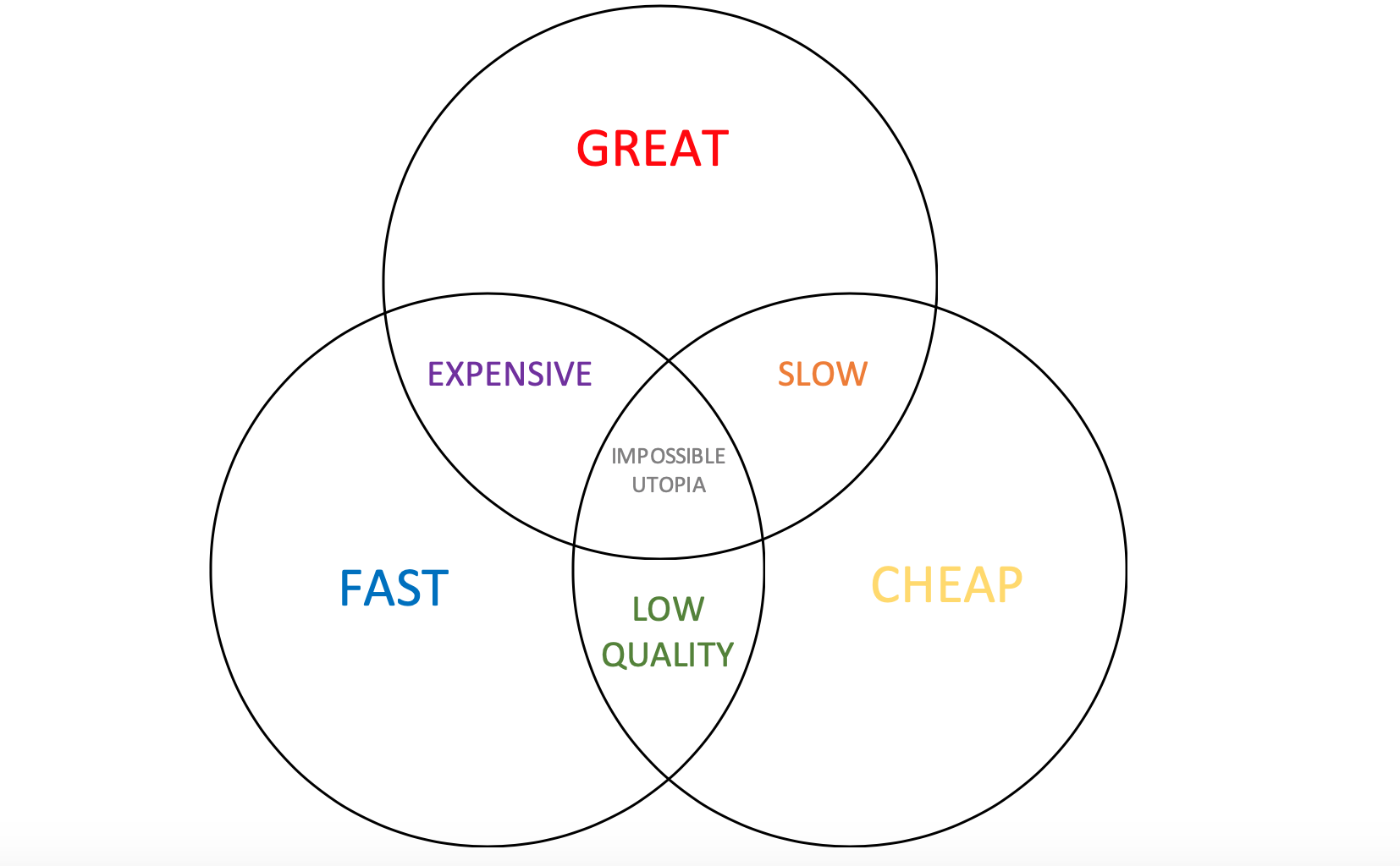
Now, e-design is a relatively newer introduction to the world of interior design as a way for individuals new to the profession of design to start building a portfolio and client base. In recent weeks, seasoned designers have also begun to offer these services as a way to continue working as the world has seemingly screeched to halt. Know that a more seasoned designer will charge more for these packages. But as we all know, you do get what you pay for.

Diagram.png

If you are thinking of offering e-design as an added service for clients, here are some questions to think about when pricing your packages.

  1. How long does a typical room take me to properly put together for a client?

  2. How much money do I want to put into marketing my e-design service?

  3. Am I skilled as putting together a lower-budget design?

  4. Does offering an introductory package cheapen my brand?

  5. Is this a bandaid for what is going on in my business right now that I want to continue when we are allowed to start going back into client’s homes?

Y’all, e-design is here to stay, but it’s up to us as designers to choose if we want to offer this as a service or if we are fine with sticking to the services that fit our business model the best.

Portland Oregon top interior designer

Kevin Twitty
Principal Designer
Kevin Twitty Interiors
503-714-5197